
Thank you! Your submission has been received!
Oops! Something went wrong while submitting the form.
Get SaaSFrame Pro
Monthly
$18
Quarterly
$48
Yearly
$180
Upgrade to access this feature
Browse all screens & flows
Filter and search screens & flows
Access Figma files
Access mobile versions
Bookmark screens & flows
Join now
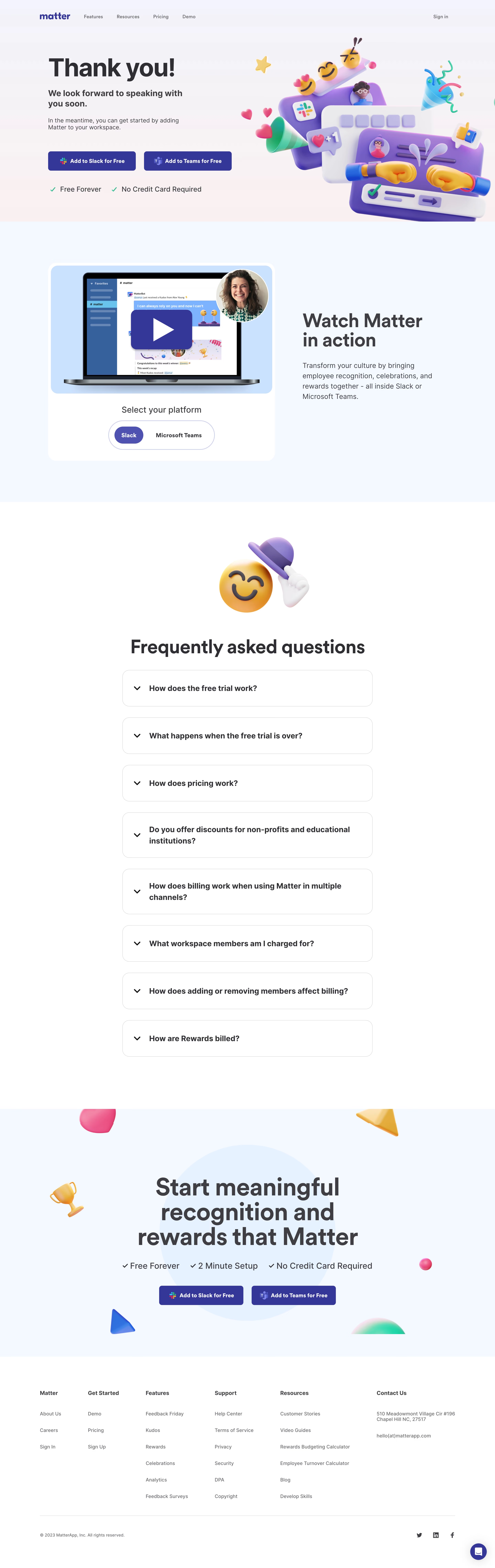

Matter Thank You Page

Matter
Peer feedback platform
Designed by
No items found.

Bookmark
Bookmark

Design with AI
Thank you! Your submission has been received!
Oops! Something went wrong while submitting the form.
# Design from Reference: Matter Thank You Page
Create an original, high-fidelity visual design inspired by the reference. Prioritize composition, typography, colors, spacing, and component styling over technical implementation.
## Reference
- **Product:** Matter
- **Category:** Thank You Page
- **Screenshot:** https://cdn.prod.website-files.com/5e9dc792e1210c5325f7ebbc/6acad844b3daa04f54276276_6acad7ca1d50254551a1d789_cms-50abf0edc56f0bca4697b349.webp
Analyze the screenshot first. If inaccessible, request it rather than guessing.
## Content
{{content.instructions}}
{{content.data}}
Preserve essential messaging and factual accuracy. Adapt structure and copy length for visual balance; never invent product claims.
## Visual Design
### Overall aesthetic
- **Character:** Celebratory confirmation page with oversized friendly sans-serif headings, soft pastel grounds and glossy three-dimensional emoji/product illustrations.
- **Evidence and scale:** Screenshot is 2880 × 9116 image pixels. Dimensions estimate a 1440px CSS canvas at 2× capture scale; exact DPR and font identity remain unverified.
### Page composition
- **Header/confirmation:** A compact brand/navigation row sits above a two-column hero. Thank-you copy and two platform actions occupy the left; a large purple, pink, yellow and turquoise celebration illustration fills the right.
- **Demonstration band:** A pale blue section pairs a rounded video/platform-selector card at left with a large explanatory heading and paragraph at right.
- **FAQ region:** A centered tipping-hat emoji sits above a large heading and eight closed question rows in a narrower centered column.
- **Closing conversion:** A full-width pale blue region contains a centered multi-line headline, three checkmarked reassurance items and the repeated pair of platform actions, surrounded by floating decorative shapes.
- **Footer:** Six columns organize company, getting-started, feature, support, resource and contact information. A divider separates copyright/social links; a circular chat control appears at bottom right.
### Information hierarchy
- **Confirmation first:** The very large thank-you title is followed by a bold two-line expectation statement and smaller suggested next step.
- **Platform choice:** Slack and Teams actions have equal size and weight, making platform selection the next key decision.
- **Progressive detail:** Demonstration precedes pricing/billing questions, then the final conversion repeats the same platform actions.
- **FAQ state:** Every question row is closed in the capture; no answer panel or expanded-state styling is visible.
### Typography
- **Hero:** Thank-you title appears around 72px CSS, bold, with tight leading. Its secondary statement is approximately 24px bold; body text is around 17–18px.
- **Section display:** Demo and FAQ headings are around 52–56px; the closing statement is around 68px with compact multi-line leading.
- **Components:** FAQ labels are around 22px bold with 30px leading. Buttons use approximately 16px bold labels; footer links are around 14px.
- **Family:** Rounded-looking neutral sans-serif throughout; exact family, weights and tracking remain unverified.
### Colors & surfaces
- **Measured foundation:** White #FFFFFF alternates with pale blue #F2F8FF; related #E2F3FF and #C5E3FF support illustration/demo surfaces.
- **Measured emphasis:** Indigo #33379E is prominent in actions and brand details; dark gray #3E3E42 appears in major text.
- **Artwork palette:** Purple panels, pink hearts, yellow emoji and green checks are rendered with gradients and soft lighting rather than flat UI fills.
- **Surface character:** Broad sections are borderless. White cards and pale blue illustration grounds provide soft separation, with subtle shadows under selected controls.
### Components
- **Platform buttons:** Approximately 255 × 56px CSS, indigo fill, white bold label, platform icon at left and corner radius around 8px. The pair uses a roughly 24px gap.
- **Demo card:** Approximately 660px wide white card with large rounded corners near 24px. A pale blue laptop thumbnail, large indigo play overlay and circular speaker portrait fill its upper region.
- **Segmented selector:** Wide outlined pill below the thumbnail, with a filled violet Slack segment and neutral Teams segment. Only the pictured selection is observed.
- **FAQ rows:** Approximately 730px CSS wide, 106–132px high depending on wrapping, thin gray border, radius near 20px and generous padding. A downward chevron precedes each bold question.
- **Chat:** Small indigo circle with white conversation glyph and soft outer shadow, inset near the lower-right page corner.
### Visual rhythm
- **Containers:** Hero/demo/footer use a broad centered region around 1160–1200px; FAQ narrows to about 730px.
- **Section spacing:** Large 100–140px top/bottom intervals separate the celebration, demo, FAQ and closing message.
- **Repeated cadence:** FAQ rows use approximately 30px gaps. Platform buttons repeat consistently in hero and closing section.
- **Illustrative balance:** Dense glossy artwork contrasts with substantial white space around the FAQ and footer.
### Responsive
- **Observed limit:** Only the desktop full-page rendering is visible; video playback, FAQ expansion, platform switching and mobile layouts are unobserved.
- **Recommended stacking:** Place hero copy before the decorative artwork, stack demonstration image/text and let platform buttons wrap or become full-width.
- **Recommended scale:** Reduce display text fluidly, keep FAQ labels readable and allow question rows to grow with wrapped text.
- **Recommended footer:** Collapse six columns into smaller groups or stacked sections while keeping contact and support routes clear.
### Adaptation guidance
- **Preserve the mood:** Use a concise confirmation, two clear integration choices and a consistent glossy illustration language with soft pastel section backgrounds.
- **Support the next step:** Follow confirmation with a demonstration and practical questions, then repeat the same action labels.
- **Implementation:** Use accessible accordion buttons, video alternatives, meaningful focus states and decorative-image handling. Free-plan and billing statements visible in the capture are message content, not verified current policy.
Use this context to reproduce the reference's visual language: layout, typography, colors, spacing, borders, radii, and distinctive elements. The screenshot takes priority if descriptions conflict.
## Direction
{{preferences.fidelityInstructions}}
## Output
{{output.instructions}}
Deliver a polished, cohesive design with precise alignment, hierarchy, and spacing. Produce the requested visual artifact, not just a description. If unsupported, explain the limitation.


Category
Patterns
No items found.
Tech Stack



Added on
October 25, 2023
Similar screens
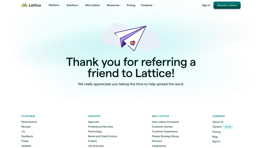






Upgrade to SaaSFrame Pro now to see similar examples.
Monthly
$18 /month
Billed $18 monthly
Browse all screens & flows
Filter and search screens & flows
Search text in screenshots
Access Figma files
Access mobile versions
Join now
Quarterly
$16 /month
Billed $48 quarterly
Browse all screens & flows
Filter and search screens & flows
Search text in screenshots
Access Figma files
Access mobile versions
Join now
Yearly
$15 /month
Billed $180 yearly
Browse all screens & flows
Filter and search screens & flows
Search text in screenshots
Access Figma files
Access mobile versions
Join now