Overall Style and Aesthetic
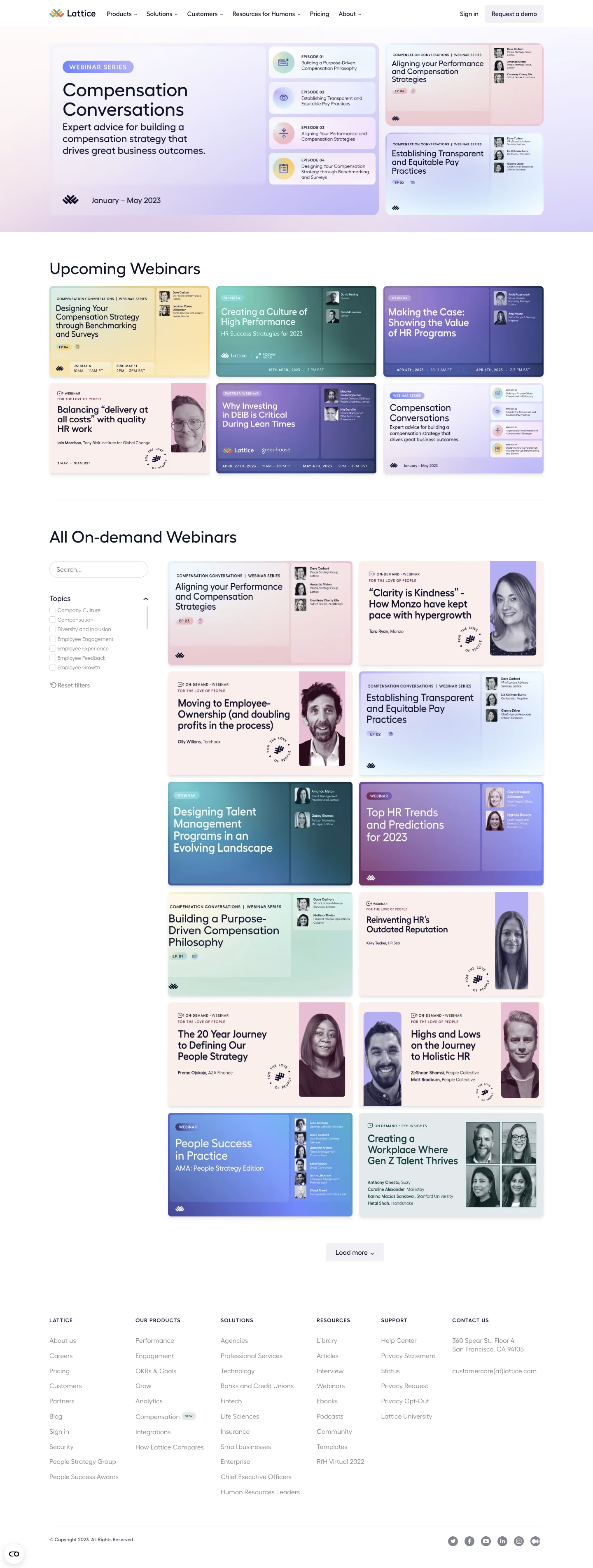
Lattice’s webinars page embodies a polished, contemporary aesthetic with an emphasis on clarity and professionalism. The minimalist approach ensures the content shines, leveraging ample white space and crisp alignments for an inviting, uncluttered feel. Subtle pops of brand colors inject vibrancy without sacrificing a clean, authoritative presence—striking the balance between accessible and sophisticated. Layout and Structure
The page structure is intuitive, beginning with a focused hero section that clearly announces the webinar archives and future events. This is immediately followed by neatly organized webinar cards, displayed in a grid layout that’s easy to scan. Filtering options along the left allow users to sort by topic, role, or type, making navigation swift and user-centric. A sticky header and streamlined footer ensure continual access to core site areas. Visual Elements
Webinar thumbnails use high-quality, branded imagery and occasional silhouettes, subtly reinforcing the Lattice identity. Minimal iconography and animation keep visual distractions at bay. Clean lines and soft shadowing add depth, while video play overlays make content interactive and actionable. Color Palette and Typography
Soft blues, teals, and understated grays form the primary color palette, projecting calm authority. Typeface choices favor modern sans-serifs with clear hierarchy: bold headlines draw attention, while body copy is highly readable. Strategic use of accent colors for tags and CTAs guides user attention efficiently. User Experience Patterns
Navigation feels seamless thanks to persistent filters and instantly updating webinar results. Prominent CTAs, such as “Watch Now,” are visually distinct. Marked registration prompts, intuitive forms, and thoughtful pagination keep users engaged without friction. Unique or Notable Design Choices
Lattice’s design stands out with its effortless blending of functionality and personality—a bold yet unintrusive overlay for upcoming webinars, contextual topic filtering, and spotlighted “Featured” events. Overall, the tone remains trustworthy and empowering, offering users a sense of expertise and support.