Design with AI
Generate a new design based on this screen using your own content.
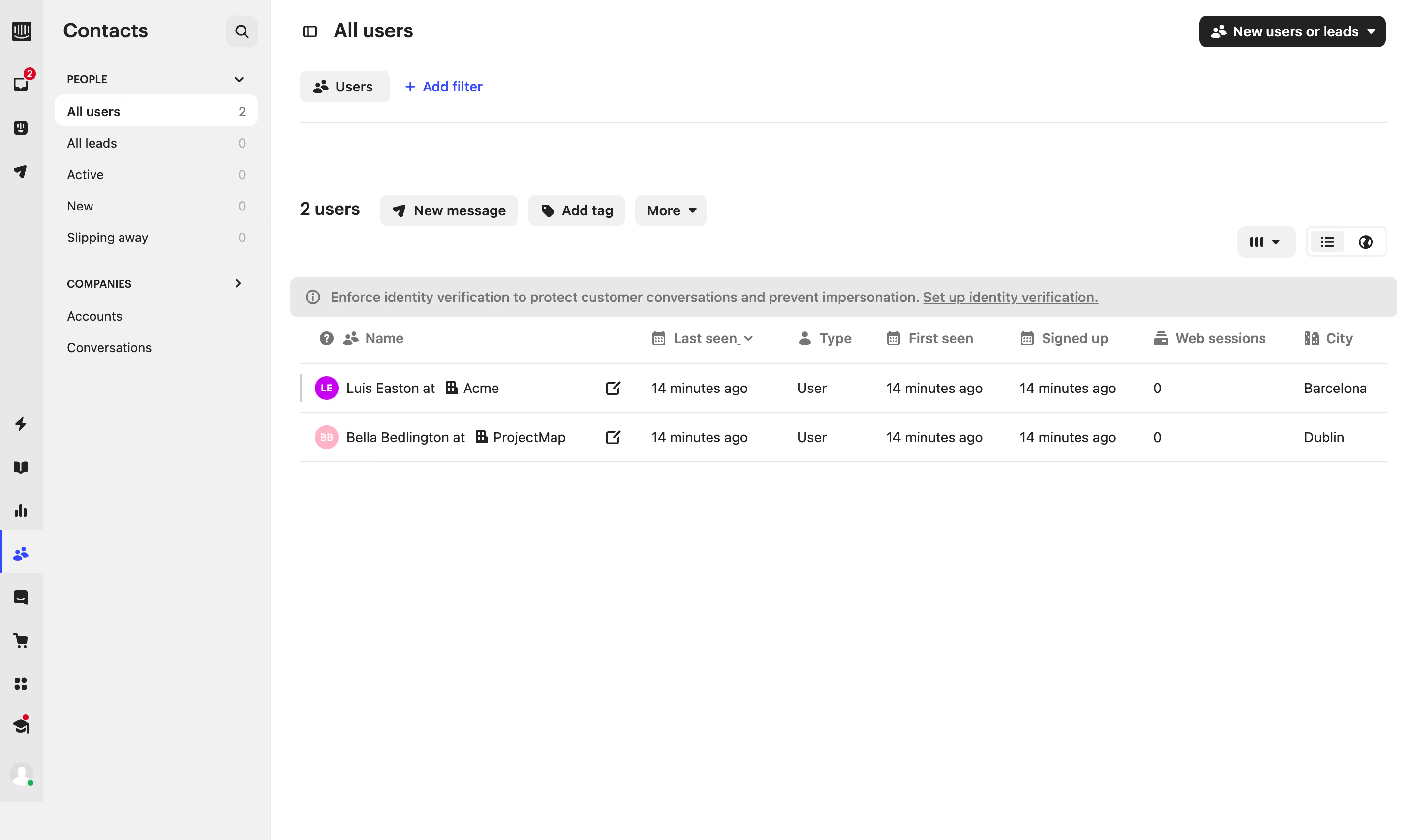
# Design from Reference: Intercom Users Table
Create an original, high-fidelity visual design inspired by the reference. Prioritize composition, typography, colors, spacing, and component styling over technical implementation.
## Reference
- **Product:** Intercom
- **Category:** Table
- **Screenshot:** https://cdn.prod.website-files.com/5e9dc792e1210c5325f7ebbc/6acad625fef6904ce0090dc9_6acad5aba56d77db6c10742e_cms-ceff0164044c1d8bd7abf26f.webp
Analyze the screenshot first. If inaccessible, request it rather than guessing.
## Content
{{content.instructions}}
{{content.data}}
Preserve essential messaging and factual accuracy. Adapt structure and copy length for visual balance; never invent product claims.
## Visual Design
### Overall aesthetic
- **Character:** Compact CRM contact table with grayscale utility controls, narrow navigation and small colored identity markers.
### Page composition
- **Capture:** 2880 × 1708 screenshot pixels; estimated 2× CSS scale.
- **Structure:** Icon rail, Contacts sidebar, All users header/filter row, bulk-action toolbar, identity-verification banner and two-row user table.
### Information hierarchy
- **Priority:** Selected audience and user count establish context; New message/Add tag actions precede the table. Names and organizations anchor rows before activity/type/date columns.
### Typography
- **Family:** Neutral sans serif; exact family unverified.
- **Estimated CSS sizes:** Page/sidebar headings 20px, row text 14px, metadata and column labels 13px; bold labels distinguish primary actions.
### Colors & surfaces
- **Measured palette:** White #FFFFFF, sidebar/control gray #F1F1F1, icon-rail/banner gray #E8E8E8, rules #E5E5E5, dark #222222 and muted #757575.
- **Accents:** Blue selection/filter controls and small pink/purple circular avatars.
### Components
- **Elements:** Audience counts, New users or leads dropdown, Users filter chip, Add filter link, bulk-action pills, view controls, warning banner and sortable column headers.
- **Estimated geometry:** Combined navigation approximately 276px wide, rows 50px high, controls 32px high and radii 6–8px.
### Visual rhythm
- **Spacing:** Multiple compact toolbars sit above a sparse table; large blank canvas below emphasizes the low record count.
### Responsive
- **Suggested adaptation:** Collapse navigation and preserve horizontal table scrolling, with names and row actions remaining accessible. Mobile behavior is not evidenced.
### Adaptation guidance
- **Transfer:** Preserve audience/filter context and the compact action hierarchy. Adapt columns to real contact data without crowding the empty state.
Use this context to reproduce the reference's visual language: layout, typography, colors, spacing, borders, radii, and distinctive elements. The screenshot takes priority if descriptions conflict.
## Direction
{{preferences.fidelityInstructions}}
## Output
{{output.instructions}}
Deliver a polished, cohesive design with precise alignment, hierarchy, and spacing. Produce the requested visual artifact, not just a description. If unsupported, explain the limitation.