



1. The website https://www.hugo.team/ consists of a header section that includes the logo of the website and some navigation links to different pages of the website such as features, integrations, pricing, login and sign up. 2. The header section also contains a call-to-action button that encourages the visitors to try the product for free by signing up through the website. 3. The main content of the homepage is a hero section that features an image of the product and a concise tagline that communicates the benefits of the product. 4. The hero section is followed by three sections that provide a high-level overview of the product features. Each section includes an icon, a short description and a call-to-action button that directs the visitors to a more detailed page about the corresponding feature. 5. The next section highlights some of the product integrations that the visitors can use to enhance the functionality of the product. It presents a grid of logos for different software and tools that the product is integrated with. 6. The following section provides information about the pricing plans of the product. It features a table that compares the features of different plans, and it also highlights the recommended plan for users based on their company size. 7. At the bottom of the page, there is a section that features some customer testimonials that endorse the product. It includes the name and title of the customer, their image, and a short quote about their experience with the product. 8. Finally, the footer section of the website includes some additional navigation links, social media icons, and copyright information.

Thank you! Your submission has been received!
Oops! Something went wrong while submitting the form.
Get SaaSFrame Pro
Monthly
$18
Quarterly
$48
Yearly
$180
Upgrade to access this feature
Browse all screens & flows
Filter and search screens & flows
Access Figma files
Access mobile versions
Bookmark screens & flows
Join now
Hugo Landing Page

Hugo
Connected Meeting Notes
Designed by
No items found.

Bookmark
Bookmark
Design with AI
Thank you! Your submission has been received!
Oops! Something went wrong while submitting the form.
# Design from Reference: Hugo Landing Page
Create an original, high-fidelity visual design inspired by the reference. Prioritize composition, typography, colors, spacing, and component styling over technical implementation.
## Reference
- **Product:** Hugo
- **Category:** Landing Page
- **Screenshot:** https://cdn.prod.website-files.com/5e9dc792e1210c5325f7ebbc/6acc0f40304575a4a3255299_6acc0e483eb7579a6a0da8f2_cms-13fab59fc61cfc773707dd6b-v3.webp
Analyze the screenshot first. If inaccessible, request it rather than guessing.
## Content
{{content.instructions}}
{{content.data}}
Preserve essential messaging and factual accuracy. Adapt structure and copy length for visual balance; never invent product claims.
## Visual Design
### Overall aesthetic
- **Character:** A bold meeting-product landing page uses warm cream, burgundy/plum blocks, turquoise actions, heavy display type and expressive illustrated people.
- **Evidence:** The source measures 1440 × 12054 pixels. All nine readable portions were inspected; CSS dimensions assume an unverified 1× capture density.
### Page composition
- **Header/hero:** A cream navigation row precedes a burgundy split hero with large uppercase copy, trial action/review marks and a cropped meeting-interface video illustration.
- **Proof/pain points:** A large adoption count sits beside a bordered customer-logo grid; a checklist of meeting frustrations pairs with a large character illustration.
- **Feature sequence:** Four long cream/taupe feature regions describe preparation, finding notes, action tracking and collaboration. Only the first shows a template-library graphic in this capture; later right-hand regions are largely blank.
- **Integrations/templates:** A split integrations message/testimonial leads into seven app logos in bordered cells. A dark plum template section combines six categorized checklists and one large template preview.
- **Trust/closing:** A turquoise testimonial band precedes a time-saving/calendar section, a centered setup checklist, a burgundy trial panel and a cream footer.
### Information hierarchy
- **Display priority:** Heavy uppercase hero text is followed by an even larger 30,000+ proof figure.
- **Feature headings:** Thick rounded headings lead short explanatory paragraphs; uppercase orange labels identify template categories.
- **Trust:** Customer marks, review stars and portrait testimonials support the product narrative.
- **Actions:** Turquoise pill buttons recur at header, hero and final trial; smaller all-caps text links use circular arrow symbols.
### Typography
- **Hero:** Approximately 50–52 pixels, extra-heavy uppercase with tight line-height.
- **Proof figure:** Around 100 pixels heavy; supporting proof text is roughly 26 pixels bold.
- **Section headings:** Approximately 34–38 pixels, heavy rounded sans-serif, with 1.3 line-height.
- **Body:** About 15–20 pixels with 25–28-pixel leading depending on section. Template labels use bold monospaced-looking uppercase forms.
- **Identity:** Display/body families are unverified; the marked contrast between heavy headings and lighter copy is observable.
### Colors & surfaces
- **Measured palette:** ICC-to-sRGB sampling identifies #FBF9EA as cream, #F2EFE3 as taupe, #411033 as dark plum and #6A1C3D as burgundy.
- **Measured support:** #C8EFED supplies the testimonial band and #FFFFFF light interface cards.
- **Accents:** Turquoise fills main actions; coral and ochre highlight artwork, category labels and selected words.
- **Surface treatment:** Thin muted rules divide logo grids; testimonial/template panels use modest rounding and restrained borders.
### Components
- **Hero video:** A large white meeting UI panel shows avatars, checklist/editor details, app marks and a coral play control.
- **Logo grids:** Customer marks occupy tall cream cells with thin rules; integration logos form four cells in the first row and three in the second.
- **Checklists:** Large outlined check circles mark pain points/setup benefits; template categories use smaller white ticks.
- **Feature graphic:** A white rounded template-library panel overlaps a dark plum block; subsequent feature areas remain mostly empty on the right in the supplied raster.
- **Testimonials:** One outlined quote card has a small avatar/byline; the larger turquoise-band card pairs a portrait, cream quote area and three vertical pagination dots.
- **Trial panel/footer:** A broad rounded burgundy banner pairs promotional copy with turquoise action; footer uses two link columns, award marks, social symbols and a small legal line.
### Visual rhythm
- **Large-scale pacing:** Very tall feature bands and substantial blank areas make the page unusually long; preserve this as observed rather than inventing missing artwork.
- **Color chapters:** Cream introduction, taupe features, plum templates and turquoise testimonial distinguish the major narrative stages.
- **Alignment:** Approximately 72-pixel outside margins recur, with split regions using roughly half-width compositions.
- **Micro rhythm:** Paragraph blocks have short line lengths; checklists and template lists use regular row spacing.
### Responsive
- **Observed scope:** One desktop capture is supplied; blank feature regions do not establish animation or loading behavior.
- **Recommended layout:** Stack split sections, reduce large display type and collapse logo/template grids to fewer columns.
- **Recommended spacing:** Shorten oversized blank vertical bands on small screens while retaining clear section boundaries.
- **Recommended controls:** Make video, testimonial pagination and navigation keyboard accessible with visible focus.
### Adaptation guidance
- **Landing narrative:** Combine product promise, adoption proof, problem checklist, features, integrations, templates and customer evidence.
- **Brand system:** Retain warm/plum contrast, turquoise actions and heavy rounded headings; use expressive illustration consistently.
- **Content fidelity:** Recreate only visible graphics and verify commercial/adoption claims before live reuse.
- **Implementation:** Confirm fonts/density and define responsive layouts and media states explicitly; do not infer unseen feature imagery.
Use this context to reproduce the reference's visual language: layout, typography, colors, spacing, borders, radii, and distinctive elements. The screenshot takes priority if descriptions conflict.
## Direction
{{preferences.fidelityInstructions}}
## Output
{{output.instructions}}
Deliver a polished, cohesive design with precise alignment, hierarchy, and spacing. Produce the requested visual artifact, not just a description. If unsupported, explain the limitation.
Category
Patterns
No items found.
Tech Stack
Added on
May 23, 2020
Similar screens



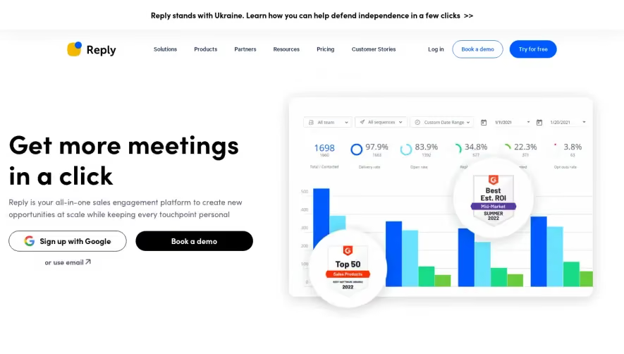


Upgrade to SaaSFrame Pro now to see similar examples.
Monthly
$18 /month
Billed $18 monthly
Browse all screens & flows
Filter and search screens & flows
Search text in screenshots
Access Figma files
Access mobile versions
Join now
Quarterly
$16 /month
Billed $48 quarterly
Browse all screens & flows
Filter and search screens & flows
Search text in screenshots
Access Figma files
Access mobile versions
Join now
Yearly
$15 /month
Billed $180 yearly
Browse all screens & flows
Filter and search screens & flows
Search text in screenshots
Access Figma files
Access mobile versions
Join now