Design with AI
Generate a new design based on this screen using your own content.
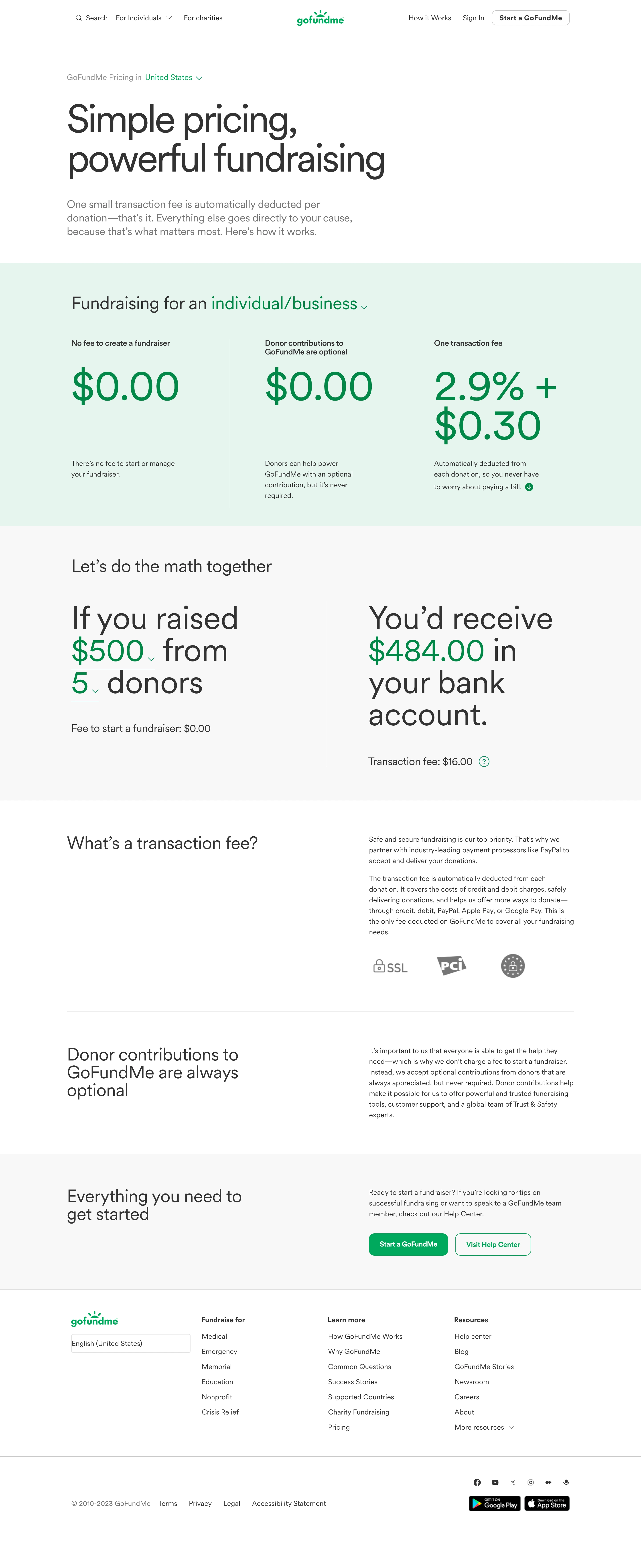
# Design from Reference: GoFundMe Pricing Page
Create an original, high-fidelity visual design inspired by the reference. Prioritize composition, typography, colors, spacing, and component styling over technical implementation.
## Reference
- **Product:** GoFundMe
- **Category:** Pricing Page
- **Screenshot:** https://cdn.prod.website-files.com/5e9dc792e1210c5325f7ebbc/6acad5275a5fdf4c30310f83_6acad49372f8a3a5b8650b9f_cms-ab1b0ff9f9b40799efb14609.webp
Analyze the screenshot first. If inaccessible, request it rather than guessing.
## Content
{{content.instructions}}
{{content.data}}
Preserve essential messaging and factual accuracy. Adapt structure and copy length for visual balance; never invent product claims.
## Visual Design
### Overall aesthetic
- **Character:** Friendly, transparent pricing explainer dominated by oversized regular-weight typography, green figures and open horizontal sections.
### Page composition
- **Canvas:** 2880 × 7038 screenshot pixels; CSS estimates assume approximately 2× capture scale.
- **Sequence:** Navigation; country selector and large hero; mint three-column fee summary; pale calculator; two explanatory split rows; CTA band; white footer.
- **Grid:** Approximately 1140px CSS content width, with two-column explanatory rows and thin vertical separators in pricing/calculator sections.
### Information hierarchy
- **Priority:** Large headline leads to three visually equal pricing figures. Calculator input/result columns translate the fee structure into an example.
- **Support:** Transaction-fee explanation, trust marks and optional-contribution copy precede primary and help-center actions.
### Typography
- **Family:** Rounded clean sans-serif, mostly regular weight; exact font is unverified.
- **Scale:** Estimated CSS hero 82–88px, pricing values 84–92px, calculator text 64–72px, section headings 38–40px and body 16–24px depending on prominence.
### Colors & surfaces
- **Sampled palette:** White #FFFFFF; pale gray #F8F8F8; mint #E2F6EE; charcoal #333333; green #008A41 and #00AB53; muted gray #767676.
- **Treatment:** Green emphasizes amounts, links and actions; broad mint/gray bands distinguish major sections without heavy cards.
### Components
- **Calculator:** Large sentence-style selectors with green underlines/chevrons on the left and equally large result on the right.
- **Actions:** Filled green and green-outlined buttons with approximately 10px radii and 48px heights.
- **Footer:** Brand/language block beside three link groups, then legal/social/app-download row.
### Visual rhythm
- **Spacing:** Approximately 64–96px CSS section padding; very large numerals contrast with compact explanatory paragraphs.
- **Alignment:** Consistent section boundaries and fine dividers keep the long page organized.
### Responsive
- **Guidance:** Mobile is not shown. Stack fee columns and calculator result, reduce oversized type and retain clear editable-value affordances.
### Adaptation guidance
- **Transfer:** Preserve transparent fee breakdown and sentence-style calculator. Use verified target rates and examples rather than copying historical amounts.
Use this context to reproduce the reference's visual language: layout, typography, colors, spacing, borders, radii, and distinctive elements. The screenshot takes priority if descriptions conflict.
## Direction
{{preferences.fidelityInstructions}}
## Output
{{output.instructions}}
Deliver a polished, cohesive design with precise alignment, hierarchy, and spacing. Produce the requested visual artifact, not just a description. If unsupported, explain the limitation.