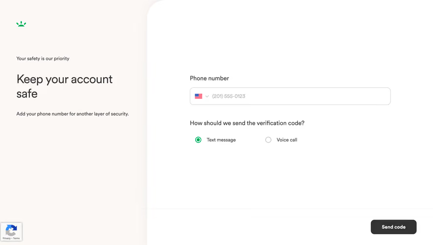
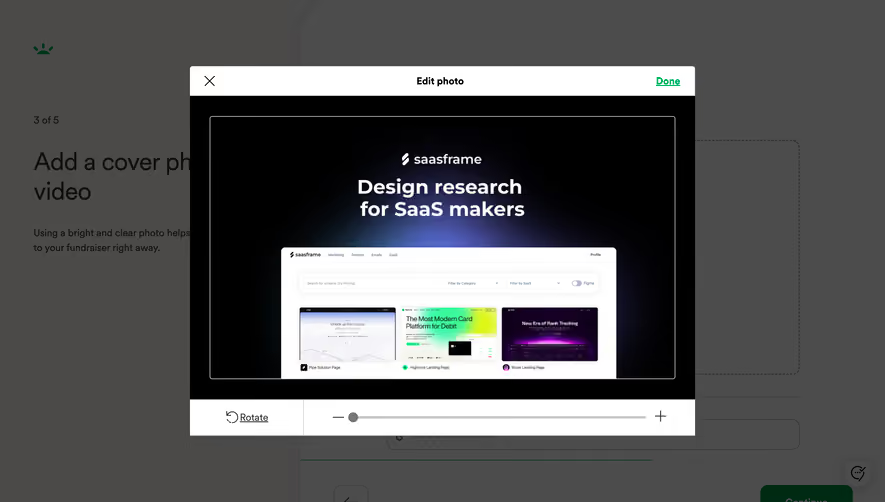
Generate a new design based on this screen using your own content.
Thank you! Your submission has been received!
Oops! Something went wrong while submitting the form.
# Design from Reference: GoFundMe Foundraiser Goal Setup
Create an original, high-fidelity visual design inspired by the reference. Prioritize composition, typography, colors, spacing, and component styling over technical implementation.
## Reference
- **Product:** GoFundMe
- **Category:** Account Setup
- **Screenshot:** https://cdn.prod.website-files.com/5e9dc792e1210c5325f7ebbc/6acad51f5a5fdf4c30310e35_6acad444c910b3adf9e4a11d_cms-abaf1fcc7fa254bd240fa925.webp
Analyze the screenshot first. If inaccessible, request it rather than guessing.
## Content
{{content.instructions}}
{{content.data}}
Preserve essential messaging and factual accuracy. Adapt structure and copy length for visual balance; never invent product claims.
## Visual Design
Use this context to reproduce the reference's visual language: layout, typography, colors, spacing, borders, radii, and distinctive elements. The screenshot takes priority if descriptions conflict.
## Direction
{{preferences.fidelityInstructions}}
## Output
{{output.instructions}}
Deliver a polished, cohesive design with precise alignment, hierarchy, and spacing. Produce the requested visual artifact, not just a description. If unsupported, explain the limitation.
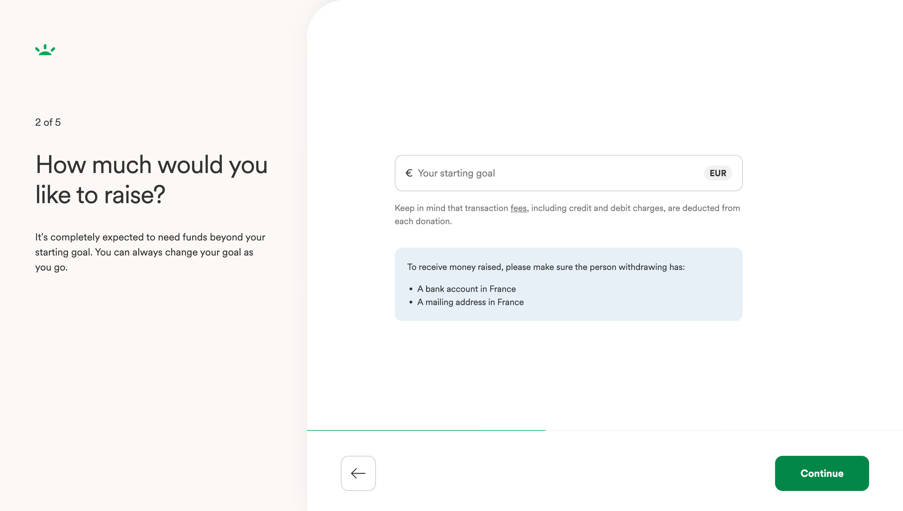
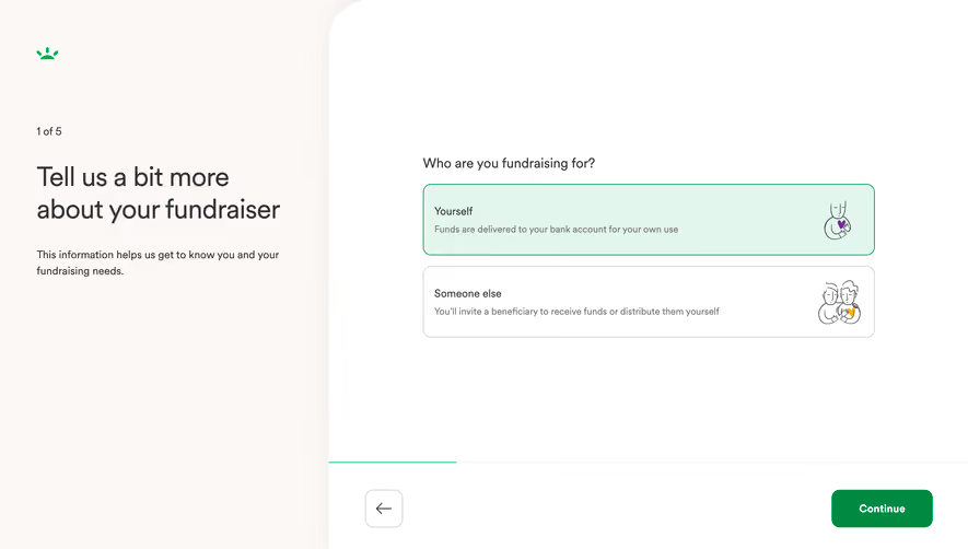
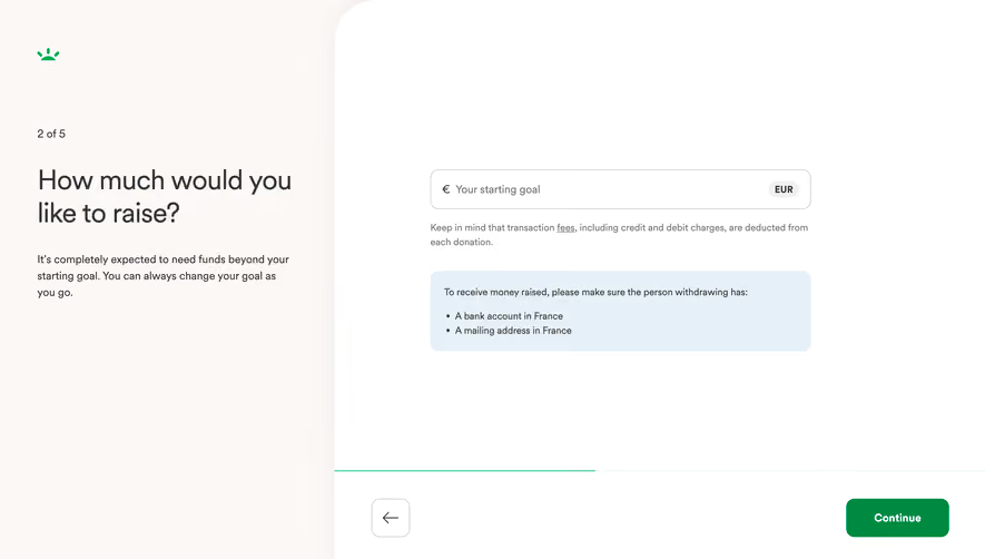
This is GoFundMe's fundraiser creation flow, step 2 of 5. The split layout immediately draws you in. Left side handles context and reassurance. Right side is pure action. No clutter, no distractions.
Layout That Breathes
The warm off-white left panel against the white right panel creates a subtle but effective visual split. That single input field with the euro symbol and "EUR" badge is doing all the heavy lifting. It's confident. One field, one job. The light blue info box below it feels helpful without being pushy, listing withdrawal requirements in France. Smart progressive disclosure.
Typography and Color Restraint
The heading is large, bold, and human. "How much would you like to raise?" feels conversational. Body text underneath immediately addresses anxiety about picking the wrong number. The green GoFundMe logo and that solid green "Continue" button are the only real color accents on the entire page. Everything else stays neutral.
What Makes It Work
The progress bar at the bottom is barely there but still communicates momentum. The back arrow keeps things low-pressure. This whole screen says "take your time" while still pushing forward.