Overall Style and Aesthetic
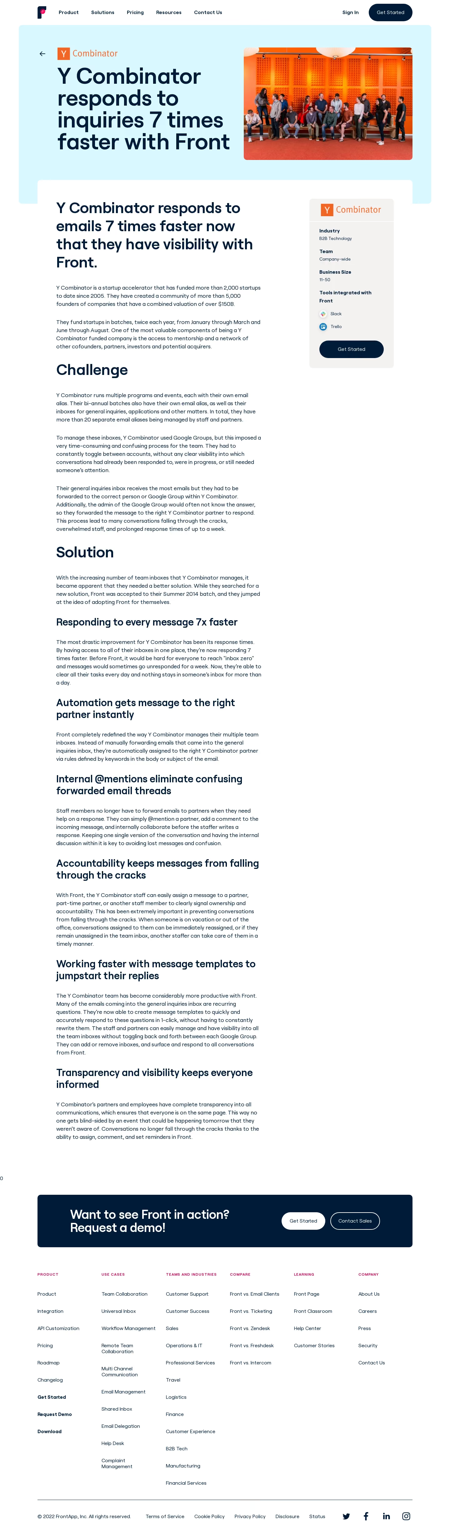
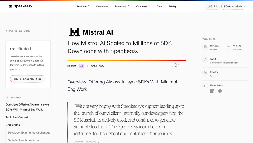
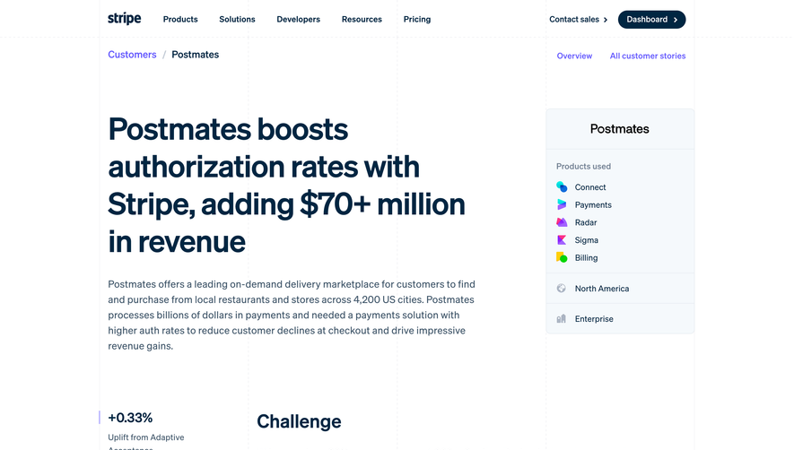
The Front customer story page for Y Combinator radiates a clean, modern professionalism. It embraces a minimalist aesthetic, balancing generous white space with crisp lines and well-structured layouts. The design communicates trustworthiness and innovation, while touches of brand color inject energy without overwhelming the user. Layout and Structure
The page opens with a prominent hero section, featuring a large, high-quality image that anchors the page and provides immediate context. Concise introductory text and a prominent CTA button sit comfortably above the fold. The story unfolds below in digestible sections—quotations, outcomes, and case details—organized in a clear, scannable flow. Inline pull-quotes, icon-assisted highlights, and short paragraphs create a seamless reading experience. Visual Elements
Photography of real people brings authenticity, while subtle iconography punctuates key points throughout the narrative. There are no distracting animations; instead, the design relies on strong visuals—like branded avatar images and device mockups—to illustrate the product’s impact. Crisp borders, light shadows, and occasional gradients create depth and separation without clutter. Color Palette and Typography
The color palette leans into light neutrals, punctuated by Front’s signature blue and accent colors for CTAs and highlights. Typography is thoughtfully selected—bold, sans-serif headers establish hierarchy, while plentiful body text breathes and reads effortlessly. Ample font sizing and spacing create a visually accessible experience. User Experience Patterns
Intuitive navigation keeps users grounded, with well-placed back links and consistent menus. Sticky CTAs, such as “See more customer stories,” guide users to the next step without distraction. Scrolling reveals new content sections smoothly with no abrupt transitions, keeping engagement high. Unique or Notable Design Choices
What stands out is the fusion of storytelling and product-centric detail. The layout feels editorial, almost like a magazine feature, elevating the case study from a basic testimonial to a compelling narrative. The restraint in animations and the focus on genuine visuals help build a credible, humanized brand perception.