Overall Style and Aesthetic
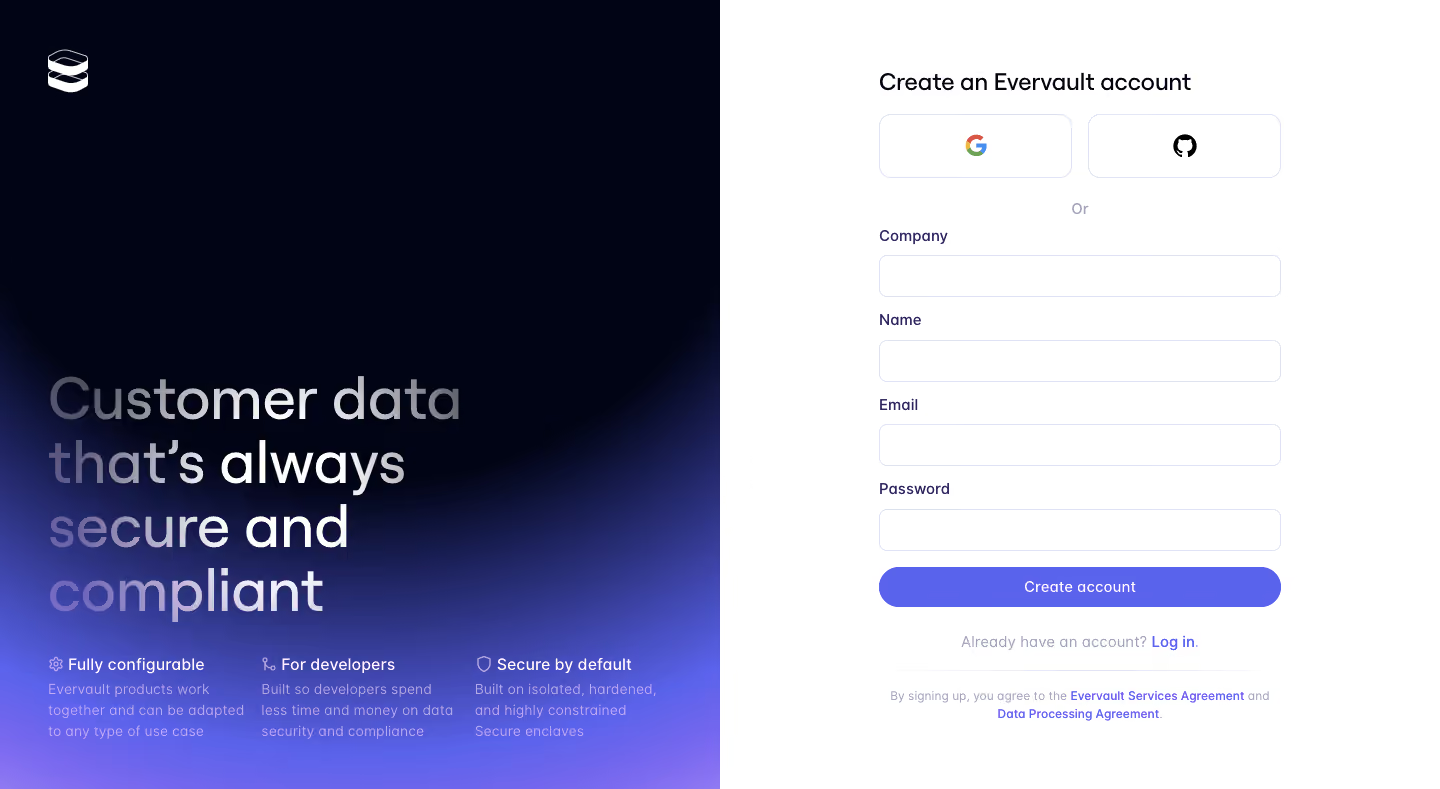
Evervault’s registration page embraces a refined, minimalist aesthetic that feels distinctly modern and tech-forward. The design radiates professionalism with its uncluttered interface, generous white space, and sparse, meticulously aligned elements. The subtle use of gradients and soft shadows add depth without visual noise, conveying an understated confidence that’s both welcoming and sophisticated. Layout and Structure
The page is purpose-built around its primary conversion goal: registration. With a single-column layout, attention is directed straight to the sign-up form, which occupies the visual center. Ancillary navigation, branding, and supporting information are minimized or completely absent, streamlining the experience for new users and eliminating decision fatigue. Visual Elements
Embedded alongside the form is a gently-animated illustration—sleek, abstract, and tech-inspired—serving as both a visual anchor and a subtle brand signature. No cluttered images or busy graphics; every visual is purposeful, adding polish and trustworthiness without distraction. Color Palette and Typography
A restricted palette of deep navy, crisp white, and flashes of electric blue amplifies focus and legibility. Clean, sans-serif typography—likely Inter or a similar geometric font—leverages strong hierarchy: bold headings stand out, succinct hint text reassures, and form labels are clear and scannable. User Experience Patterns
The user journey is frictionless: minimal fields, clear input focus states, and a prominent, full-width CTA button guide users efficiently. Responsive micro-interactions—like form validation and subtle hover effects—boost usability and confidence. Unique or Notable Design Choices
Evervault’s bold restraint is especially notable. By paring back distractions and emphasizing the essentials with visual finesse, the design projects a sense of security and innovation—a pitch-perfect balance for users in the privacy and security SaaS space.