


```html

Thank you! Your submission has been received!
Oops! Something went wrong while submitting the form.
Get SaaSFrame Pro
Monthly
$18
Quarterly
$48
Yearly
$180
Upgrade to access this feature
Browse all screens & flows
Filter and search screens & flows
Access Figma files
Access mobile versions
Bookmark screens & flows
Join now
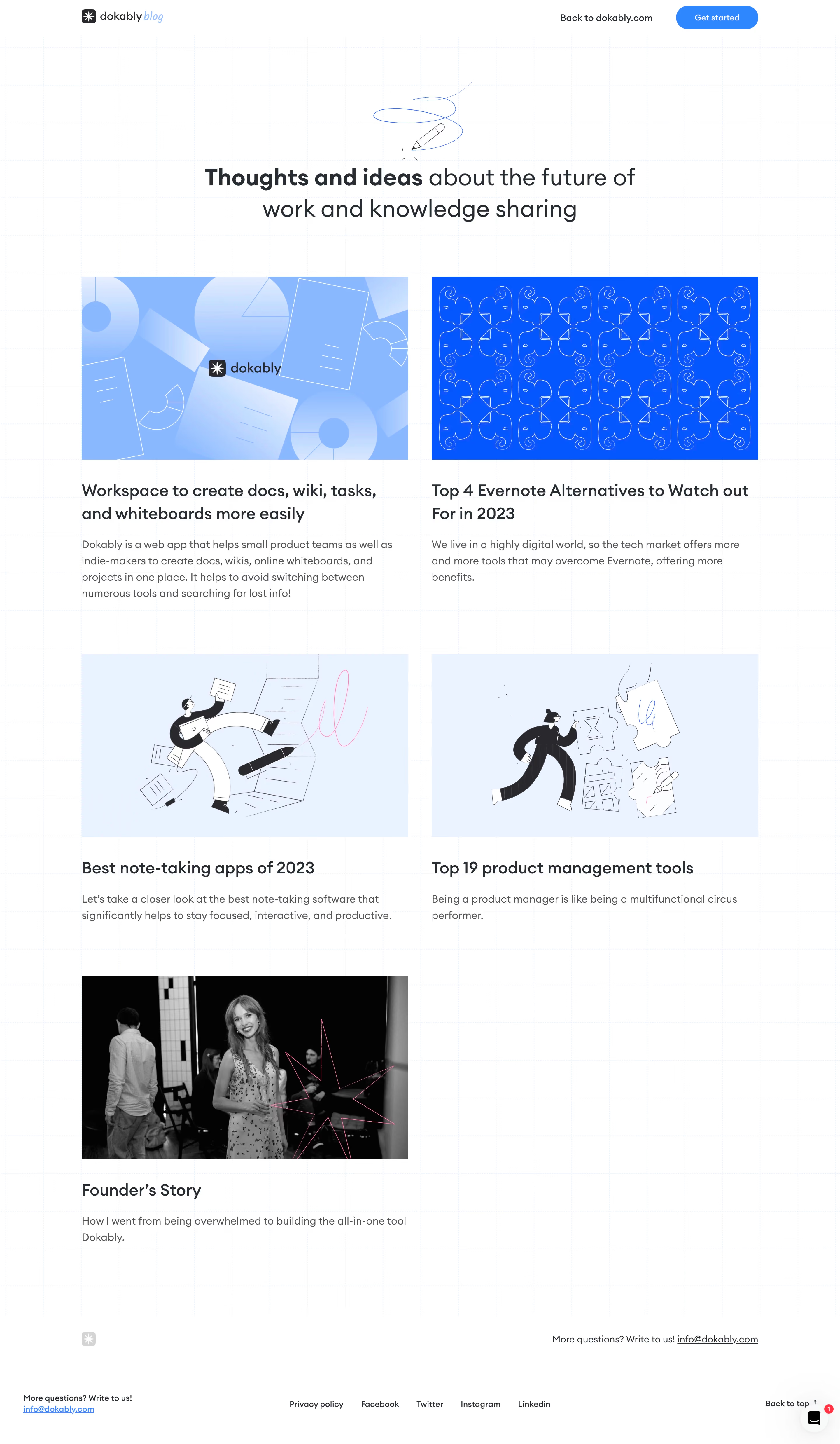
Dokably Blog Feed

Dokably
All-in-one product management
Designed by
No items found.

Bookmark
Bookmark
Design with AI
Thank you! Your submission has been received!
Oops! Something went wrong while submitting the form.
# Design from Reference: Dokably Blog Feed
Create an original, high-fidelity visual design inspired by the reference. Prioritize composition, typography, colors, spacing, and component styling over technical implementation.
## Reference
- **Product:** Dokably
- **Category:** Blog Feed
- **Screenshot:** https://cdn.prod.website-files.com/5e9dc792e1210c5325f7ebbc/6acb6e902837b9f3168fb23a_6acb6aa28162924cd98578bd_cms-c511f1bd3cee1d8dfef52b02.webp
Analyze the screenshot first. If inaccessible, request it rather than guessing.
## Content
{{content.instructions}}
{{content.data}}
Preserve essential messaging and factual accuracy. Adapt structure and copy length for visual balance; never invent product claims.
## Visual Design
### Overall aesthetic
- **Style:** Airy editorial blog index on white, with a faint blue dotted grid and bright blue product illustrations.
- **Character:** Rounded dark typography, a hand-drawn pencil flourish and varied article artwork produce an informal productivity-tool identity.
### Page composition
- **Canvas:** Source 2880 × 4948 pixels, inspected throughout in two crops at 1400px width. Measurements use inspection pixels; an approximately 2× source capture is plausible but unverified.
- **Header:** Compact logo/blog wordmark at x136, with a return link and blue pill CTA on the right.
- **Hero:** Centered pencil-line illustration above a two-line headline around y279. The text occupies roughly 730px.
- **Article grid:** A roughly 1128px wrapper begins near y460. Two approximately 545px columns have about 39px gap; two complete rows are followed by a final left-column founder article.
- **Footer:** The dotted grid ends above a white contact strip. A lower utility row contains contact, policy/social links, back-to-top control and a floating chat launcher.
### Information hierarchy
- **Hero emphasis:** The opening words of the headline are bold, while the remainder stays regular weight at the same large size.
- **Article pattern:** Large landscape thumbnail, two-line-or-shorter title and a brief excerpt repeat without enclosing card borders.
- **Content variety:** First-row brand graphics give way to hand-drawn productivity illustrations, then a black-and-white founder photograph with a pink line accent.
- **Closing routes:** A contact prompt appears above the final utility links; the page has no visible category filter or pagination control.
### Typography
- **Hero:** Approximately 40px rounded sans serif, around 51px line height, with mixed bold and regular weights. Family identity is unverified.
- **Article titles:** Approximately 28px medium-to-semibold with 37px line height.
- **Excerpts:** Around 18px regular, 27px line height, in gray; paragraphs range from two to four lines.
- **Header/footer:** Around 14–16px medium. The blog suffix uses a lighter blue handwritten treatment distinct from the body type.
### Colors & surfaces
- **Measured base:** #FFFFFF canvas; #282D33 dark headline/body heading pixels and #545356 secondary text.
- **Measured blues:** #0555FF supplies a saturated illustration field, #89B8FF a lighter blue graphic tone, and #EBF2FF / #EAF1FF pale illustration surfaces.
- **Measured dark artwork:** #030303 occurs in black elements and photography.
- **Decoration:** Very pale blue dotted grid lines form regular squares across the main region. Pink line accents appear selectively in artwork.
- **Surface treatment:** Articles sit directly on the background; no pronounced shadows, rounded card shells or colored text boxes are visible.
### Components
- **Header CTA:** Approximately 137 × 40px, fully rounded, bright blue fill and centered white label.
- **Hero artwork:** Small line-drawn pencil with looping blue stroke, centered independently of the headline.
- **Article thumbnails:** Approximately 545 × 306px, near 16:9, with square corners and no visible frame.
- **Article text:** Titles begin roughly 34px below images; excerpts sit about 20px below titles.
- **Footer controls:** Underlined email links, plain social/policy text and a Back to top label with upward arrow. Floating chat control includes a small red notification badge.
- **States:** Only the static index is shown; link hover, article pages and chat behavior are unverified.
### Visual rhythm
- **Hero breathing room:** Large empty bands separate header, pencil illustration, headline and first article row.
- **Grid cadence:** Equal image dimensions and aligned text starts establish a repeated two-column rhythm despite different excerpt lengths.
- **Row spacing:** Approximately 85–95px separates the first-row text from second-row imagery; a similar broad gap precedes the last article.
- **Final row:** The empty right column preserves the two-column grid rather than centering the fifth article.
- **Footer separation:** A substantial white gap separates the final excerpt from contact and utility rows.
### Responsive
- **Observed scope:** Desktop only; narrower layouts are unverified.
- **Recommended grid:** Collapse to one column with 20–24px gutters and fluid 16:9 images.
- **Recommended hero:** Reduce headline toward 28–32px and keep the mixed-weight phrase readable across natural line breaks.
- **Recommended footer:** Wrap policy/social links and stack contact information; ensure chat does not cover the back-to-top control.
- **Decoration:** Reduce grid prominence if it interferes with text at smaller sizes.
### Adaptation guidance
- **Preserve:** Large editorial thumbnails, borderless article groups, faint grid and blue illustration system.
- **Content:** Populate supplied article images, titles and excerpts without adding unsupported dates, categories or metrics.
- **Implementation:** Use a semantic article grid with consistent thumbnail ratio and adaptable text height.
- **Accessibility:** Provide meaningful image alternatives and visible keyboard focus; keep decorative pencil/grid artwork out of the reading order.
Use this context to reproduce the reference's visual language: layout, typography, colors, spacing, borders, radii, and distinctive elements. The screenshot takes priority if descriptions conflict.
## Direction
{{preferences.fidelityInstructions}}
## Output
{{output.instructions}}
Deliver a polished, cohesive design with precise alignment, hierarchy, and spacing. Produce the requested visual artifact, not just a description. If unsupported, explain the limitation.
Category
Patterns
No items found.
Tech Stack
Added on
May 6, 2023
Similar screens





Upgrade to SaaSFrame Pro now to see similar examples.
Monthly
$18 /month
Billed $18 monthly
Browse all screens & flows
Filter and search screens & flows
Search text in screenshots
Access Figma files
Access mobile versions
Join now
Quarterly
$16 /month
Billed $48 quarterly
Browse all screens & flows
Filter and search screens & flows
Search text in screenshots
Access Figma files
Access mobile versions
Join now
Yearly
$15 /month
Billed $180 yearly
Browse all screens & flows
Filter and search screens & flows
Search text in screenshots
Access Figma files
Access mobile versions
Join now