
Thank you! Your submission has been received!
Oops! Something went wrong while submitting the form.
Get SaaSFrame Pro
Monthly
$18
Quarterly
$48
Yearly
$180
Upgrade to access this feature
Browse all screens & flows
Filter and search screens & flows
Access Figma files
Access mobile versions
Bookmark screens & flows
Join now
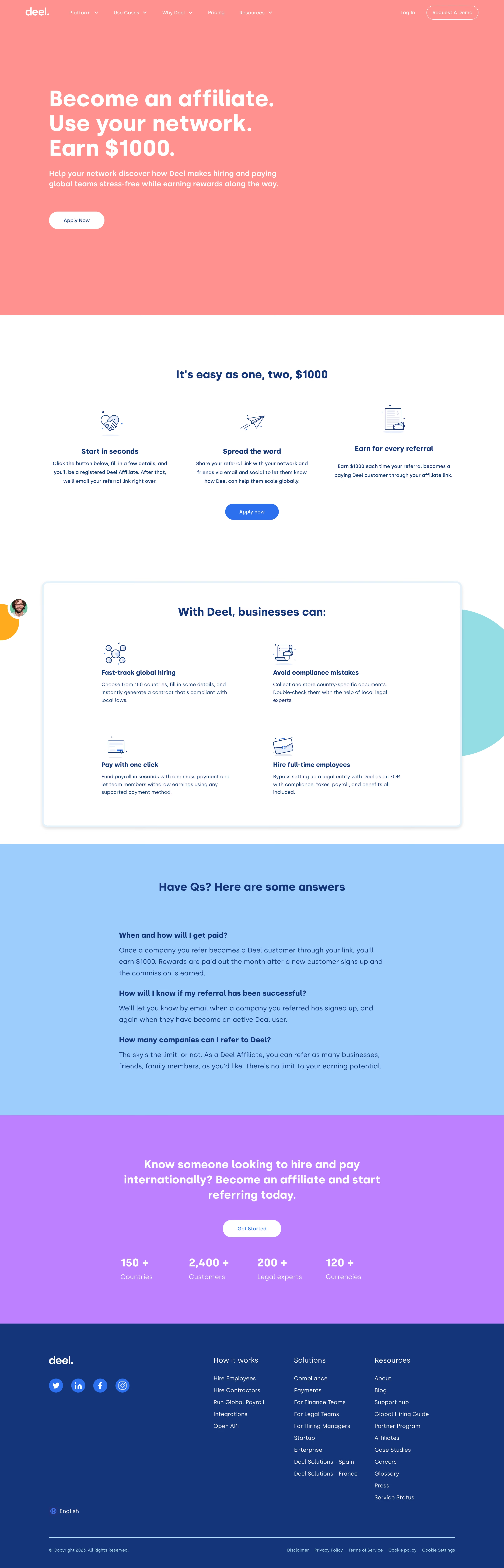

Deel Affiliate Page

Deel
Payroll for remote teams
Designed by
No items found.

Bookmark
Bookmark

Design with AI
Thank you! Your submission has been received!
Oops! Something went wrong while submitting the form.
# Design from Reference: Deel Affiliate Page
Create an original, high-fidelity visual design inspired by the reference. Prioritize composition, typography, colors, spacing, and component styling over technical implementation.
## Reference
- **Product:** Deel
- **Category:** Affiliate Page
- **Screenshot:** https://cdn.prod.website-files.com/5e9dc792e1210c5325f7ebbc/6acadc5b5c79bb17f221b17b_6acadbbd6eb1019ee8871ed8_cms-a3ea4a38c76939101011bb12.webp
Analyze the screenshot first. If inaccessible, request it rather than guessing.
## Content
{{content.instructions}}
{{content.data}}
Preserve essential messaging and factual accuracy. Adapt structure and copy length for visual balance; never invent product claims.
## Visual Design
### Overall aesthetic
- **Style:** Bold color-block affiliate landing page with oversized white hero copy, dark-blue supporting typography and simple outline illustrations.
- **Character:** Flat coral, sky-blue and violet sections create an upbeat promotional identity, contrasted with a deep-blue footer.
- **Capture:** The image measures 2880 × 8954 pixels. CSS estimates assume a 2× capture, equivalent to approximately 1440 × 4477 CSS pixels; actual scale and font identity are unverified.
### Page composition
- **Header:** A white wordmark and compact navigation sit across the coral hero, with login and an outlined demo pill at right.
- **Hero:** A large three-line affiliate/reward headline, two-line explanation and white application pill are left aligned around a 140-CSS-pixel inset. The right half is largely empty.
- **Referral process:** A white section centers a short heading above three equally spaced icon-led steps and a blue application button.
- **Product benefits:** A large white bordered panel presents four benefits in a two-column grid, with small blue outline illustrations and surrounding decorative shapes.
- **FAQ:** A full-width sky-blue region contains a centered heading and three openly displayed question-and-answer blocks in a narrower text column.
- **Closing conversion:** A violet section combines a centered multi-line invitation, white action pill and four scale metrics in a horizontal row.
- **Footer:** A deep-blue region places brand/social controls at left and three link columns at right, followed by language selection, divider and legal baseline.
### Information hierarchy
- **Reward proposition:** The hero's oversized three-line message is the strongest element; supporting copy and application action sit directly beneath it.
- **Process clarity:** Three steps explain joining, sharing and earning, each with a bold short heading and compact paragraph.
- **Product context:** The four-benefit panel explains what referred businesses can do, supporting the affiliate proposition.
- **FAQ emphasis:** Questions are bold and answers regular; all three answers are visible without accordion controls.
- **Repeated conversion:** Application actions recur in the hero, process section and closing invitation.
- **Scale proof:** Four large counts sit below the closing action with smaller labels.
- **Footer priority:** Link-group headings are larger than links; social buttons and language selection occupy a separate left zone.
### Typography
- **Family:** A geometric sans-serif with rounded forms is visible; exact font identity is unverified.
- **Hero heading:** Approximately 64-pixel CSS size, bold, with around 70-pixel line height and a broad left-column measure.
- **Hero support:** Approximately 22 pixels, medium weight, with 30-pixel line height.
- **Section headings:** Approximately 32 pixels and bold; the closing invitation uses the same scale across several centered lines.
- **Step and benefit headings:** Approximately 20 pixels and bold; supporting text around 14–15 pixels with 24-pixel line height.
- **FAQ:** Questions around 20 pixels and bold; answers approximately 20 pixels with 32-pixel line height.
- **Metrics:** Counts approximately 32 pixels and bold, labels around 20 pixels.
- **Header and footer:** Navigation around 14 pixels; footer links around 16 pixels, with smaller legal text near 12 pixels.
### Colors & surfaces
- **Measured coral:** #FF8A8A fills the opening hero.
- **Measured sky blue:** #8BCFFF fills the FAQ region.
- **Measured violet:** #C87DFF fills the closing conversion region.
- **Measured deep blue:** #04367F supports the footer and much of the dark-blue text.
- **Measured action blue:** #0072F9 appears in filled application and social controls.
- **Measured supporting accents:** White #FFFFFF supports content and buttons; #7FDFE6 and #E1F3F9 appear in decorative and border regions.
- **Depth:** Most sections are flat; the benefits panel uses a pale-blue border and a subtle shadow.
### Components
- **Navigation menus:** Several text links have small down chevrons; expanded menus are not shown.
- **Hero application:** A white pill approximately 160 × 50 CSS pixels uses a dark-blue label.
- **Referral steps:** Three centered groups pair blue outline icons with bold titles and short copy. No enclosing cards separate them.
- **Process action:** A bright-blue pill approximately 154 × 46 pixels sits beneath the three columns.
- **Benefits panel:** Approximately 1200 pixels wide, with small rounded corners, a thick pale-blue edge and generous inner spacing.
- **Benefit illustrations:** Small line icons represent global hiring, compliance documents, payment and employment, using a consistent blue drawing style.
- **FAQ blocks:** Three vertically spaced text groups share a roughly 760-pixel measure; there are no visible toggles or separators between them.
- **Closing metrics:** Four evenly distributed count-label pairs summarize geographic, customer, legal and currency scale.
- **Footer socials:** Four circular blue buttons contain white social marks. Link columns remain unboxed.
- **Decorative details:** Large partial circles and a small portrait-like marker sit near the benefits panel edge, adding local visual play.
### Visual rhythm
- **Hero whitespace:** The left-aligned content sits within a large coral field, leaving substantial space above, below and to the right.
- **Section contrast:** Hard horizontal boundaries separate coral, white, blue, violet and deep-blue regions.
- **Grid repetition:** Three process columns, four benefit blocks and four metric groups create distinct reusable rhythms.
- **Vertical pacing:** Generous 100–150-pixel CSS breaks separate major white-section modules; FAQ spacing is tighter for reading.
- **Footer density:** The multi-column link region is denser than the marketing sections but retains wide gutters and clear line spacing.
### Responsive
- **Recommendation — hero:** Reduce headline size fluidly and preserve intentional line breaks without excessive empty space.
- **Recommendation — grids:** Stack process steps, reduce the two-column benefits panel and wrap closing metrics as space narrows.
- **Recommendation — FAQ:** Keep a readable single-column measure and allow questions/answers to wrap naturally.
- **Recommendation — header:** Collapse navigation into a menu while retaining the application/demo route.
- **Recommendation — footer:** Stack link groups and wrap social/legal controls. No mobile layout is evidenced.
### Adaptation guidance
- **Preserve the affiliate narrative:** Lead with reward, explain the referral process, establish product value, answer questions and repeat the application route.
- **Reuse color roles:** Keep strong flat backgrounds and white/deep-blue text relationships consistent across sections.
- **Maintain icon discipline:** Use small coherent outline illustrations instead of mixing unrelated visual styles.
- **Keep FAQ answers visible:** The captured design uses open text blocks; an accordion would be a separate interaction decision.
- **Balance metrics and action:** Place scale proof beneath the closing invitation without competing with the main action.
- **Define unseen outcomes:** Application forms, dropdown menus and referral tracking states are not visible and should be designed separately.
Use this context to reproduce the reference's visual language: layout, typography, colors, spacing, borders, radii, and distinctive elements. The screenshot takes priority if descriptions conflict.
## Direction
{{preferences.fidelityInstructions}}
## Output
{{output.instructions}}
Deliver a polished, cohesive design with precise alignment, hierarchy, and spacing. Produce the requested visual artifact, not just a description. If unsupported, explain the limitation.


Category
Patterns
No items found.
Tech Stack

Added on
August 8, 2023
Similar screens




Upgrade to SaaSFrame Pro now to see similar examples.
Monthly
$18 /month
Billed $18 monthly
Browse all screens & flows
Filter and search screens & flows
Search text in screenshots
Access Figma files
Access mobile versions
Join now
Quarterly
$16 /month
Billed $48 quarterly
Browse all screens & flows
Filter and search screens & flows
Search text in screenshots
Access Figma files
Access mobile versions
Join now
Yearly
$15 /month
Billed $180 yearly
Browse all screens & flows
Filter and search screens & flows
Search text in screenshots
Access Figma files
Access mobile versions
Join now