Overall Style and Aesthetic
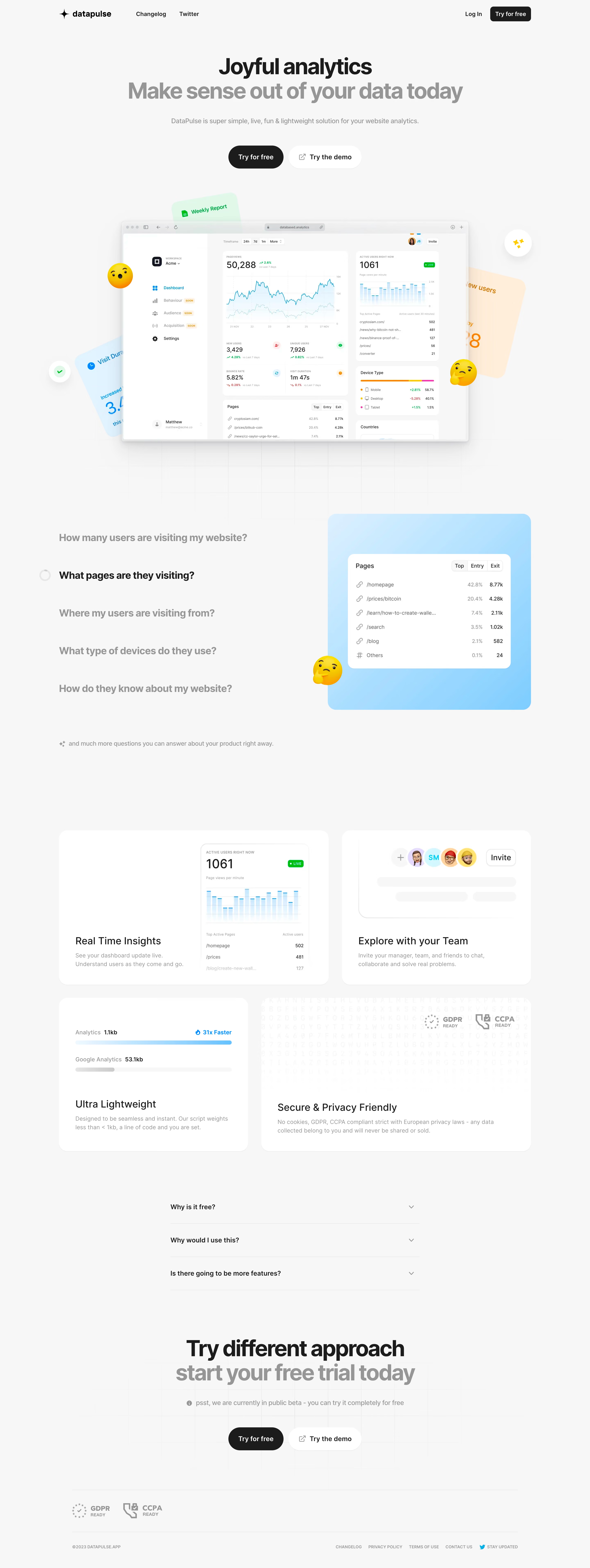
Datapulse.app exudes a sleek, ultra-modern aesthetic, rooted in minimalism yet energized by carefully chosen pops of color. The interface feels professional and forward-thinking, striking a harmonious balance between clean whitespace and vibrant accent elements. The use of subtly animated UI details injects a quiet dynamism without overwhelming the user. Layout and Structure
The site opens with a bold hero section—crisp headline, succinct supporting text, and a prominent CTA—all framed by a distinctive dashboard illustration. Sections flow vertically: feature highlights with icons, customer quotes, an FAQ, and a streamlined pricing grid. The sticky navigation aids orientation, while the footer distills essential links and contact information in a no-fuss format. Visual Elements
Custom vector illustrations and expressive icons communicate product capabilities, reinforcing brand identity while sidestepping stock imagery. Light-motion hover states and micro-animations add a tactile sense of interactivity. The use of subtle gradients provides depth and modernity, while maintaining a composed visual experience. Color Palette and Typography
A crisp palette centers on deep purple-blues and bright turquoise accents, layered over a soft, light-gray backdrop. Headlines employ a geometric sans-serif font, introducing a sense of clarity and confidence, while supporting text uses a slightly softened sans-serif for maximum legibility. Typographic hierarchy is clear, with bold headers and ample spacing creating an airy, readable layout. User Experience Patterns
Navigation is frictionless, with anchored scroll and instantly visible calls-to-action guiding users from awareness to conversion. Minimal form fields, clear pricing tiers, and context-sensitive tooltips enhance usability. The progressive reveal of content as users scroll invites exploration without overwhelming them. Unique or Notable Design Choices
A standout dashboard mockup in the hero doubles as both a visual anchor and a product preview, giving visitors immediate context. The restrained use of animation balances delight and performance, conveying innovation while ensuring quick load times and broad device compatibility. Tone and Feel
Datapulse’s website conveys trustworthiness and competence wrapped in a vibrant, innovative energy—perfect for a SaaS aiming to feel cutting-edge without sacrificing dependability. The precise, inviting aesthetic makes it a valuable source of inspiration for designers seeking fresh, user-centric SaaS design patterns.