Design with AI
Generate a new design based on this screen using your own content.
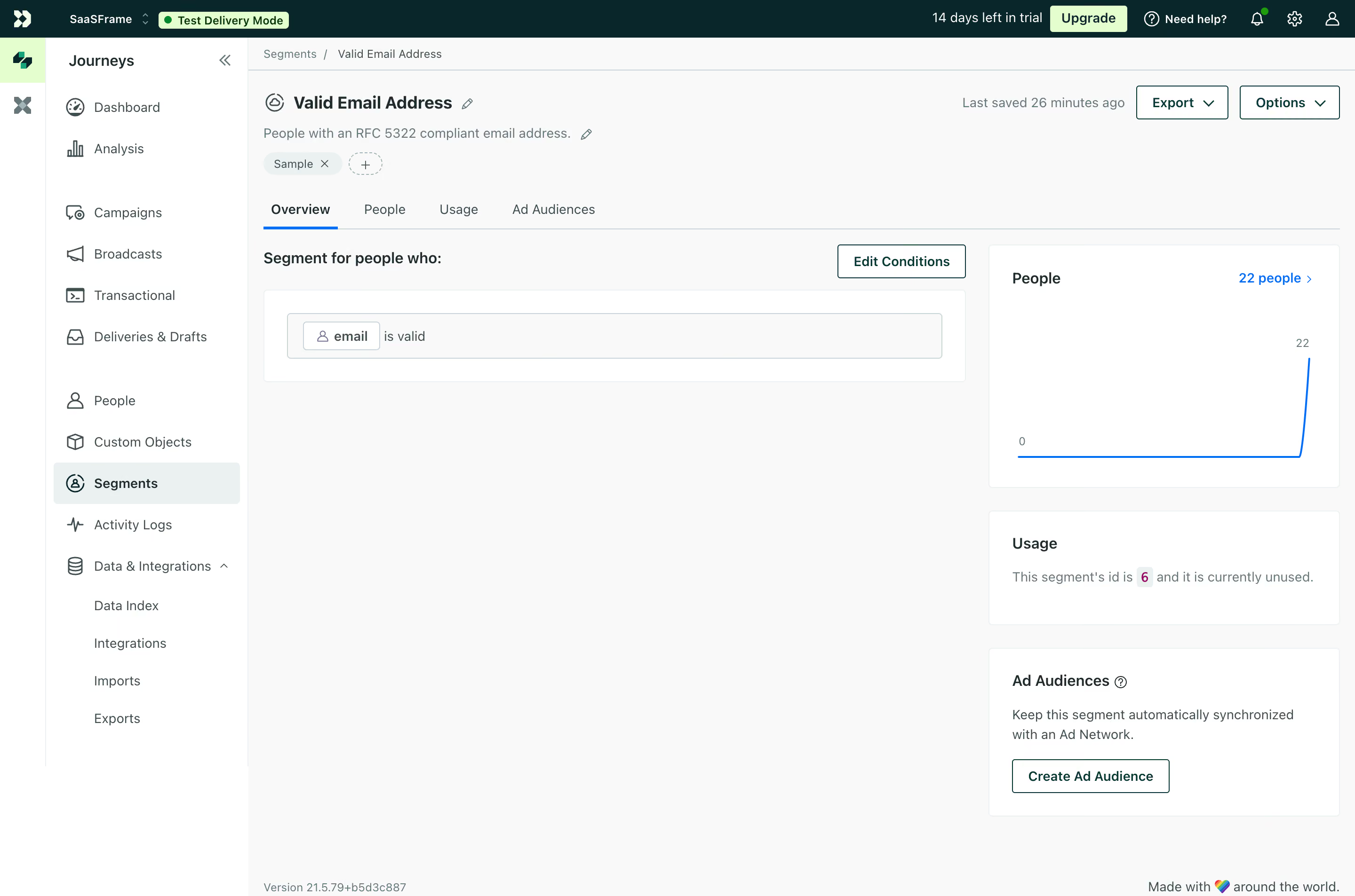
# Design from Reference: Customer.io Segment Overview
Create an original, high-fidelity visual design inspired by the reference. Prioritize composition, typography, colors, spacing, and component styling over technical implementation.
## Reference
- **Product:** Customer.io
- **Category:** Details
- **Screenshot:** https://cdn.prod.website-files.com/5e9dc792e1210c5325f7ebbc/6acad4ba1025e911ae518343_6acad37e3ce5f4104ebdcf02_cms-b6dbb2f5bfb1d5a697c2e663.webp
Analyze the screenshot first. If inaccessible, request it rather than guessing.
## Content
{{content.instructions}}
{{content.data}}
Preserve essential messaging and factual accuracy. Adapt structure and copy length for visual balance; never invent product claims.
## Visual Design
### Overall aesthetic
- **Style:** A practical segment-management dashboard uses a dark teal top bar, pale-gray canvas and lightly outlined white panels.
- **Character:** Dense navigation and compact controls frame a sparse segment overview with a simple blue chart.
### Page composition
- **Capture:** The source measures 2880 × 1906 pixels. Estimated CSS dimensions below assume an unverified 2× capture.
- **Shell:** A dark top bar spans the screen above a narrow icon rail and roughly 215-pixel text navigation column.
- **Page header:** Breadcrumb, segment title, description, tag and edit affordances sit above a four-tab row. Export/Options align right.
- **Main grid:** A broad left column contains the segment-condition panel; a roughly 370-pixel right column stacks People, Usage and Ad Audiences cards.
- **Footer:** Small version text sits lower left of the content area, with a brief brand line lower right.
### Information hierarchy
- **Segment identity:** Bold title leads a muted explanatory sentence.
- **Selected tab:** Overview is heavier and underlined blue.
- **Condition:** A short heading and Edit Conditions action precede a single outlined rule row.
- **Metrics:** People count and chart lead the right column; usage status and audience creation are secondary.
- **Global state:** Trial information, mint Upgrade and a test-delivery badge remain in the top bar.
### Typography
- **Family:** Neutral sans serif throughout; exact identity is unverified.
- **Title:** Approximately 20 pixels, bold.
- **Section labels:** Around 16 pixels, semibold.
- **Body and navigation:** Approximately 14 pixels with 20-pixel leading.
- **Utilities:** Breadcrumb, chart labels and footer text around 12 pixels.
### Colors & surfaces
- **Measured canvas:** Near-white #F8F9F9 contrasts with white #FFFFFF panels.
- **Top bar:** Deep teal #00282C supplies strong shell contrast.
- **Secondary surface:** Pale #EAF0F1 marks tags and selected navigation.
- **Accent:** Mint #DDFFC8 highlights upgrade/test controls; blue marks active tabs, links and chart.
- **Ink:** Sampled #3B4F50 contributes muted teal-gray text. Exact chart-blue hex is unverified.
### Components
- **Top bar:** Compact workspace identity, test badge, trial copy and small utility icons share one row.
- **Navigation:** Icon-led rows have generous group breaks; Segments uses a pale rounded highlight.
- **Tabs:** Four text choices sit over a thin divider, with a narrow blue selected rule.
- **Condition panel:** White outlined rectangle contains an inset pale rule row and a small outlined property chip.
- **People card:** A roughly 370 × 260-pixel white card contains heading, linked count and a blue line that stays flat before rising sharply.
- **Support cards:** Usage is a short text card; Ad Audiences includes explanation and an outlined creation action.
- **Header actions:** Export and Options are outlined rectangles with down chevrons.
### Visual rhythm
- **Asymmetry:** The sparse broad condition area contrasts with denser stacked right-hand cards.
- **Panel spacing:** Roughly 24 pixels separate cards; consistent 24-pixel padding aligns internal headings.
- **Navigation rhythm:** Compact rows and large group breaks organize the long sidebar.
### Responsive
- **Evidence:** Only desktop is shown; menus, editing and responsive states are unverified.
- **Recommended grid:** Stack right-hand cards after the condition area and collapse secondary navigation on narrow screens.
- **Controls:** Allow header actions and tabs to wrap or scroll without obscuring labels.
- **Charts:** Preserve readable labels and an accessible text summary of the count.
### Adaptation guidance
- **Preserve:** Keep the teal shell, pale workspace, compact condition builder and restrained metric cards.
- **Implementation:** Separate shell, segment identity, tabs, conditions and support metrics.
- **Data:** Use actual segment rules/counts rather than copying captured account data.
- **Behavior:** Define editing, export and audience creation explicitly; no resulting action is shown.
Use this context to reproduce the reference's visual language: layout, typography, colors, spacing, borders, radii, and distinctive elements. The screenshot takes priority if descriptions conflict.
## Direction
{{preferences.fidelityInstructions}}
## Output
{{output.instructions}}
Deliver a polished, cohesive design with precise alignment, hierarchy, and spacing. Produce the requested visual artifact, not just a description. If unsupported, explain the limitation.