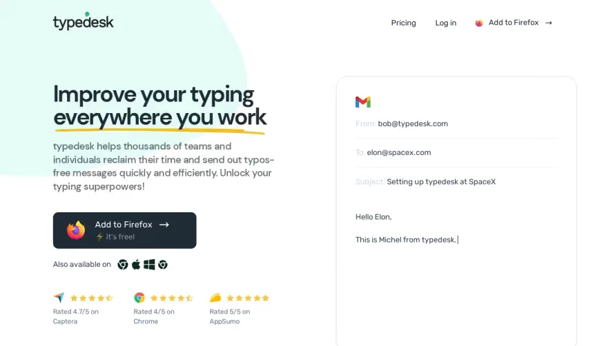
Generate a new design based on this screen using your own content.
Thank you! Your submission has been received!
Oops! Something went wrong while submitting the form.
# Design from Reference: Copy.ai Landing Page
Create an original, high-fidelity visual design inspired by the reference. Prioritize composition, typography, colors, spacing, and component styling over technical implementation.
## Reference
- **Product:** Copy.ai
- **Category:** Landing Page
- **Screenshot:** https://cdn.prod.website-files.com/5e9dc792e1210c5325f7ebbc/62f3cce027fd43e4b5d7ce29_1660143330622--1660142955420.webp
Analyze the screenshot first. If inaccessible, request it rather than guessing.
## Content
{{content.instructions}}
{{content.data}}
Preserve essential messaging and factual accuracy. Adapt structure and copy length for visual balance; never invent product claims.
## Visual Design
Use this context to reproduce the reference's visual language: layout, typography, colors, spacing, borders, radii, and distinctive elements. The screenshot takes priority if descriptions conflict.
## Direction
{{preferences.fidelityInstructions}}
## Output
{{output.instructions}}
Deliver a polished, cohesive design with precise alignment, hierarchy, and spacing. Produce the requested visual artifact, not just a description. If unsupported, explain the limitation.
Copy.ai embraces a modern and energetic aesthetic that channels both professionalism and approachability. The interface harmonizes generous white space with lively gradients and understated geometric backgrounds, resulting in a clean yet dynamic first impression. Contemporary, soft-edged UI elements convey trust and innovation without feeling sterile, making the site visually engaging for a tech-savvy audience.
Layout and Structure
The homepage is organized with clarity and purpose. A high-impact hero section immediately communicates the product’s value proposition, paired with a prominent CTA. Sequential sections guide users through key features, benefit-driven solutions, testimonials, sample outputs, and intuitive pricing tables. A sticky navigation bar keeps users oriented, while the footer condenses essentials like links, language options, and social media access.
Visual Elements
Playful illustrations, subtle motion graphics, and clear iconography punctuate content-rich blocks, helping to break up text and guide users visually. Occasional micro-animations and floating effects add dynamism without overwhelming visitors. The blend of minimal photography with product mockups contextualizes use cases and grounds the page in real-world scenarios.
Color Palette and Typography
The color palette spotlights fresh, energetic teals and blues balanced with soft neutrals, creating a sense of optimism and trust. Accent gradients and bold CTA buttons grab attention organically. Typography is modern sans-serif—bold headlines establish hierarchy, while easy-to-read body copy ensures comprehension at a glance.
User Experience Patterns
Navigation is streamlined with clear menu labels and sticky access. CTAs recur at strategic intervals with inviting copy, ensuring conversion opportunities remain top-of-mind. Forms are minimal, reducing friction, and interactive demos foster exploration. The overall tone signals reliability and forward-thinking energy, inviting visitors to engage and explore.