Generate a new design based on this screen using your own content.
Thank you! Your submission has been received!
Oops! Something went wrong while submitting the form.
# Design from Reference: Clutch Security Page
Create an original, high-fidelity visual design inspired by the reference. Prioritize composition, typography, colors, spacing, and component styling over technical implementation.
## Reference
- **Product:** Clutch
- **Category:** Security Page
- **Screenshot:** https://cdn.prod.website-files.com/5e9dc792e1210c5325f7ebbc/6acad416c910b3adf9e48e80_6acad2f95a5fdf4c30304dc4_cms-f179091f608e5da1a85cabd7.webp
Analyze the screenshot first. If inaccessible, request it rather than guessing.
## Content
{{content.instructions}}
{{content.data}}
Preserve essential messaging and factual accuracy. Adapt structure and copy length for visual balance; never invent product claims.
## Visual Design
Use this context to reproduce the reference's visual language: layout, typography, colors, spacing, borders, radii, and distinctive elements. The screenshot takes priority if descriptions conflict.
## Direction
{{preferences.fidelityInstructions}}
## Output
{{output.instructions}}
Deliver a polished, cohesive design with precise alignment, hierarchy, and spacing. Produce the requested visual artifact, not just a description. If unsupported, explain the limitation.
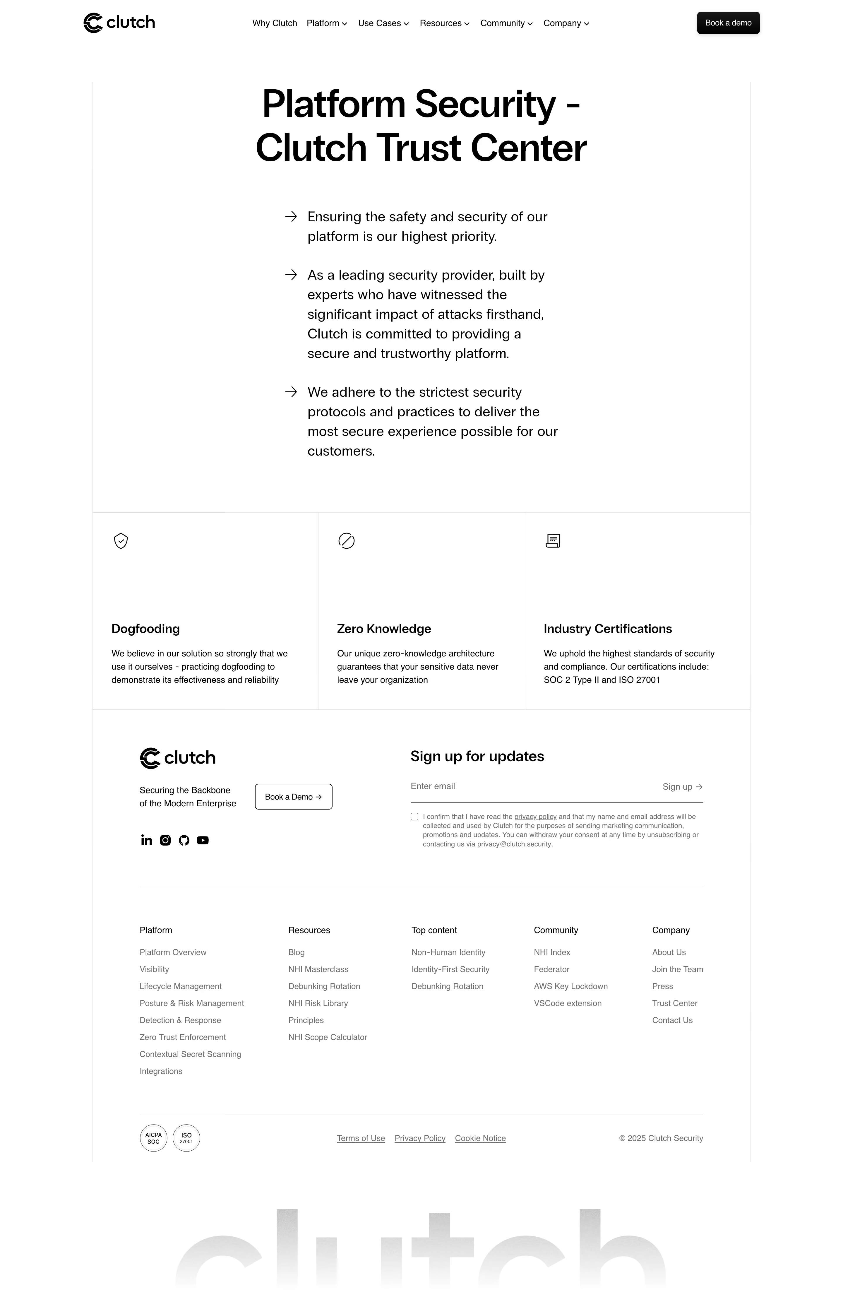
Clutch Security’s Trust Center embodies a sleek, modern aesthetic with a distinctly professional yet approachable vibe. The design leans toward minimalism, utilizing ample white space to highlight core content. Clean lines, understated icons, and crisp content blocks exude confidence and clarity, establishing immediate trust with the visitor.
Layout and Structure
The page opens with a spacious hero section, instantly communicating purpose through bold headlines and a succinct value proposition. Information flows logically via stacked sections—features, certifications, and process explanations—each separated by generous padding. Anchored navigation remains accessible, allowing seamless jumps to pertinent content without overwhelming the user.
Visual Elements
A harmonious blend of vector illustrations and subtle animation injects energy into the site, while security icons reinforce credibility. Interactive checkmarks and progress indicators guide users through compliance details, introducing micro-engagements that keep the viewer invested in learning more.
Color Palette and Typography
Soft blues and grays dominate, punctuated by reassuring green accents for CTAs and status indicators. The sans-serif font family is modern and legible, with clear hierarchy achieved through weight and size, ensuring scannability across devices.
User Experience Patterns
Persistent navigation, sticky CTAs, and in-context tooltips create a frictionless journey. Interactive elements prompt users to explore, while collapsible FAQ sections reduce cognitive load. Forms are minimal and invitation-only, enhancing user comfort and trust.
Unique or Notable Design Choices
Noteworthy is the focus on transparency: real-time status updates and third-party audit badges are visually prioritized, making trust tangible. The overall tone is competent and reassuring, positioning the platform as both cutting-edge and dependable for security-conscious audiences.