Overall Style and Aesthetic
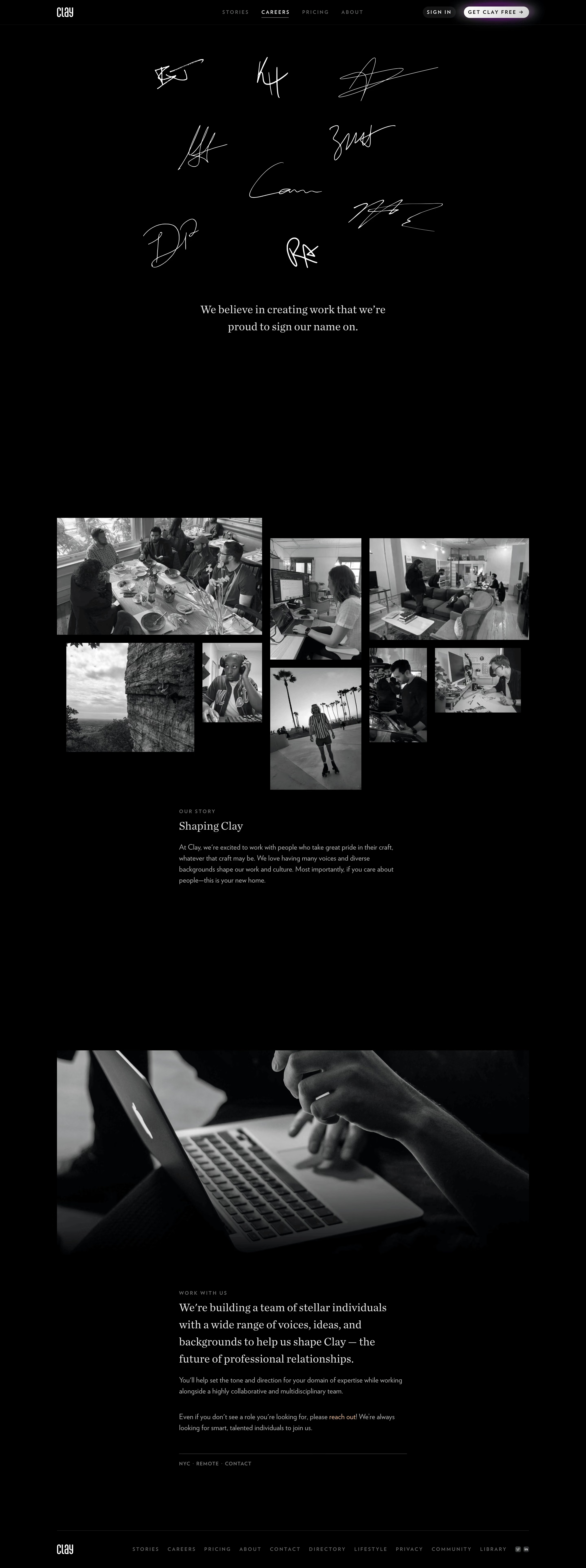
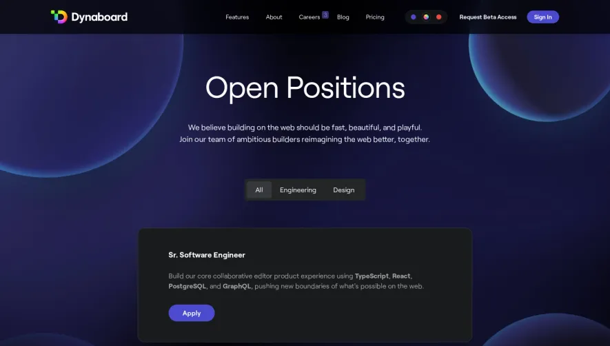
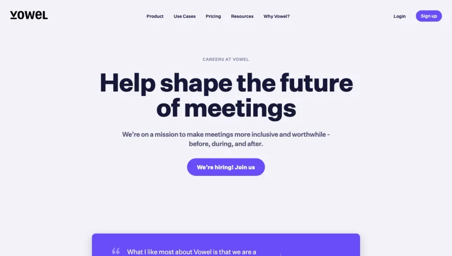
Clay’s careers page embraces a refined minimalist aesthetic that radiates modern professionalism. The design is understated yet inviting, pairing generous whitespace with subtle, tactile drop shadows and delicate accents—the page feels calm, approachable, and considerate, in line with the company’s people-first ethos. Playful, softly curved shapes and micro-animations add personality without distracting from content. Layout and Structure
The layout is focused and intentional, leading with a succinct hero section featuring a warmly welcoming headline, a brief value proposition, and an engaging illustration. Below, open-card sections reveal roles, company culture highlights, and direct calls to action. The absence of clutter keeps attention on what matters: open positions and the team’s culture. The footer—muted and minimalist—reinforces consistency and trust. Visual Elements
Hand-drawn style illustrations and avatars sprinkle the page with warmth and character, creating a sense of human connection. There are no stock photos; instead, soft gradients and line drawings are interwoven with gentle, looping animations for surprising moments of delight. Embedded links to social proofs (like articles and podcasts) add credibility. Color Palette and Typography
The palette is anchored by calm off-whites and understated grayscale, with vibrant accent colors (a friendly purple and sage green) used sparingly for CTAs and highlights. Typography is modern and highly legible—sans-serif for headers giving a contemporary edge, while body copy ensures easy reading and natural hierarchy. User Experience Patterns
Navigation is sticky and minimal, keeping users oriented without crowding the viewport. Key CTAs are prominent and clearly labeled. Job postings are organized in expandable cards, reducing scroll fatigue. Micro-interactions nudge engagement with tactile feedback during hover and press events. Unique or Notable Design Choices
Clay’s focus on friendliness and inclusivity stands out—handdrawn team avatars, a conversational tone, and the absence of cold corporate visuals foster trust. The application flow is simplified, with in-page forms and reassuring copy, lowering barriers for diverse talent. The design signals innovation while making everyone feel welcome.