
Thank you! Your submission has been received!
Oops! Something went wrong while submitting the form.
Get SaaSFrame Pro
Monthly
$18
Quarterly
$48
Yearly
$180
Upgrade to access this feature
Browse all screens & flows
Filter and search screens & flows
Access Figma files
Access mobile versions
Bookmark screens & flows
Join now
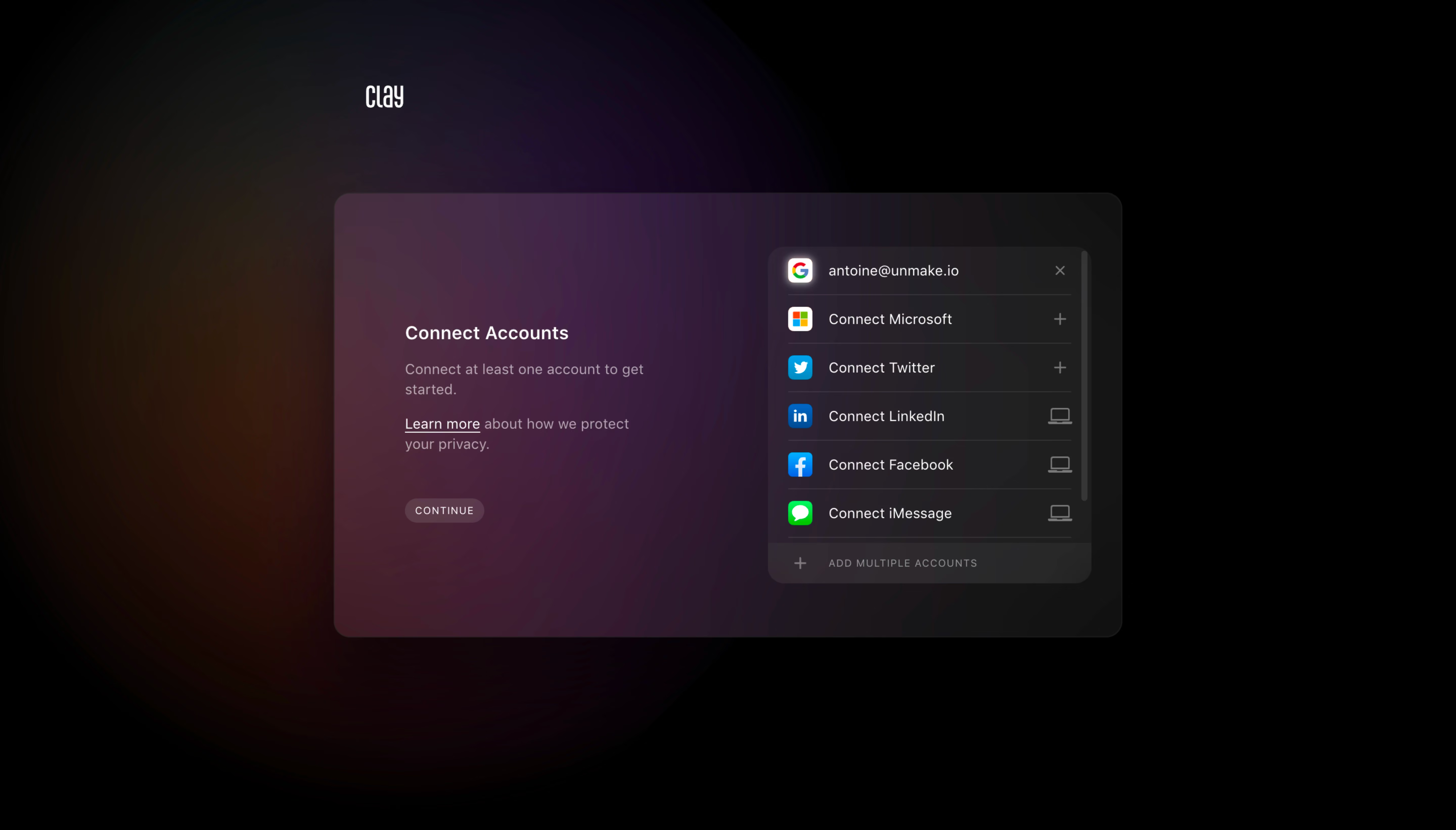
Clay Account Setup

Clay
Be more thoughtful with the people in your network.
Designed by
No items found.

Bookmark
Bookmark

Design with AI
Thank you! Your submission has been received!
Oops! Something went wrong while submitting the form.
# Design from Reference: Clay Account Setup
Create an original, high-fidelity visual design inspired by the reference. Prioritize composition, typography, colors, spacing, and component styling over technical implementation.
## Reference
- **Product:** Clay
- **Category:** Account Setup
- **Screenshot:** https://cdn.prod.website-files.com/5e9dc792e1210c5325f7ebbc/6acb69925e515b69c7964dd1_6acb67ce096561906c245695_cms-a2b1b7a18163699ff34b7b29.webp
Analyze the screenshot first. If inaccessible, request it rather than guessing.
## Content
{{content.instructions}}
{{content.data}}
Preserve essential messaging and factual accuracy. Adapt structure and copy length for visual balance; never invent product claims.
## Visual Design
### Overall aesthetic
- **Character:** A cinematic account-connection screen uses a black canvas, a large blurred amber/purple glow, and a translucent dark panel. Small provider logos provide bright points of recognition.
- **Mood:** Soft gradients, restrained typography, and generous surrounding darkness create a focused, premium onboarding presentation.
- **Observed scale:** The source measures 5760 × 3284 pixels. Estimated CSS dimensions below assume a 4× capture, equivalent to roughly 1440 × 821; actual device pixel ratio is unverified.
### Page composition
- **Brand:** A small white Clay wordmark sits above the main panel, aligned near its left side rather than centered across the page.
- **Main panel:** A rounded rectangle approximately 780 × 440 CSS pixels is centered in the viewport. Its left side is tinted purple/rose, fading toward near-black at right.
- **Instruction column:** The left section contains Connect Accounts, a short two-line requirement, a two-line privacy explanation with an underlined link, and a compact Continue pill.
- **Provider list:** A darker rounded card occupies the right section, approximately 320 × 335 pixels. Six provider rows appear above an Add multiple accounts footer.
- **Surrounding space:** Most of the viewport is empty black, with the soft glow concentrated behind and to the left of the panel.
### Information hierarchy
- **Task heading:** Connect Accounts is the strongest text within the main panel, though it remains modest in scale.
- **Requirement:** The supporting sentence says to connect at least one account. It is secondary and more muted than the heading.
- **Privacy reassurance:** An underlined Learn more phrase distinguishes the privacy link within otherwise subdued explanatory copy.
- **Connection state:** The first provider row displays an account identifier and a close/remove symbol, while the remaining rows display connection prompts with plus or desktop symbols.
- **Continuation:** A small Continue control sits below the explanatory text. Its subdued appearance alone does not establish whether it is enabled.
- **Privacy limit:** The visible account identifier is personal example data and should not be reused as a design detail.
### Typography
- **Typeface appearance:** A neutral sans-serif is used for the interface. The small Clay wordmark has a narrow custom appearance; exact fonts are unverified.
- **Heading:** Approximately 18 pixels, medium/semibold, with a line-height around 24 pixels.
- **Explanations:** Around 14–15 pixels with 20-pixel line-height, muted lavender-gray, and moderate line length.
- **Provider rows:** Approximately 14 pixels, regular weight, vertically centered beside icons.
- **Small controls:** Continue and Add multiple accounts use roughly 10–11-pixel uppercase text with expanded tracking.
- **Alignment:** All instructional text is left aligned. Provider labels form a consistent second column beside equal-sized logo tiles.
### Colors & surfaces
- **Measured base:** #000000 dominates the outer canvas. Sampled #151515 and #131313 represent near-black areas of the panel family.
- **Measured gradient:** Original-image samples include #482F40 and #44202C on the tinted left panel, with #4F2C41 in a nearby rose-purple area.
- **Measured provider surface:** Samples #2A2330 and #312A30 occur in the darker right-side panel region. These are gradient positions rather than uniform flat tokens.
- **Text:** Primary labels are near-white; explanations, row-end symbols, and footer text are muted gray/lavender.
- **Provider accents:** Google, Microsoft, Twitter, LinkedIn, Facebook, and iMessage marks retain recognizable multicolor or saturated brand colors.
- **Depth:** Fine dark borders, translucent fills, and the broad background glow create depth without strong conventional shadows.
### Components
- **Main container:** A large rounded panel has corners around 16–18 CSS pixels and a subtle outline. The glow remains visible through or around its tinted surface.
- **Instruction block:** A compact heading, requirement paragraph, privacy link, and continuation control create one narrow vertical group.
- **Continue pill:** Approximately 78 × 24 pixels with muted rose fill, fully rounded ends, uppercase label, and generous letter spacing.
- **Provider rows:** Rows are roughly 47–49 pixels high, separated by fine horizontal rules. Each has a small logo tile at left, text in the middle, and a state/action symbol at right.
- **Connected row:** The Google row shows an account identifier and an x-shaped affordance. The screenshot does not establish the effect of activating it.
- **Plus rows:** Microsoft and Twitter have plus symbols at right. LinkedIn, Facebook, and iMessage show small desktop-outline symbols; the reason for this difference is not verified.
- **List footer:** A darker/lighter translucent footer strip contains a plus icon and Add multiple accounts label.
- **Scroll cue:** A narrow vertical scroll indicator appears along the provider card’s right edge.
- **Unshown states:** No authentication popup, provider permission screen, connection error, focus state, or completed onboarding screen is visible.
### Visual rhythm
- **Two balanced groups:** The small instruction column and dense provider card share a horizontal center while maintaining clear separation.
- **List regularity:** Equal row heights, repeated icon tiles, and aligned trailing symbols make provider choices easy to scan.
- **Generous frame:** The large black margins make the central panel the only task focus.
- **Muted-to-bright contrast:** Bright logos punctuate otherwise subdued dark surfaces and gray text.
- **Soft background flow:** The glow moves from warm amber at far left through rose/purple behind the panel to black at right, without hard section boundaries.
### Responsive
- **Evidence limit:** Only a desktop account-connection screen is captured. Mobile layout and provider behavior are unverified.
- **Recommended stacking:** Place instructions above the provider list on narrow screens and make the panel fluid within safe side gutters.
- **Recommended controls:** Increase the compact Continue hit area for touch use and provide explicit focus/disabled styling.
- **Recommended list:** Keep provider labels and state symbols readable; allow long account identifiers to truncate accessibly or wrap without pushing controls offscreen.
- **Recommended scrolling:** Preserve access to all providers and the footer with a clear scroll region when viewport height is limited.
- **Recommended contrast:** Verify explanatory copy and symbols against the actual gradient at every position.
### Adaptation guidance
- **Preserve the connection model:** Clearly distinguish connected accounts from available providers, with an explicit continuation path.
- **Do not infer provider rules:** Specify plus, desktop, disconnect, and multiple-account behavior from real product requirements.
- **Use privacy-safe examples:** Replace the captured identifier with approved sample data and ensure provider permissions are explained in real copy.
- **Implement accessible choices:** Use real buttons or links with provider names, clear state labels, keyboard access, and non-color status cues.
- **Treat gradients as artwork:** Recreate the sampled dark rose/purple atmosphere while keeping interaction surfaces and text contrast stable.
- **Design missing states:** Add authentication progress, success, failure, reconnect, and removal confirmation behavior where required; none is established by this screenshot.
Use this context to reproduce the reference's visual language: layout, typography, colors, spacing, borders, radii, and distinctive elements. The screenshot takes priority if descriptions conflict.
## Direction
{{preferences.fidelityInstructions}}
## Output
{{output.instructions}}
Deliver a polished, cohesive design with precise alignment, hierarchy, and spacing. Produce the requested visual artifact, not just a description. If unsupported, explain the limitation.


Category
Patterns
Tech Stack
No items found.
Added on
May 25, 2023



Similar screens





Upgrade to SaaSFrame Pro now to see similar examples.
Monthly
$18 /month
Billed $18 monthly
Browse all screens & flows
Filter and search screens & flows
Search text in screenshots
Access Figma files
Access mobile versions
Join now
Quarterly
$16 /month
Billed $48 quarterly
Browse all screens & flows
Filter and search screens & flows
Search text in screenshots
Access Figma files
Access mobile versions
Join now
Yearly
$15 /month
Billed $180 yearly
Browse all screens & flows
Filter and search screens & flows
Search text in screenshots
Access Figma files
Access mobile versions
Join now