Design with AI
Generate a new design based on this screen using your own content.
# Design from Reference: Checkout.com API Key Details
Create an original, high-fidelity visual design inspired by the reference. Prioritize composition, typography, colors, spacing, and component styling over technical implementation.
## Reference
- **Product:** Checkout.com
- **Category:** Details
- **Screenshot:** https://cdn.prod.website-files.com/5e9dc792e1210c5325f7ebbc/6acad4c01025e911ae51840e_6acad3d05a5fdf4c30309883_cms-4ae1f84f987fb4b9a4f0b742.webp
Analyze the screenshot first. If inaccessible, request it rather than guessing.
## Content
{{content.instructions}}
{{content.data}}
Preserve essential messaging and factual accuracy. Adapt structure and copy length for visual balance; never invent product claims.
## Visual Design
### Overall aesthetic
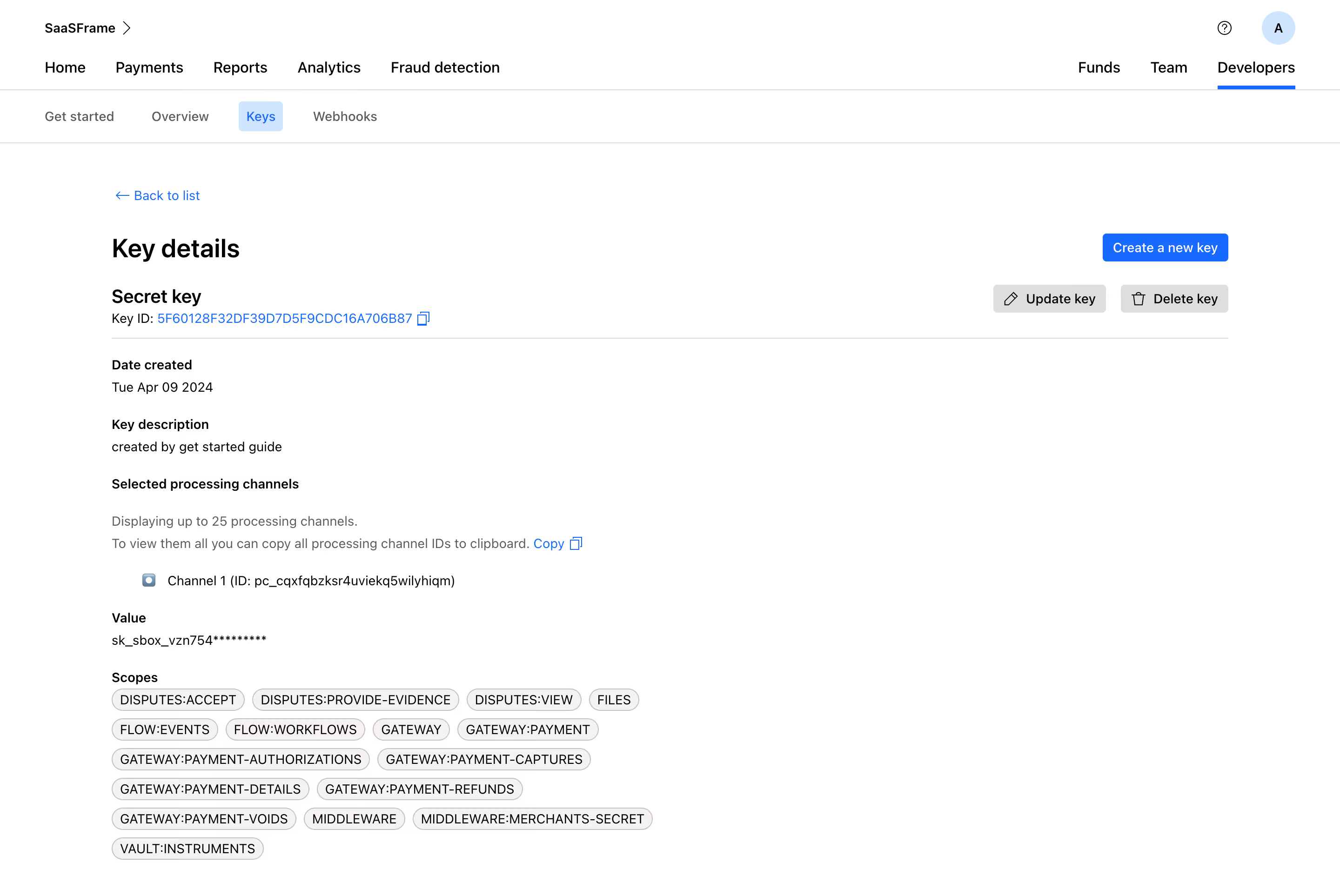
- **Character:** Sparse white developer-key detail page with black typography, blue links/actions and neutral scope chips.
- **Visual tone:** Plain labels and thin rules prioritize technical information over decoration.
- **Scale:** The source measures 2880 × 1926 image px. Dimensions below estimate a 1440 × 963 CSS layout at 2× scale; device ratio and zoom are unverified.
### Page composition
- **Global navigation:** Workspace/account row sits above a broad product-navigation row.
- **Developer tabs:** Get started, Overview, Keys and Webhooks form a second navigation strip; Keys is selected.
- **Main region:** A wide centered content column begins with Back to list and Key details.
- **Key header:** Secret-key label and copyable identifier align left, with create/update/delete controls right.
- **Details:** Creation date, description, processing-channel information, masked value and wrapping scope chips stack beneath a divider.
### Information hierarchy
- **Location:** Developers and Keys have distinct active treatments.
- **Resource:** Key details and key-type label lead before technical metadata.
- **Actions:** Blue creation action is strongest; gray update/delete controls are secondary and are not activated.
- **Permissions:** Many compact scope chips form a dense lower group.
- **Privacy:** Identifiers, channel values and masked-secret prefixes are intentionally not reproduced in this description.
### Typography
- **Family:** Neutral sans-serif; exact identity is unverified.
- **Page title:** Approximately 28 px, bold.
- **Key type:** Around 22 px, bold.
- **Labels/values:** Approximately 14–16 px, with bold labels and regular values.
- **Scopes:** Compact uppercase text around 14 px in rounded chips.
- **Navigation:** Approximately 16 px, medium weight.
### Colors & surfaces
- **Measured base:** ICC-aware sRGB sampling yields #FFFFFF.
- **Measured neutral:** #F4F2F2, #DFDDDD and #C7C1C1 occur in chips/buttons/rules.
- **Measured action:** Blue #006BFF marks links and creation; #CAE5FF is the selected-tab fill.
- **Measured foreground:** #000000 and #424141 are dark tones; #5C5B60 is muted.
- **Depth:** Flat controls and fine outlines dominate, with no large cards/shadows.
### Components
- **Active navigation:** A blue underline marks Developers; a pale-blue rounded chip marks Keys.
- **Copy controls:** Small outline copy symbols follow identifier/channel-copy links.
- **Actions:** Compact blue create button and gray update/delete buttons pair text with simple icons.
- **Scope chips:** Light warm-gray fully rounded capsules wrap across several lines.
- **Masked value:** A single text line displays a partially obscured key without a visible reveal control.
- **Channel row:** Small marker and one channel entry sit below explanatory copy.
### Visual rhythm
- **Alignment:** Main title, section labels and values share one left axis.
- **Spacing:** Generous gaps separate metadata groups; label/value pairs remain tight.
- **Density:** Scope chips create the only dense cluster at the bottom.
- **Whitespace:** Large blank right-side areas keep the page visually light.
### Responsive
- **Evidence limit:** Only desktop is shown; recommendations follow.
- **Navigation:** Collapse/wrap broad navigation strips.
- **Actions:** Move key utilities beneath the header on narrow screens.
- **Values:** Wrap or safely scroll long identifiers and preserve copy targets.
- **Scopes:** Continue natural chip wrapping with readable labels.
### Adaptation guidance
- **Reusable pattern:** Show key metadata, processing scope and permissions with clearly separated management actions.
- **Privacy:** Keep credentials masked and avoid exposing identifiers in reusable examples.
- **State clarity:** Distinguish viewing details from updating/deleting/creating keys.
- **Accessibility:** Label copy controls and active tabs, and provide focus/confirmation feedback for real management actions.
Use this context to reproduce the reference's visual language: layout, typography, colors, spacing, borders, radii, and distinctive elements. The screenshot takes priority if descriptions conflict.
## Direction
{{preferences.fidelityInstructions}}
## Output
{{output.instructions}}
Deliver a polished, cohesive design with precise alignment, hierarchy, and spacing. Produce the requested visual artifact, not just a description. If unsupported, explain the limitation.