Overall Style and Aesthetic
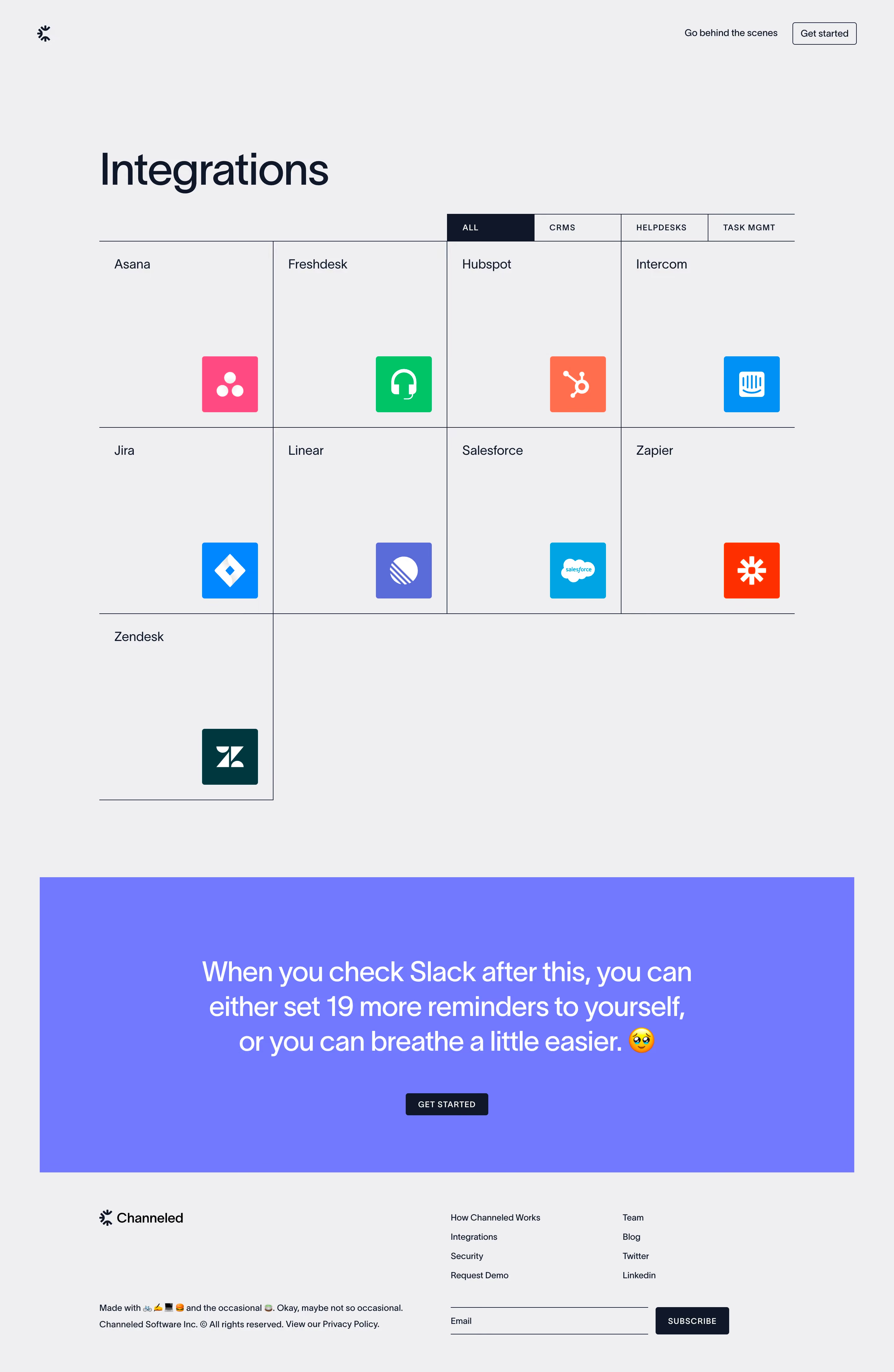
Channeled’s Integrations page embodies a sleek, modern, and welcoming aesthetic. The design leans into minimalist principles, creating a sense of clarity and space that immediately feels inviting. There’s a professional polish with a hint of playfulness, making the experience approachable without sacrificing sophistication. Layout and Structure
The page opens with a concise hero section: bold headline, supporting subtext, and a prominent call-to-action, all framed by generous white space. Below, integrations are showcased in a visually rich, grid-style gallery—each partner brand instantly recognizable. The layout is clean and grid-based, ensuring users can scan seamlessly without distraction. The footer is minimal yet informative, containing succinct links and social media icons. Visual Elements
Vibrant, color-coded partner icons dominate the integrations grid, making each service pop while maintaining page harmony. Subtle animations trigger as users scroll, adding dynamic energy without overwhelming. Crisp SVG illustrations and soft drop shadows provide depth. There’s minimal use of photography, keeping focus on the SaaS branding and integrations themselves. Color Palette & Typography
A calming, corporate-leaning palette dominates—soft blues, gentle off-whites, and strategic accent colors for CTAs. Typography feels thoughtfully curated: a sans-serif primary font with bold weights for headlines and comfortable body text for readability. Hierarchy is maintained through font size and color contrast, directing attention effortlessly. User Experience Patterns
Navigation is sticky and highly legible, ensuring persistent access to other core pages. “Add Integration” CTAs are visually prominent, using accent hues and playful micro-interactions (e.g., hover animations). The streamlined, responsive design delivers a frictionless scroll, ideal for both desktop and mobile users. Unique or Notable Design Choices
The use of animated, branded integration cards stands out, transforming a traditionally static section into an engaging visual showcase. Transparency on what each integration offers is immediate—no extra clicks required. The warm, user-centric tone, enhanced by concise copy and subtle motion, makes the experience feel innovative and energetic, yet always trustworthy.