SaaSFrame

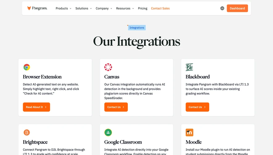
1. Hero section: The page features a hero section with a large background image, a headline and a subheading, and a call-to-action (CTA) button. 2. Navigation menu: Below the hero section is a navigation menu that includes options to learn more about Guru, its features, pricing, integrations, and resources. 3. Integrations section: The main part of the page focuses on integrations. It begins with a heading that introduces the section and a subheading that provides more details. Below that is a list of popular apps that Guru can integrate with, including Slack, Trello, Salesforce, and more. 4. App categories: Below the list of popular apps are four categories of integrations: Project Management, CRM and Sales, Support and Success, and Productivity and Collaboration. Each category features a heading, a subheading with more details, and a list of apps that fit into that category. 5. App cards: Each app in the list is presented as a card featuring a logo, a brief description of how it integrates with Guru, and a CTA button to learn more about that integration. 6. Additional categories: Below the four main categories are two additional categories: Guru Extensions and Guru Embed. Both of these categories feature a heading, a subheading with more details, and a list of tools and apps that fall under that category. 7. Footer: Like most webpages, the Get Guru Integrations page also features a footer with links to other pages on the website, as well as social media links. Overall, the page is well-structured, with clear headings and subheadings that make it easy to find the information you need. The use of card-style design for each of the apps and tools listed makes it easy to see at a glance what the app can do and how it integrates with Guru. The use of colors on the page is also effective, with the hero section featuring a bright orange CTA button that contrasts nicely with the rest of the color scheme.