Design with AI
Generate a new design based on this screen using your own content.
# Design from Reference: Café Offices Setup
Create an original, high-fidelity visual design inspired by the reference. Prioritize composition, typography, colors, spacing, and component styling over technical implementation.
## Reference
- **Product:** Café
- **Category:** Account Setup
- **Screenshot:** https://cdn.prod.website-files.com/5e9dc792e1210c5325f7ebbc/6acb72b4018523cfee2da0cc_6acb702f1a5e5fba58c7b6f5_cms-1e41cd54e1ac06aa80899fa5.webp
Analyze the screenshot first. If inaccessible, request it rather than guessing.
## Content
{{content.instructions}}
{{content.data}}
Preserve essential messaging and factual accuracy. Adapt structure and copy length for visual balance; never invent product claims.
## Visual Design
### Overall aesthetic
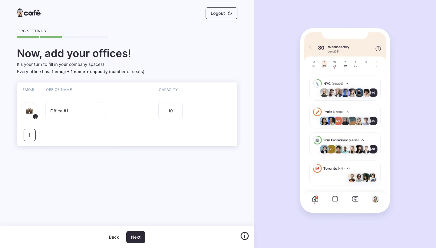
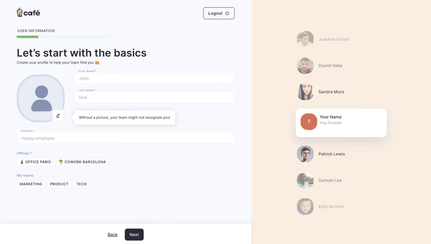
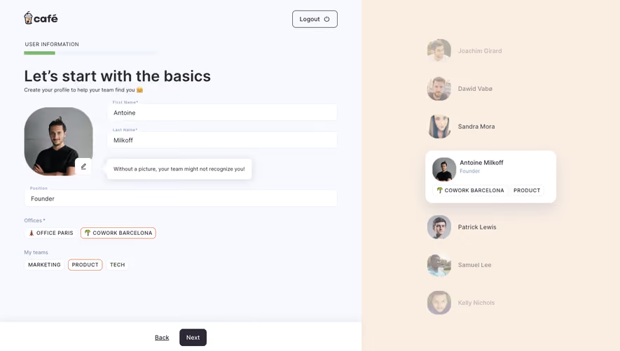
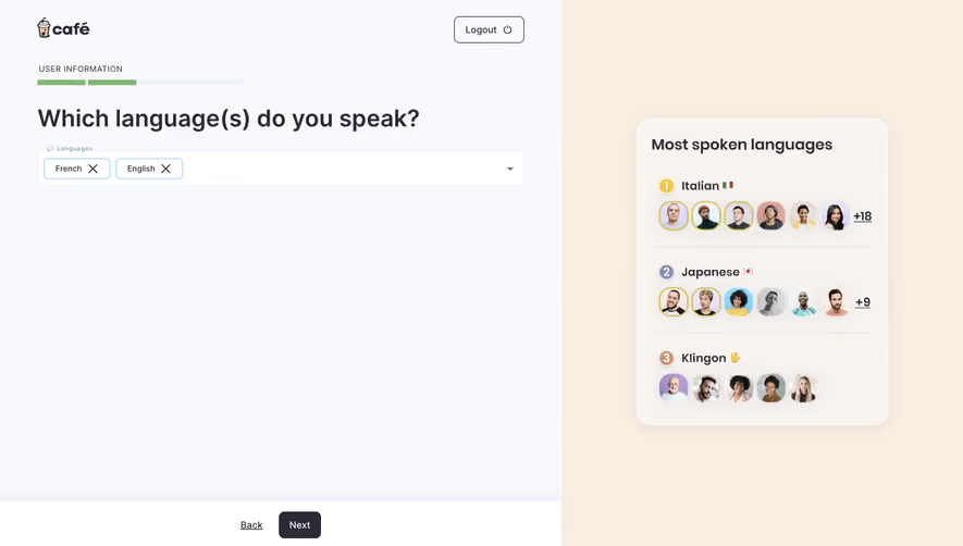
- **Style:** Friendly office-setup onboarding with pale surfaces, lavender preview panel, and compact table-like entry.
### Page composition
- **Canvas:** 1440 × 821 screenshot px.
- **Split:** Left form occupies roughly 58%; right lavender mobile-preview area.
- **Left:** Logo/logout, organization progress, title/instructions, office row editor, bottom Back/Next.
- **Right:** Tall phone mockup showing office attendance cards.
### Information hierarchy
- **Primary:** Add offices title and one editable office row.
- **Fields:** Emoji, office name, and capacity.
- **Progress:** Four thin segments, two green.
- **Action:** Dark Next in fixed-looking bottom bar.
### Typography
- **Family:** Rounded sans serif; exact identity unverified.
- **Title:** Approximately 36 screenshot px, semibold.
- **Body:** Approximately 14–16px.
- **Table labels:** Approximately 12px uppercase.
- **Precision:** Screenshot estimates.
### Colors & surfaces
- **Left canvas:** #F8F9FE.
- **Cards/phone:** #FFFFFF.
- **Preview lavender:** #E2E0FC.
- **Phone header peach:** #FAEEE3.
- **Text/actions:** #2D2936.
- **Precision:** Flat sampled colors.
### Components
- **Office panel:** Rounded white card with soft shadow, header row, one editable row, and plus control.
- **Emoji:** Small rounded tile with edit affordance.
- **Inputs:** Thin pale outlines and small radius.
- **Preview:** White phone shell, rounded attendance cards, overlapping avatars.
- **Footer:** Back link, dark Next, and info icon.
### Visual rhythm
- **Spacing:** Broad margins and large empty area beneath short form.
- **Alignment:** Table columns establish structured entry.
- **Balance:** Detailed mobile preview contrasts with sparse setup.
### Responsive
- **Observed:** Desktop only.
- **Recommendation:** Prioritize form, move preview below/hide it, stack office fields, and keep progression visible.
### Adaptation guidance
- **Preserve:** Office identity/capacity structure and clear multi-step orientation.
- **Content:** Use supplied office names, capacities, and imagery.
- **Behavior:** Add-row and preview updates unverified.
Use this context to reproduce the reference's visual language: layout, typography, colors, spacing, borders, radii, and distinctive elements. The screenshot takes priority if descriptions conflict.
## Direction
{{preferences.fidelityInstructions}}
## Output
{{output.instructions}}
Deliver a polished, cohesive design with precise alignment, hierarchy, and spacing. Produce the requested visual artifact, not just a description. If unsupported, explain the limitation.