Overall Style and Aesthetic
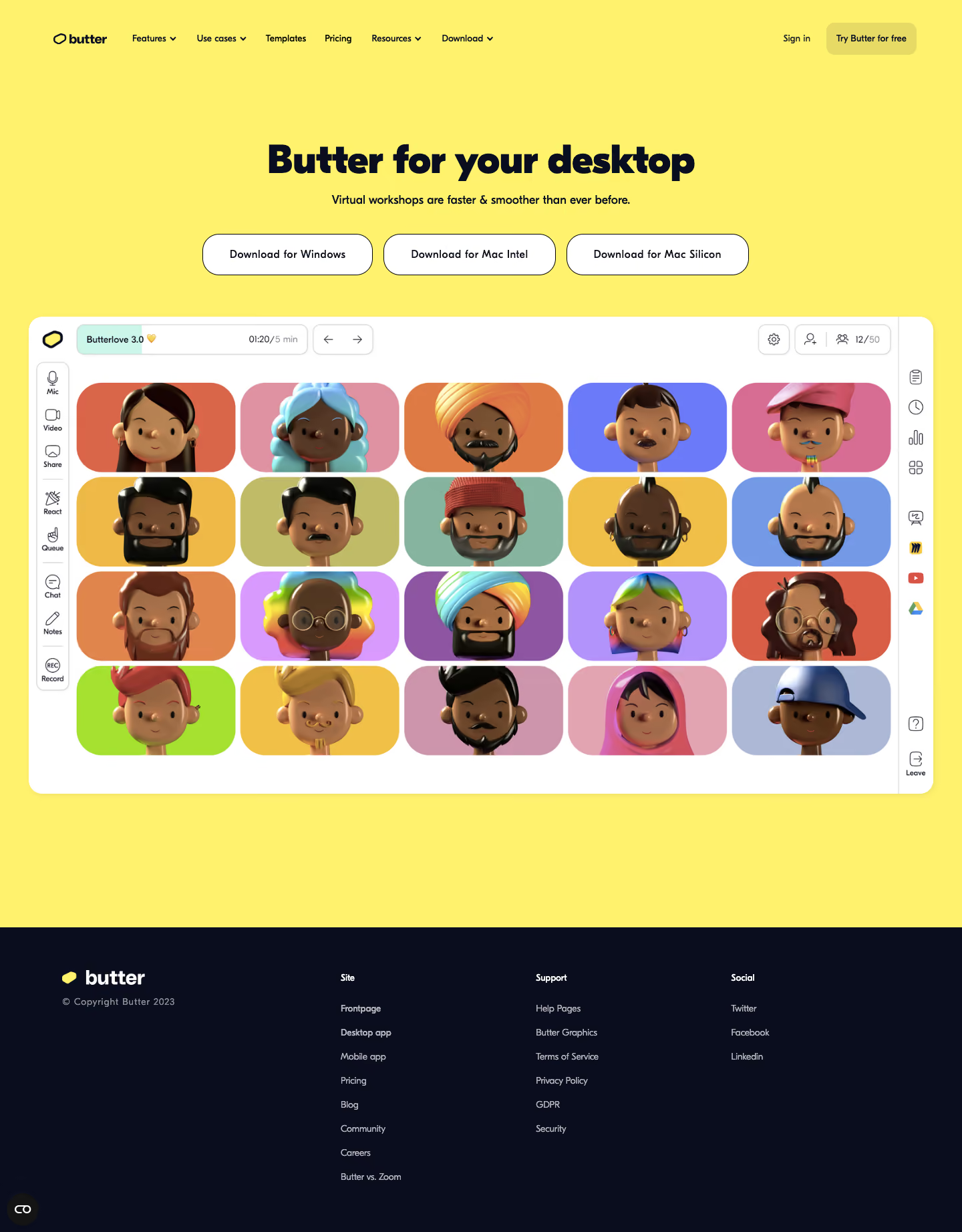
Butter’s download page embraces a playful yet professional vibe, seamlessly blending vibrant color accents with a clean, modern framework. The aesthetic radiates positivity and approachability, using rounded shapes, floating elements, and lively illustrations to invite user engagement while maintaining SaaS credibility. Layout and Structure
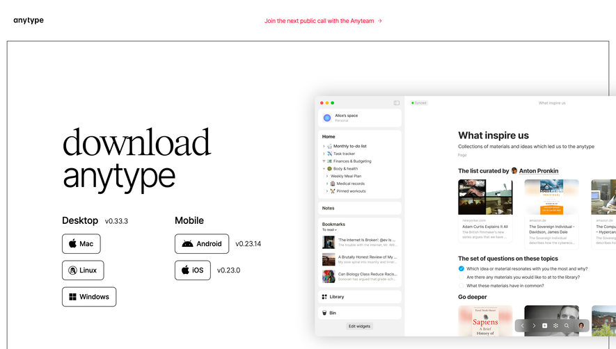
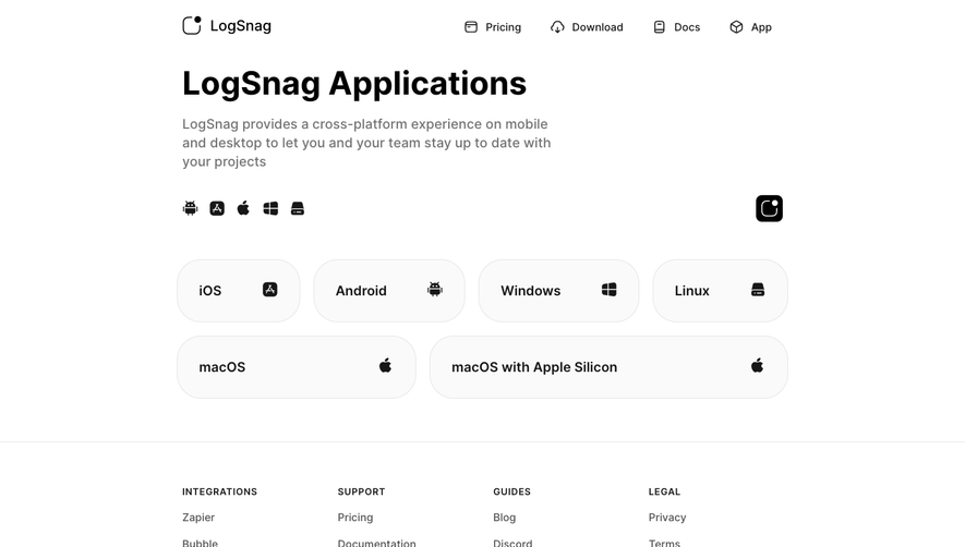
The page is built around a bold hero section, featuring a catchy headline and instantly recognizable download buttons for different platforms, making actions clear from the outset. Information is modular and well-spaced, cascading into platform-specific cards with neat download options, and a “Joining a session?” section for direct usability. Secondary content is limited, keeping focus sharp and the conversion path uncluttered. The sticky navigation bar and prominent footer reinforce ease of movement and company trust. Visual Elements
Illustrative avatars, custom vector icons, and soft drop shadows add personality, supported by smooth hover animations that create a tactile sense of interactivity. The absence of stock photography ensures originality, while subtle micro-animations enhance clickability without distracting. Color Palette and Typography
Vivid yellows and purples punctuate a neutral-white background, drawing attention to CTAs and key navigation. The playful palette is balanced by strategic whitespace and strong visual contrast. Typography is friendly yet crisp, using a geometric sans-serif font with clear headings and perfectly legible body text, establishing hierarchy and effortless scanning. User Experience Patterns
Navigation is fixed and direct, CTAs are visually immediate, and FAQ links guide users as needed. The single-scroll, device-aware structure ensures no friction between intent and action. Each download option is accessible with one click, reinforcing a low-effort user journey. Unique or Notable Design Choices
The standout feature is the delightful use of expressive avatars and icons woven into functional elements, making each action feel personalized. Ample breathing room and clever layering give the interface a dynamic, uplifting feel that draws users toward engagement.