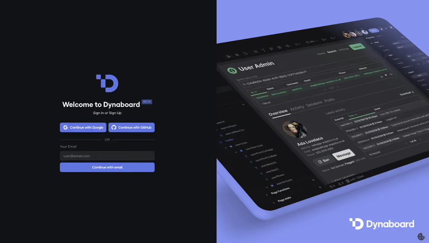
Design with AI
Generate a new design based on this screen using your own content.
# Design from Reference: Buffer Login
Create an original, high-fidelity visual design inspired by the reference. Prioritize composition, typography, colors, spacing, and component styling over technical implementation.
## Reference
- **Product:** Buffer
- **Category:** Login
- **Screenshot:** https://cdn.prod.website-files.com/5e9dc792e1210c5325f7ebbc/63fcd93c8642a6a0d833cd75_9XOIUe0nXP648F7SNIryi0v8JDgfnC8lt2Uo5v_SwtU.avif
Analyze the screenshot first. If inaccessible, request it rather than guessing.
## Content
{{content.instructions}}
{{content.data}}
Preserve essential messaging and factual accuracy. Adapt structure and copy length for visual balance; never invent product claims.
## Visual Design
### Overall aesthetic
- **Style:** Split login with narrow white form and bright-yellow product promotion.
- **Character:** Plain controls, blue action, tilted device mockups.
### Page composition
- **Canvas:** 1440 × 821 screenshot px.
- **Split:** White left third, yellow right two-thirds.
- **Form:** Logo, Log in title, email/password, blue action, account/recovery links, social-login notice, legal footer.
- **Promotion:** New badge, headline/copy, tilted mobile site previews.
### Information hierarchy
- **Primary:** Login form.
- **Recovery:** Forgot password and account creation.
- **Promotion:** Large free-microsite message supports the right side.
### Typography
- **Family:** Neutral sans serif; exact identity unverified.
- **Login title:** Approximately 30px bold.
- **Promo heading:** Approximately 36px bold.
- **Body:** Approximately 18px.
- **Form labels:** Approximately 14px.
- **Precision:** Screenshot estimates.
### Colors & surfaces
- **Right yellow:** #F8D947.
- **Form:** #FFFFFF.
- **Action blue:** #1063F7.
- **Dark text:** #010001 and #131212.
- **Neutral:** #FDFDFC.
- **Precision:** Flat samples.
### Components
- **Fields:** Full-width simple gray outline, roughly 48px high.
- **Login:** Blue rectangular full-width action.
- **Mockups:** Tilted black-edged phone frames with varied content.
- **Notice:** Small centered text beneath recovery links.
### Visual rhythm
- **Whitespace:** Wide gaps around form heading and lower legal links.
- **Contrast:** Quiet login pane against saturated promotion.
- **Alignment:** Equal-width controls.
### Responsive
- **Observed:** Desktop only.
- **Recommendation:** Prioritize form and move/hide promotion; maintain recovery links.
### Adaptation guidance
- **Preserve:** Simple credential flow and separate marketing panel.
- **Content:** Use actual authentication/recovery policy.
- **Behavior:** Login and password reset unverified.
Use this context to reproduce the reference's visual language: layout, typography, colors, spacing, borders, radii, and distinctive elements. The screenshot takes priority if descriptions conflict.
## Direction
{{preferences.fidelityInstructions}}
## Output
{{output.instructions}}
Deliver a polished, cohesive design with precise alignment, hierarchy, and spacing. Produce the requested visual artifact, not just a description. If unsupported, explain the limitation.