Design with AI
Generate a new design based on this screen using your own content.
# Design from Reference: Bubble Onboarding Email Flow
Create an original, high-fidelity visual design inspired by the reference. Prioritize composition, typography, colors, spacing, and component styling over technical implementation.
## Reference
- **Product:** Bubble
- **Category:** Onboarding Email
- **Screenshot:** https://cdn.prod.website-files.com/5e9dc792e1210c5325f7ebbc/6acbcea675891049b183ff80_6acbcd158313d4c6c0ccee3b_cms-8fce16f4ee6825f8bc3603d5.webp
Analyze the screenshot first. If inaccessible, request it rather than guessing.
## Content
{{content.instructions}}
{{content.data}}
Preserve essential messaging and factual accuracy. Adapt structure and copy length for visual balance; never invent product claims.
## Visual Design
### Overall aesthetic
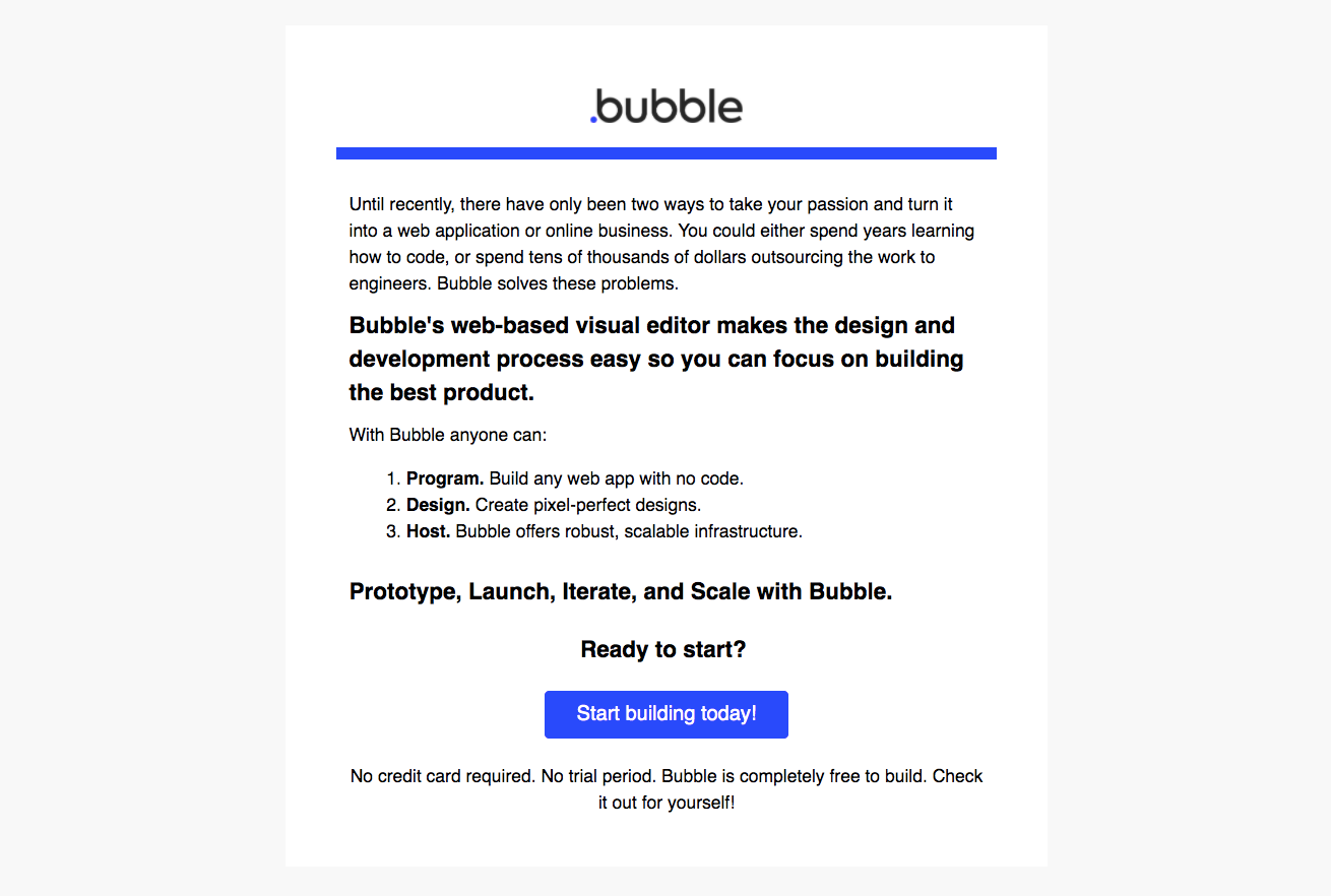
- **Character:** Plain, text-led onboarding email with strong blue branding and a direct conversion action.
### Page composition
- **Canvas:** 1310 × 882 screenshot pixels; rendered CSS scale is unverified.
- **Structure:** Centered white email panel on a pale gray background, with centered logo, thick blue rule, left-aligned educational text and centered closing CTA.
### Information hierarchy
- **Priority:** Introductory paragraph leads to a bold value statement, three-item numbered list, summary line and Start building action.
- **Support:** A short reassurance sentence sits beneath the button.
### Typography
- **Family:** Conventional sans-serif, with bold phrases and headings; exact font is unverified.
- **Scale:** Estimated rendered body 18px, emphasized headings 23–24px and button label 20px; adapt to actual email rendering scale.
### Colors & surfaces
- **Sampled palette:** White #FFFFFF; surrounding gray #F8F8F8; black #000000; saturated blue #294AFB.
- **Treatment:** Nearly all color is reserved for the horizontal rule, logo detail and primary action.
### Components
- **Content:** Numbered list uses bold lead words followed by regular explanations.
- **Action:** Blue rectangular button with approximately 4px radius and generous horizontal padding; no imagery or secondary cards.
### Visual rhythm
- **Spacing:** Estimated 50–60 screenshot-pixel side padding, 20–28px paragraph gaps and a larger gap before the closing CTA.
### Responsive
- **Guidance:** Mobile is not shown. Use a fluid email column, reduced padding and readable line lengths; keep the numbered list intact.
### Adaptation guidance
- **Transfer:** Retain the concise problem/value/capabilities/action sequence. Replace product claims and reassurance copy with verified target content.
Use this context to reproduce the reference's visual language: layout, typography, colors, spacing, borders, radii, and distinctive elements. The screenshot takes priority if descriptions conflict.
## Direction
{{preferences.fidelityInstructions}}
## Output
{{output.instructions}}
Deliver a polished, cohesive design with precise alignment, hierarchy, and spacing. Produce the requested visual artifact, not just a description. If unsupported, explain the limitation.