Design with AI
Generate a new design based on this screen using your own content.
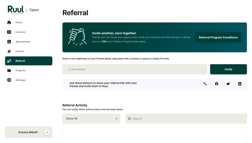
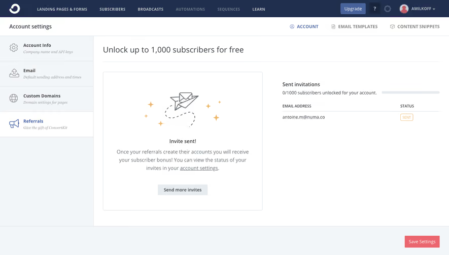
# Design from Reference: Bonsai Referral Flow
Create an original, high-fidelity visual design inspired by the reference. Prioritize composition, typography, colors, spacing, and component styling over technical implementation.
## Reference
- **Product:** Bonsai
- **Category:** Referral
- **Screenshot:** https://cdn.prod.website-files.com/5e9dc792e1210c5325f7ebbc/6acbcec175891049b18403a2_6acbcd207ce271b12873969c_cms-2e38d3a86a5f99f75b53c2cc.webp
Analyze the screenshot first. If inaccessible, request it rather than guessing.
## Content
{{content.instructions}}
{{content.data}}
Preserve essential messaging and factual accuracy. Adapt structure and copy length for visual balance; never invent product claims.
## Visual Design
### Overall aesthetic
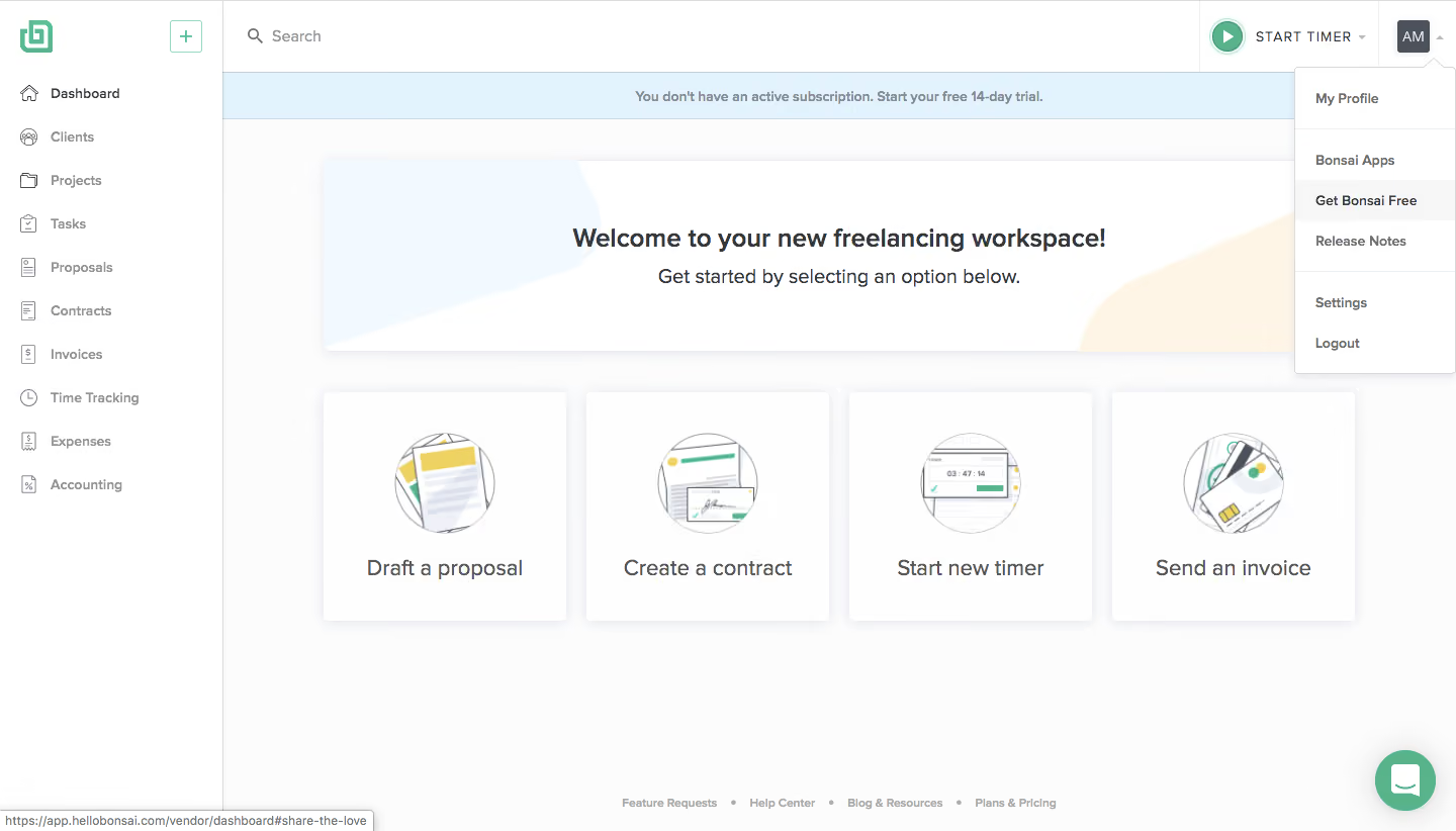
- **Character:** Light freelance-workspace dashboard with mint accents, friendly line illustrations and a visible account dropdown.
### Page composition
- **Canvas:** 1440 × 822 screenshot pixels; CSS estimates are near screenshot scale, with capture scale unverified.
- **Structure:** Narrow left navigation, top search/timer/account bar, blue trial strip, wide welcome banner and four equal action cards.
### Information hierarchy
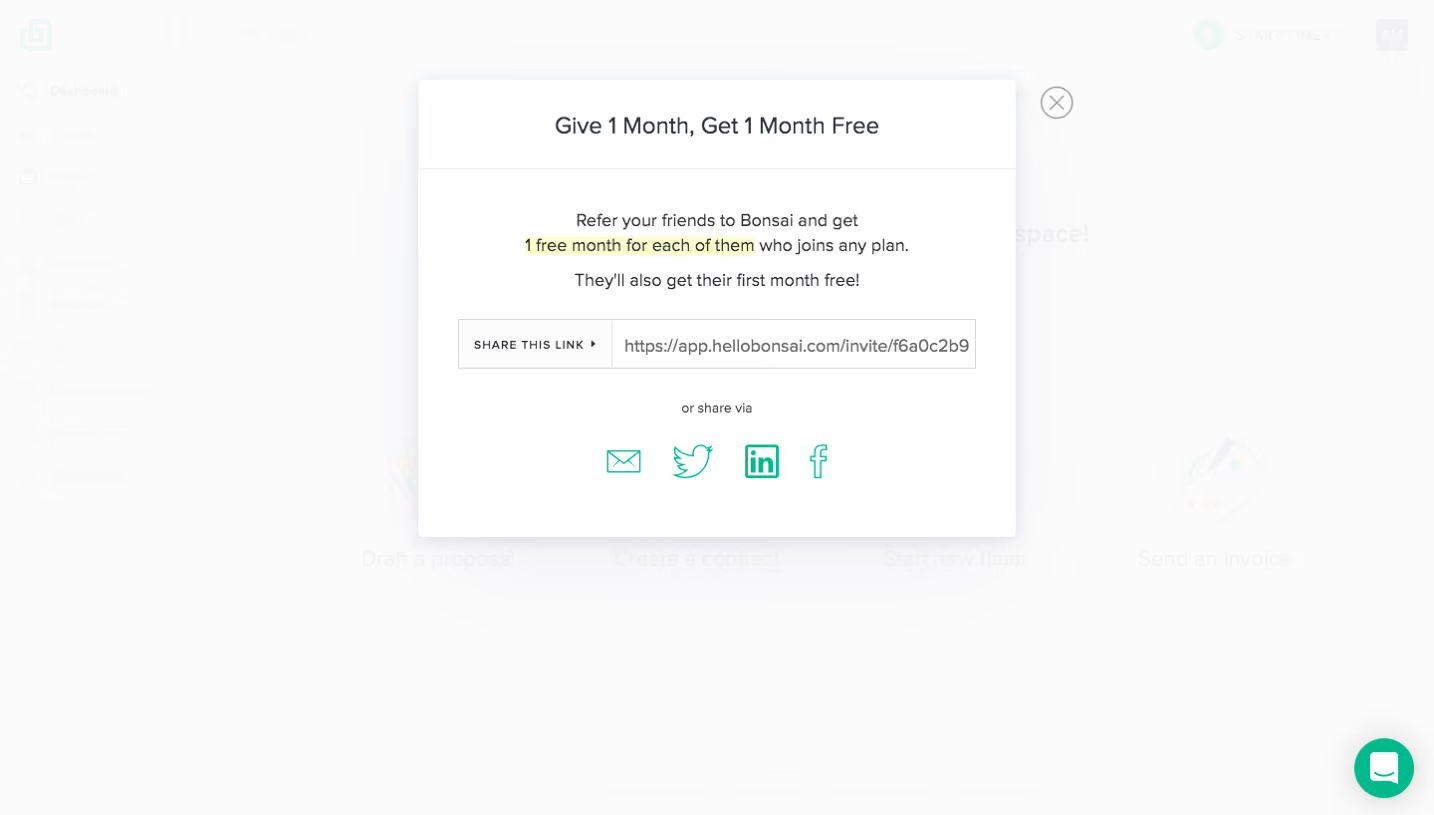
- **Priority:** Welcome message and four starting tasks lead the workspace. The open upper-right account menu highlights Get Bonsai Free; no referral dialog is shown.
### Typography
- **Family:** Neutral sans-serif; exact font is unverified.
- **Scale:** Estimated CSS welcome heading 24px bold, card labels 20px, navigation 14px and utility text 12–13px.
### Colors & surfaces
- **Sampled palette:** White #FFFFFF; near-white #FBFCFC; pale blue #E2F3FE and #F2FAFF; warm cream #FEF5E7.
- **Accents:** Mint brand/timer/chat controls and muted gray text maintain a soft administrative palette.
### Components
- **Cards:** Four white panels with circular line illustrations, light shadows and roughly 4px radii.
- **Dropdown:** White menu with separators and a subtly highlighted row; estimated 160px width and 40–48px rows.
- **Utilities:** Small sidebar icons, trial notice and floating circular chat launcher.
### Visual rhythm
- **Spacing:** Approximately 20px card gutters and 40px between banner/cards; large empty lower workspace.
### Responsive
- **Guidance:** Mobile is not shown. Collapse navigation, stack action cards and anchor the account menu within the viewport.
### Adaptation guidance
- **Transfer:** Preserve the welcoming task-launch grid and clear account menu. Describe only the visible referral entry point when adapting this screen.
Use this context to reproduce the reference's visual language: layout, typography, colors, spacing, borders, radii, and distinctive elements. The screenshot takes priority if descriptions conflict.
## Direction
{{preferences.fidelityInstructions}}
## Output
{{output.instructions}}
Deliver a polished, cohesive design with precise alignment, hierarchy, and spacing. Produce the requested visual artifact, not just a description. If unsupported, explain the limitation.