Design with AI
Generate a new design based on this screen using your own content.
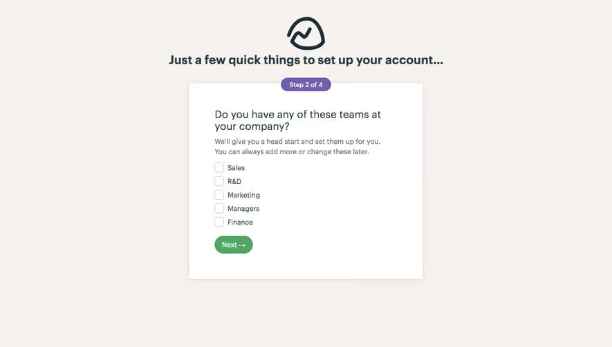
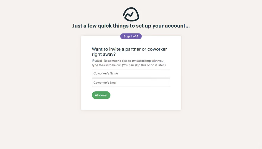
# Design from Reference: Basecamp Sign Up Flow
Create an original, high-fidelity visual design inspired by the reference. Prioritize composition, typography, colors, spacing, and component styling over technical implementation.
## Reference
- **Product:** Basecamp
- **Category:** Account Setup
- **Screenshot:** https://cdn.prod.website-files.com/5e9dc792e1210c5325f7ebbc/6acbc134b7ca13cf70095a10_6acbc0278313d4c6c0c9fb01_cms-196b7f2fdb90caa533de085f.webp
Analyze the screenshot first. If inaccessible, request it rather than guessing.
## Content
{{content.instructions}}
{{content.data}}
Preserve essential messaging and factual accuracy. Adapt structure and copy length for visual balance; never invent product claims.
## Visual Design
### Overall aesthetic
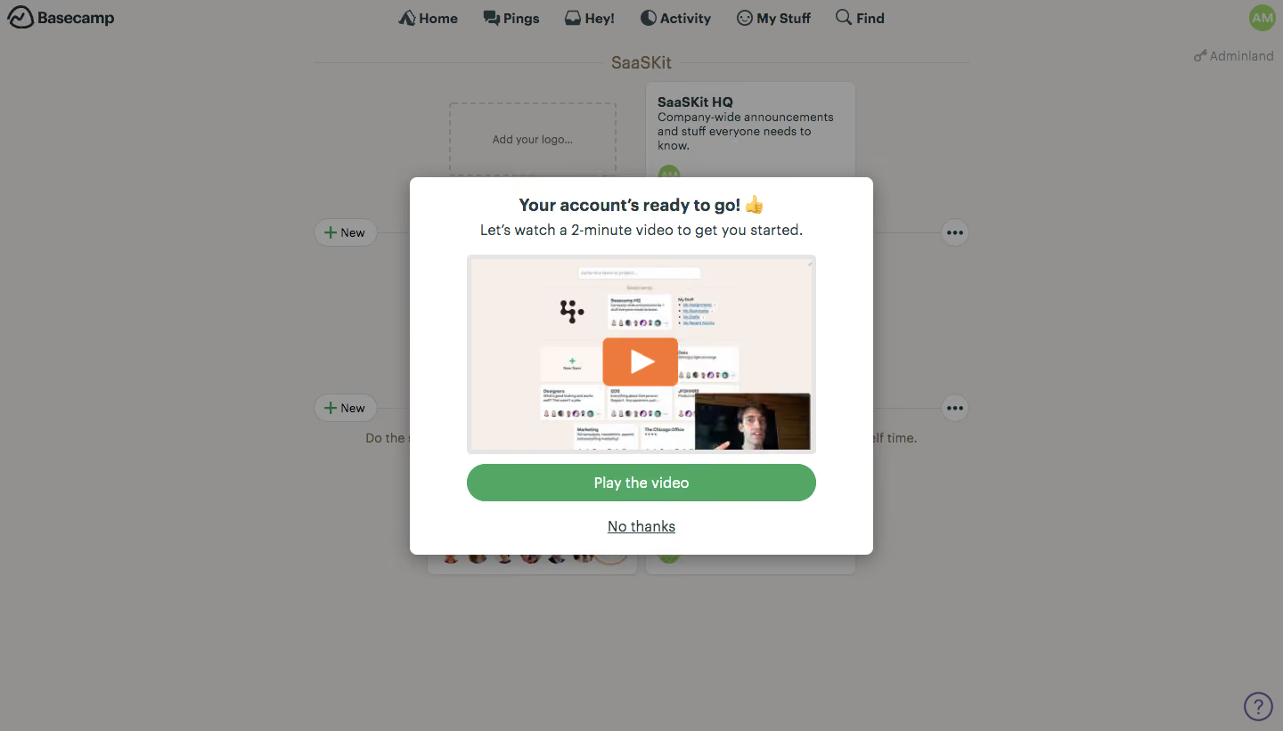
- **Style:** A friendly onboarding modal uses a white surface, dark blue-gray text and green video action over a dimmed project dashboard.
- **Character:** A thumbs-up emoji and short video invitation make the account-ready state approachable.
### Page composition
- **Capture:** The source measures 1440 × 821 pixels. Sizes below approximate image pixels; CSS scale is unverified.
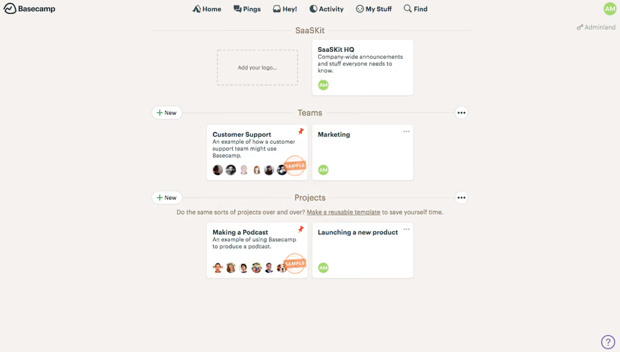
- **Background:** A project dashboard with top navigation, workspace heading and cards remains visible through a gray scrim.
- **Modal:** A centered white panel around 520 × 424 pixels contains a bold announcement, one-line explanation, video thumbnail, green action and underlined decline link.
- **Thumbnail:** A roughly 390 × 224-pixel preview combines a product dashboard and small presenter inset.
- **Peripheral utility:** A small help circle remains at the background's bottom right.
### Information hierarchy
- **Announcement:** A bold centered account-ready line leads.
- **Instruction:** A regular sentence introduces a short starter video.
- **Video:** Large thumbnail and orange play overlay form the primary visual.
- **Action:** A full-width green Play the video capsule sits above the smaller No thanks link.
### Typography
- **Family:** Neutral sans serif; exact identity is unverified.
- **Heading:** Approximately 20 pixels, bold.
- **Instruction:** Around 17–18 pixels.
- **Action:** Around 16 pixels, semibold, white.
- **Secondary link:** Approximately 16 pixels, regular and underlined.
### Colors & surfaces
- **Measured modal:** White #FFFFFF.
- **Dimmed canvas:** Gray #93918F and nearby #92908E dominate the scrim-covered background.
- **Preview surface:** Warm pale #F6EFE9 appears inside the video imagery.
- **Action:** Green #53A663 is sampled in the primary button.
- **Contrast:** Dark blue-gray text and an orange play overlay distinguish content and media action.
### Components
- **Modal shell:** Roughly 8-pixel corners with a broad dark shadow.
- **Video preview:** Thin light-gray frame and small rounded corners.
- **Play overlay:** A large orange rounded rectangle contains a white triangular glyph.
- **Primary action:** Roughly 390 × 42 pixels with fully rounded ends.
- **Decline:** A centered text link sits beneath the button without a surrounding container.
### Visual rhythm
- **Centering:** All modal content shares a central axis.
- **Spacing:** Title and instruction sit closely; the video has a larger top gap, and actions follow with compact separation.
- **Focus:** The scrim suppresses background cards while retaining dashboard context.
### Responsive
- **Evidence:** Only desktop is observed; video playback and mobile behavior are unverified.
- **Recommended modal:** Use fluid width with safe viewport insets and scroll on short screens.
- **Media:** Preserve thumbnail aspect ratio and a comfortable play target.
- **Accessibility:** Provide focus trapping, labeled media controls and a keyboard-accessible decline route.
### Adaptation guidance
- **Preserve:** Keep the brief celebratory message, prominent video preview and green primary action.
- **Implementation:** Treat the account-ready modal independently from the dashboard.
- **Scope:** The screenshot shows an invitation to play, not playback or a completed tutorial.
- **Content:** Use supplied onboarding video and workspace data rather than copying the preview's incidental content.
Use this context to reproduce the reference's visual language: layout, typography, colors, spacing, borders, radii, and distinctive elements. The screenshot takes priority if descriptions conflict.
## Direction
{{preferences.fidelityInstructions}}
## Output
{{output.instructions}}
Deliver a polished, cohesive design with precise alignment, hierarchy, and spacing. Produce the requested visual artifact, not just a description. If unsupported, explain the limitation.