
Thank you! Your submission has been received!
Oops! Something went wrong while submitting the form.
Get SaaSFrame Pro
Monthly
$18
Quarterly
$48
Yearly
$180
Upgrade to access this feature
Browse all screens & flows
Filter and search screens & flows
Access Figma files
Access mobile versions
Bookmark screens & flows
Join now

Arcade Customer Stories

Arcade
Interactive product demos
Designed by
No items found.

Bookmark
Bookmark

Design with AI
Thank you! Your submission has been received!
Oops! Something went wrong while submitting the form.
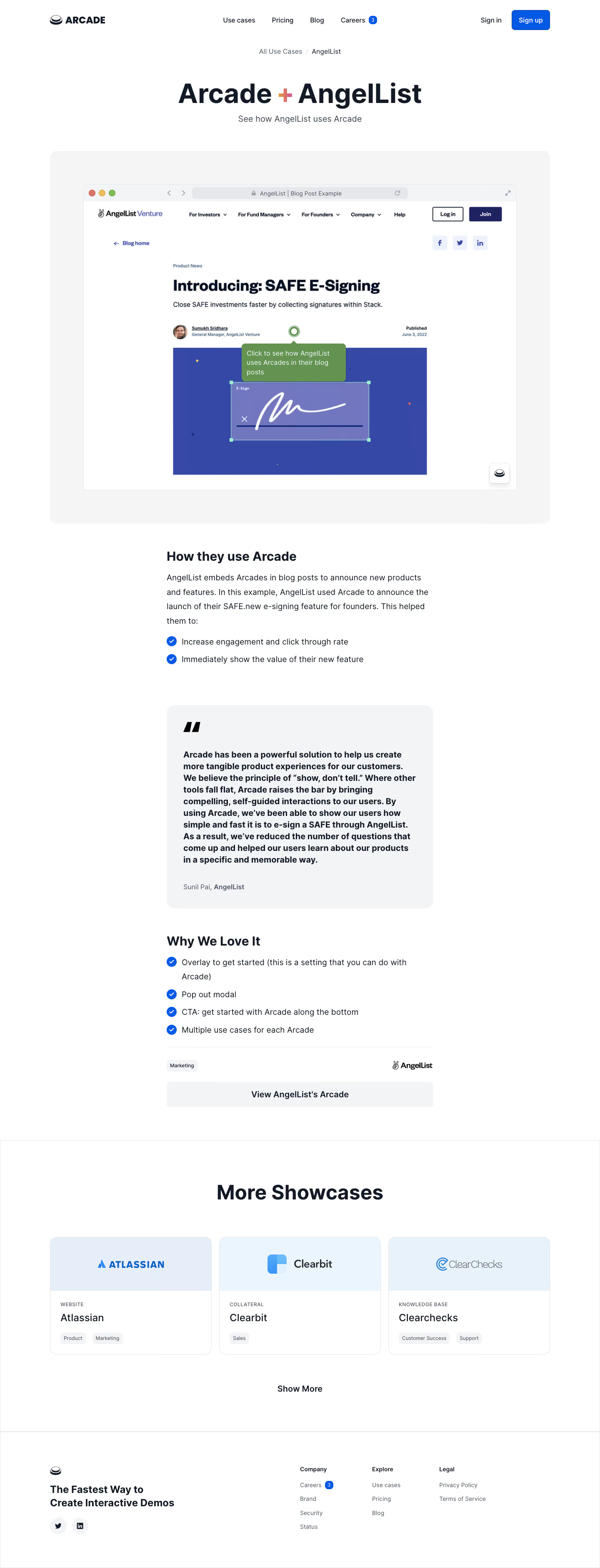
# Design from Reference: Arcade Customer Stories
Create an original, high-fidelity visual design inspired by the reference. Prioritize composition, typography, colors, spacing, and component styling over technical implementation.
## Reference
- **Product:** Arcade
- **Category:** Customer Stories
- **Screenshot:** https://cdn.prod.website-files.com/5e9dc792e1210c5325f7ebbc/6acb6f553156cd8dbc4713bd_6acb6e7aac21a1e4ab677d7c_cms-5f46bb3068b0cbf135410203.webp
Analyze the screenshot first. If inaccessible, request it rather than guessing.
## Content
{{content.instructions}}
{{content.data}}
Preserve essential messaging and factual accuracy. Adapt structure and copy length for visual balance; never invent product claims.
## Visual Design
### Overall aesthetic
- **Style:** Clean customer-showcase article with a large interactive-demo illustration, narrow editorial body, and related-story cards.
- **Character:** White space, dark navy text, blue checkmarks and actions, pale neutral panels, and minimal decorative gradients.
- **Brand pairing:** Centered Arcade + AngelList title uses a small warm gradient plus sign to join the two names.
### Page composition
- **Capture and scale:** 1440 × 3761 image px. CSS estimates assume approximately 1× capture; scale is unverified.
- **Header:** Approximately 1200px-wide centered row with brand left, compact navigation center, and sign-in/signup right.
- **Hero:** Centered breadcrumb, large paired-brand title, and one-line subtitle.
- **Demo showcase:** Broad pale-gray rounded surround about 1200px wide containing a framed browser illustration of the customer’s blog and a green instructional tooltip.
- **Editorial body:** Narrow centered column about 640px wide, beginning with a usage explanation and two checked benefits.
- **Testimonial:** Pale-gray rounded quotation card followed by a second heading and four checked observations.
- **Article close:** Fine rule, small category tag and customer logo, then a full-width pale view-demo action.
- **Related stories:** Broad section with centered heading and three equal cards, followed by Show More.
- **Footer:** Brand/tagline and circular socials at left, three compact navigation groups at right.
### Information hierarchy
- **Hero:** Large paired names identify the customer example before the demonstration.
- **Visual evidence:** The browser mockup is the largest object, showing the product embedded in a customer workflow.
- **Article:** Short heading, paragraph, checked outcomes, substantial testimonial, then product-use observations.
- **Testimonial:** Heavy multiline quote and large quotation mark create a distinct proof block; attribution is smaller.
- **Related content:** Logo panels, small uppercase use-case labels, customer names, and category chips provide descending card hierarchy.
- **Actions:** Blue signup in the header, pale article-level demo button, and plain Show More separate conversion from exploration.
### Typography
- **Family:** Neutral proportional sans serif; exact family is unverified.
- **Hero title:** Approximately 64px bold with 76px line-height and slightly tight tracking.
- **Hero subtitle:** Approximately 20–22px regular in slate gray.
- **Article headings:** Approximately 30–32px semibold with 38px line-height.
- **Body and checked lists:** Approximately 20px regular with 32–34px line-height.
- **Quote:** Approximately 20px bold with 28px line-height; attribution around 16px.
- **Related heading / card title:** Approximately 48px bold section heading and 24px medium card titles.
- **Small roles:** Navigation around 16px; uppercase labels/chips and footer links around 12–14px.
- **Precision:** All text sizes, weights, and tracking are estimates, not verified CSS/font metadata.
### Colors & surfaces
- **Canvas:** Sampled #FFFFFF.
- **Primary text:** Sampled #121927.
- **Neutral panels:** Sampled #F3F4F6 and #F5F5F5.
- **Action blue:** Sampled #005AE4 after ICC-to-sRGB conversion.
- **Related logo panels:** Sampled pale blues #E8F2FA, #E6EEF9, and #EAF5FD.
- **Embedded demo:** Sampled #3648A6 in the large blue illustration and #639251 in the green instructional overlay.
- **Boundaries:** Fine pale-gray outlines define browser frame and related cards; shadows are restrained.
- **Sampling:** Colors describe the converted screenshot, including the nested customer demo, rather than verified site tokens.
### Components
- **Header signup:** Compact blue rectangle around 92 × 48px with white text and 8px radius.
- **Demo surround:** Approximately 20px radius with broad 80px insets around the browser illustration.
- **Browser frame:** Thin gray outline, small rounded corners, traffic-light dots, navigation icons, address strip, and expand symbol.
- **Demo annotation:** Green rounded tooltip with white multiline instructions and a small pointing notch/hotspot. Its actual interaction is unverified.
- **Checked lists:** Blue circular check icons around 24px with hanging text alignment for wrapped items.
- **Quote card:** About 640px wide, approximately 24px radius, and 40px padding; oversized quotation mark above the quote.
- **Article CTA:** Full-column pale-gray rectangle about 60px high, 8px radius, bold centered label.
- **Related cards:** About 388px wide, 16px radius, thin border, pale logo banner, white content area, and small rounded neutral category chips.
- **Footer socials:** Dark icons on pale circular backgrounds.
- **State limits:** Only one demo annotation and static card states are shown; navigation, Show More, and playback are not demonstrated.
### Visual rhythm
- **Width variation:** Broad hero/demo and related grid alternate with a narrow readable article column.
- **Editorial spacing:** Large section breaks separate explanation, quotation, observations, and related content.
- **List rhythm:** Repeated circular checks create a clear left-hand scanning line.
- **Card rhythm:** Three equal related cards share banner heights, content insets, and chip placement.
- **Footer transition:** Full-width fine rules divide related content and footer from the article.
### Responsive
- **Observed state:** Desktop only; mobile and interaction behavior are unverified.
- **Article recommendation:** Retain a readable 640px maximum with 20–24px gutters.
- **Demo recommendation:** Scale the preview as a unit and offer an accessible full-size view rather than shrinking instructional text excessively.
- **Grid recommendation:** Reduce related cards to two then one column.
- **Header/footer recommendation:** Collapse navigation and wrap footer groups while preserving signup access.
### Adaptation guidance
- **Preserve:** Paired-brand hero, prominent demo evidence, narrow story body, highlighted testimonial, and structured related content.
- **Starting geometry:** Approximately 1200px broad container, 640px article, 64px hero title, 40px quote padding, and 16–24px radii under the unverified 1× assumption.
- **Content fidelity:** Use approved customer examples and quotes; do not convert historical testimonial claims into independently verified outcomes.
- **Demo adaptation:** Use the supplied recording or screenshots and deliberately authored hotspots; visible annotation does not establish playback behavior.
- **Implementation recommendation:** Provide clear accessible actions and keyboard-operable demos with meaningful alternatives.
Use this context to reproduce the reference's visual language: layout, typography, colors, spacing, borders, radii, and distinctive elements. The screenshot takes priority if descriptions conflict.
## Direction
{{preferences.fidelityInstructions}}
## Output
{{output.instructions}}
Deliver a polished, cohesive design with precise alignment, hierarchy, and spacing. Produce the requested visual artifact, not just a description. If unsupported, explain the limitation.


Category
Patterns
No items found.
Tech Stack


Added on
March 13, 2023
Similar screens





Upgrade to SaaSFrame Pro now to see similar examples.
Monthly
$18 /month
Billed $18 monthly
Browse all screens & flows
Filter and search screens & flows
Search text in screenshots
Access Figma files
Access mobile versions
Join now
Quarterly
$16 /month
Billed $48 quarterly
Browse all screens & flows
Filter and search screens & flows
Search text in screenshots
Access Figma files
Access mobile versions
Join now
Yearly
$15 /month
Billed $180 yearly
Browse all screens & flows
Filter and search screens & flows
Search text in screenshots
Access Figma files
Access mobile versions
Join now