Design with AI
Generate a new design based on this screen using your own content.
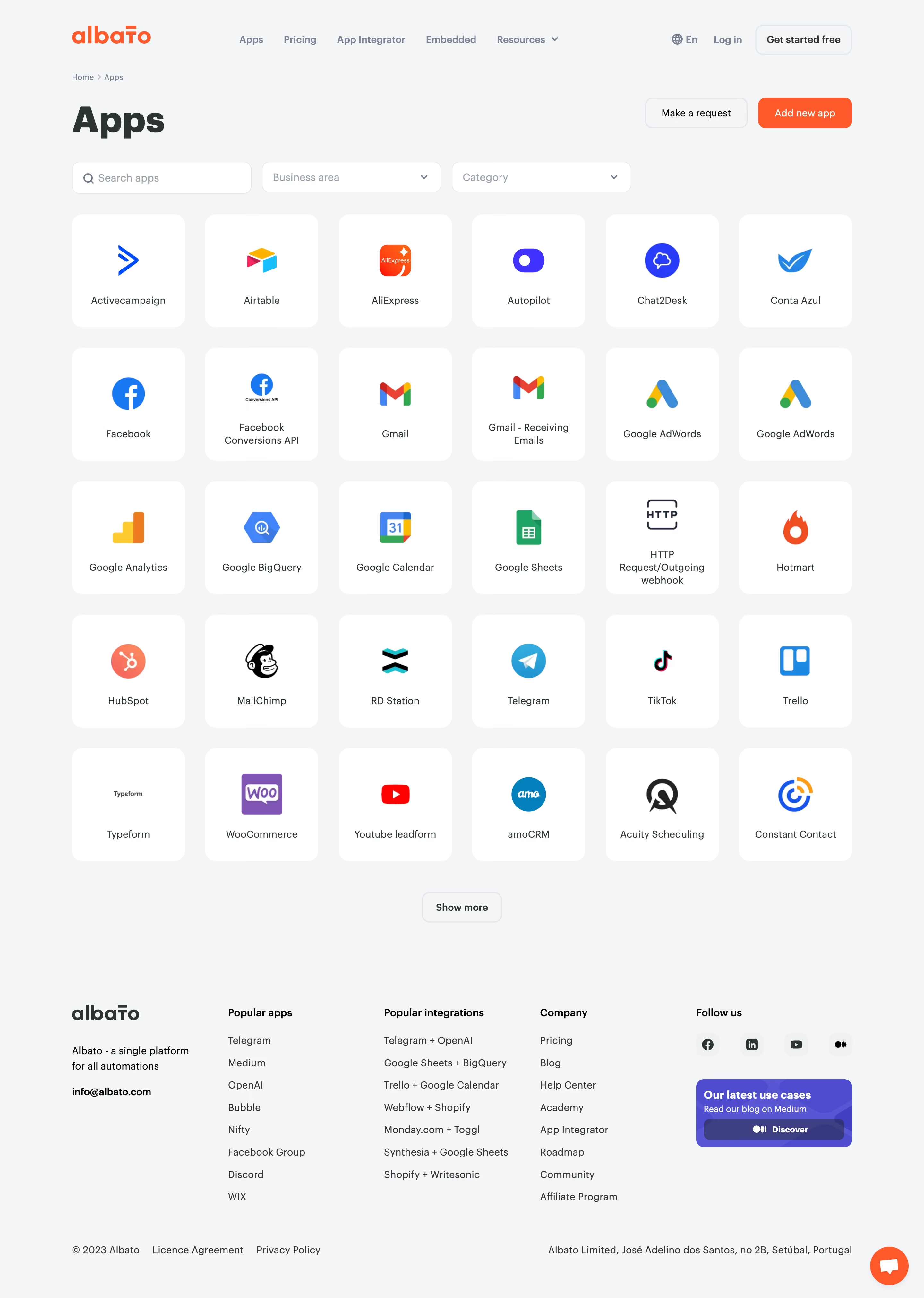
# Design from Reference: Albato Integrations Library
Create an original, high-fidelity visual design inspired by the reference. Prioritize composition, typography, colors, spacing, and component styling over technical implementation.
## Reference
- **Product:** Albato
- **Category:** Integrations Library
- **Screenshot:** https://cdn.prod.website-files.com/5e9dc792e1210c5325f7ebbc/6acada5ca43009b06fe6f1b8_6acad9f0b3daa04f5427c10f_cms-223ade8350337011fc54ec08.webp
Analyze the screenshot first. If inaccessible, request it rather than guessing.
## Content
{{content.instructions}}
{{content.data}}
Preserve essential messaging and factual accuracy. Adapt structure and copy length for visual balance; never invent product claims.
## Visual Design
### Overall aesthetic
- **Character:** A light application directory with a dense logo-card grid, orange brand accents and a restrained gray footer.
- **Evidence scale:** Original 2880 × 4046 pixels, inspected through both readable crops. CSS estimates assume an unverified 2× capture scale.
### Page composition
- **Header:** Albato logo left, product links center and language/login/get-started utilities right.
- **Directory heading:** Breadcrumb above a large Apps title, with request/add-app actions aligned right.
- **Filters:** Search, business-area dropdown and category dropdown share one row.
- **Grid:** Thirty app tiles form six columns and five rows, followed by centered Show more.
- **Footer:** Brand/contact block, popular-app/integration/company columns and social/use-case promotion, then legal/address row.
### Information hierarchy
- **Title:** Large dark Apps heading anchors the page.
- **Discovery:** Search/filter row precedes the logo grid.
- **Tiles:** Large app mark above centered name; some names wrap to two or three lines.
- **Actions:** Orange Add new app is stronger than outlined request and show-more controls.
- **Footer:** Bold group labels separate secondary resources.
### Typography
- **Page title:** Unverified sans-serif around 56 px bold.
- **Tile names:** Approximately 16 px regular, 20 px line height.
- **Navigation:** Around 14 px semibold.
- **Footer:** Around 16 px regular with 34 px link pitch.
- **Controls:** Approximately 16 px medium.
### Colors & surfaces
- **Canvas:** Measured #F4F5F6.
- **Tiles/fields:** White #FFFFFF.
- **Ink:** Dark green-gray #2A3534 and #333333.
- **Brand/action:** Orange #FF4600.
- **Footer promotion:** Purple #4D4BD5, #5856DD and dark #3E3E87; app logos retain diverse colors.
### Components
- **Tiles:** Approximately 176 × 176 px white squares, 16 px radii and no strong shadow.
- **Filters:** Roughly 280 × 48 px white bordered rounded fields, magnifier/chevrons.
- **Actions:** Rounded rectangular request/add buttons around 48 px tall.
- **Show more:** Small outlined rounded button centered beneath the grid.
- **Footer promotion:** Purple rounded card with two-line copy and darker Discover strip.
- **Support:** Orange circular chat control at lower right.
### Visual rhythm
- **Grid:** Approximately 32 px gaps create even six-column spacing.
- **Tile anatomy:** Logos occupy the upper-middle; names sit on a common lower band.
- **Footer:** Large gap after Show more separates browsing from secondary links.
### Responsive
- **Observed limit:** Desktop only.
- **Recommendation:** Reduce grid columns progressively and stack filter controls.
- **Tile handling:** Preserve logo/name association and allow long names to wrap without reducing legibility.
### Adaptation guidance
- **Retain:** Simple logo-first discovery with visible search and taxonomy.
- **Implement:** Neutral cards, consistent radii and one orange action emphasis.
- **Verify:** Confirm fonts, scale and integration/filter behavior separately; no app was added or connected.
Use this context to reproduce the reference's visual language: layout, typography, colors, spacing, borders, radii, and distinctive elements. The screenshot takes priority if descriptions conflict.
## Direction
{{preferences.fidelityInstructions}}
## Output
{{output.instructions}}
Deliver a polished, cohesive design with precise alignment, hierarchy, and spacing. Produce the requested visual artifact, not just a description. If unsupported, explain the limitation.