SaaSFrame
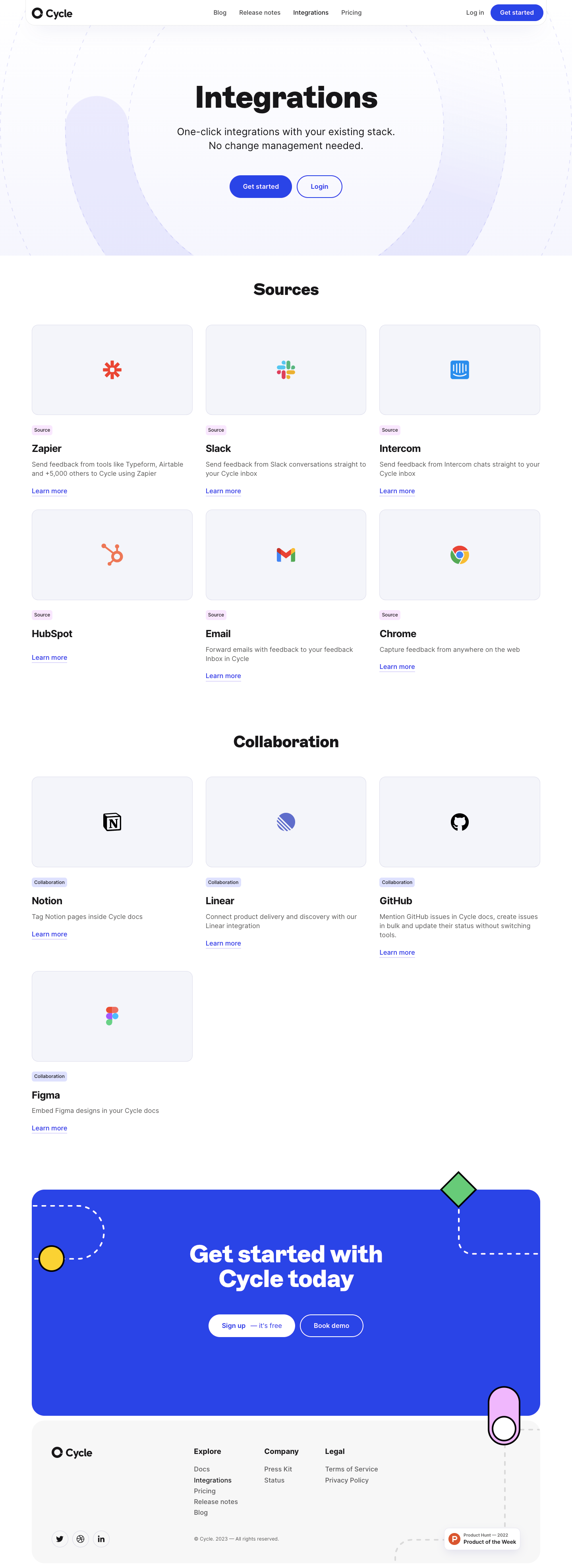
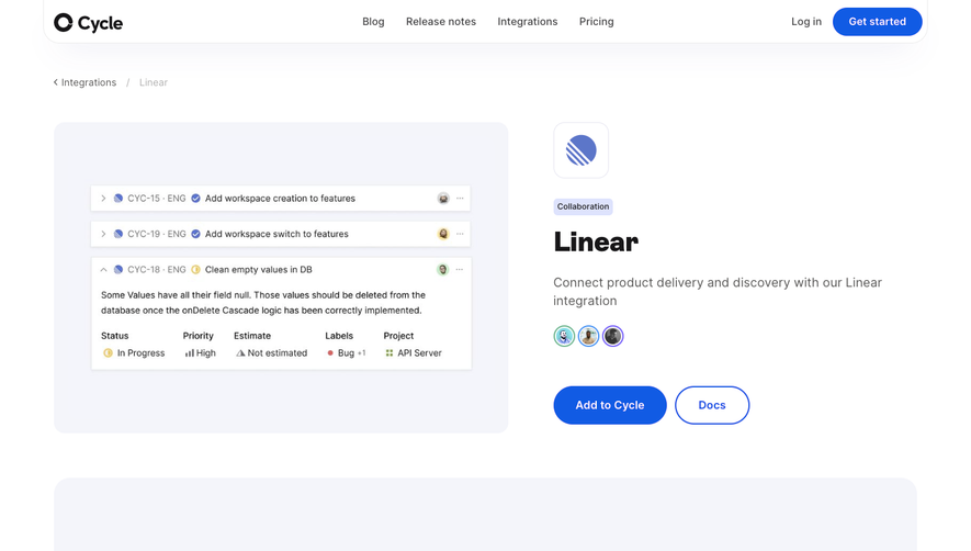
1. Header: The page has a top header section that includes the Cycle App logo and navigation links for "Cycle App," "Pricing," "Features," "Integrations," "Help," and "Login/Sign up." 2. Hero Section: The hero section includes a heading, "Connect Your Tools," and two subheadings, "Automate Your Workflow," and "Increase Productivity." There is a CTA button, "Get Started," which scrolls to the integrations section. 3. Integrations Section: The integrations section is the main focus of the page and takes up the majority of the space. It includes a search bar, where users can search for specific integrations. The integrations are arranged in large icon blocks, with each block representing a specific tool. The icon and name of the tool are displayed, along with a brief description of the integration and a "Learn More" button. 4. Featured Integrations: Under the integrations section is the featured integrations section. It showcases select integrations that Cycle App has partnered with. This section also includes a "Learn More" button. 5. Bottom Section: The bottom section includes a CTA banner with "Try Cycle App" and "Request a demo" buttons. There is also a section with customers' logos and a "Trusted by" label, which displays companies that use Cycle App's integrations. Finally, there are links to the Cycle App's social media handles and newsletters, along with a link to their blog. Overall, the page has a clear and straightforward design, with the focus on the integrations and the benefits they provide to users. The design uses simple colors, with the majority being white, black, and light pink. The page's structure is easy to navigate, with a clear hierarchy of headings and sections. The page's design is also optimized for mobile devices, ensuring that users have the best possible experience regardless of the device they are using.