
Thank you! Your submission has been received!
Oops! Something went wrong while submitting the form.
Get SaaSFrame Pro
Monthly
$18
Quarterly
$48
Yearly
$180
Upgrade to access this feature
Browse all screens & flows
Filter and search screens & flows
Access Figma files
Access mobile versions
Bookmark screens & flows
Join now
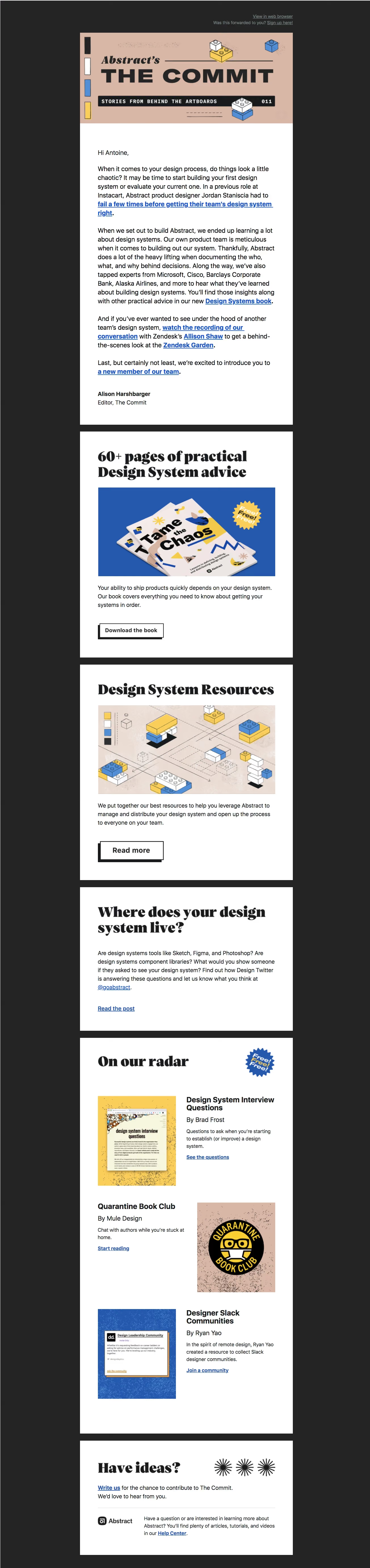
Abstract Newsletter

Abstract
Version, Collaborate & Share
Designed by
No items found.

Bookmark
Bookmark

Design with AI
Thank you! Your submission has been received!
Oops! Something went wrong while submitting the form.
# Design from Reference: Abstract Newsletter
Create an original, high-fidelity visual design inspired by the reference. Prioritize composition, typography, colors, spacing, and component styling over technical implementation.
## Reference
- **Product:** Abstract
- **Category:** Newsletters
- **Screenshot:** https://cdn.prod.website-files.com/5e9dc792e1210c5325f7ebbc/6acbceb175891049b1840164_6acbcd4179661806cce8ad84_cms-fb7dd478a450734d5a582005.webp
Analyze the screenshot first. If inaccessible, request it rather than guessing.
## Content
{{content.instructions}}
{{content.data}}
Preserve essential messaging and factual accuracy. Adapt structure and copy length for visual balance; never invent product claims.
## Visual Design
### Overall aesthetic
- **Character:** Editorial design newsletter with a charcoal outer canvas, stacked white content blocks and a peach illustrated masthead.
- **Visual language:** Heavy display serif headings, bold blue underlined links, block-like illustrations and hard-offset button shadows create a print-inspired identity.
- **Capture:** The image measures 1304 × 5516 px and was inspected in four portions. Dimensions below are image estimates; email-client/CSS scale is unverified.
### Page composition
- **Preheader:** Small muted web-view/signup links align near the top-right of the centered email column.
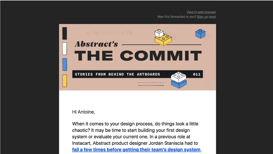
- **Masthead:** A peach banner contains the publication title, issue strip and small blue/yellow/white construction-block drawings.
- **Introduction:** A large white block contains greeting, several editorial paragraphs with prominent inline links and a named editor sign-off.
- **Feature blocks:** Separate white sections promote a design-systems book, a resources collection and a text-led discussion item.
- **Curated section:** An On our radar block contains three alternating image/text recommendations.
- **Closing:** A final white panel invites contributions, adds starburst graphics and separates a compact brand/help-center row with a fine rule.
### Information hierarchy
- **Publication:** The oversized masthead title and issue label establish newsletter identity before prose.
- **Editorial lead:** Multiple bold blue underlined links within the introduction direct readers to related stories/resources.
- **Features:** Large serif headlines lead image, short explanation and outlined action for the first two promotions.
- **Curated items:** Sans-serif item titles, bylines, descriptions and blue links sit beside colorful thumbnails.
- **Closing support:** Contribution and help links are visually distinct from the promotional feature actions.
### Typography
- **Display:** Heavy high-contrast serif headings, approximately 48–54 image px, use tight leading. Exact identity is unverified.
- **Body:** Conventional sans-serif around 22–23 px with 31–32 px line-height.
- **Links:** Bold blue underlined text uses the same body size, providing strong scanning anchors.
- **Curated titles:** Approximately 26–28 px bold sans-serif, with regular bylines beneath.
- **Masthead:** Large block capitals and smaller monospaced-looking issue-strip lettering are part of the graphic banner.
- **Small roles:** Preheader/help text is smaller and more muted than editorial prose.
### Colors & surfaces
- **Measured base:** ICC-aware sRGB sampling yields charcoal #242424 and white #FFFFFF.
- **Measured masthead:** Peach #D8B7A7 defines the publication banner and some artwork.
- **Measured accent:** Blue #2459AD appears in links/imagery.
- **Secondary art:** Yellow, blue, black and white recur in block drawings, book cover and recommendation thumbnails.
- **Depth:** White sections are flat; action buttons use strong black offset shadows rather than soft elevation.
### Components
- **Masthead artwork:** Construction-block drawings, vertical swatches and a black issue strip surround the publication name.
- **Content panels:** Consistent-width white rectangles are separated by visible charcoal gutters.
- **Feature images:** A blue-backed book mockup and peach construction-block diagram span the inner content width.
- **Outlined buttons:** White rectangular actions have thin black borders and hard black lower-left offset shadows.
- **Curated rows:** Alternating thumbnails and text columns include title, byline, short summary and underlined destination.
- **Badges/decorations:** Starburst free-resource badges and three black radial stars add editorial texture.
- **Closing row:** A small brand mark sits beside support copy under a thin gray divider.
### Visual rhythm
- **Column:** A roughly 750 px-wide email column is centered within broad dark margins.
- **Panel padding:** Approximately 60 px inner margins align prose, headings and imagery.
- **Block cadence:** Dark horizontal gutters clearly separate each story/promotion.
- **Internal spacing:** Large heading-to-image and paragraph-to-action gaps create a magazine-like pace.
- **Alternation:** Curated image/text rows reverse sides while keeping a shared grid.
### Responsive
- **Evidence limit:** Only one email rendering is shown; recommendations follow.
- **Column:** Use fluid width and smaller mobile padding.
- **Rows:** Stack curated images above their associated text.
- **Type:** Scale display headings while preserving readable body text and strong link underlines.
- **Images/buttons:** Keep images proportional and actions comfortably touchable.
### Adaptation guidance
- **Reusable pattern:** Combine a strong publication masthead, editorial introduction, two major resources and a curated recommendation section.
- **Identity:** Reuse peach/blue/yellow illustrations and bold serif headings for a coherent editorial system.
- **Content hierarchy:** Keep primary feature actions distinct from inline editorial/support links.
- **Accessibility:** Preserve semantic headings, meaningful link names and image alternatives; avoid relying on raster masthead text alone.
Use this context to reproduce the reference's visual language: layout, typography, colors, spacing, borders, radii, and distinctive elements. The screenshot takes priority if descriptions conflict.
## Direction
{{preferences.fidelityInstructions}}
## Output
{{output.instructions}}
Deliver a polished, cohesive design with precise alignment, hierarchy, and spacing. Produce the requested visual artifact, not just a description. If unsupported, explain the limitation.


Category
Patterns
No items found.
Tech Stack



Added on
May 27, 2020
Found in 1 flow

Similar screens
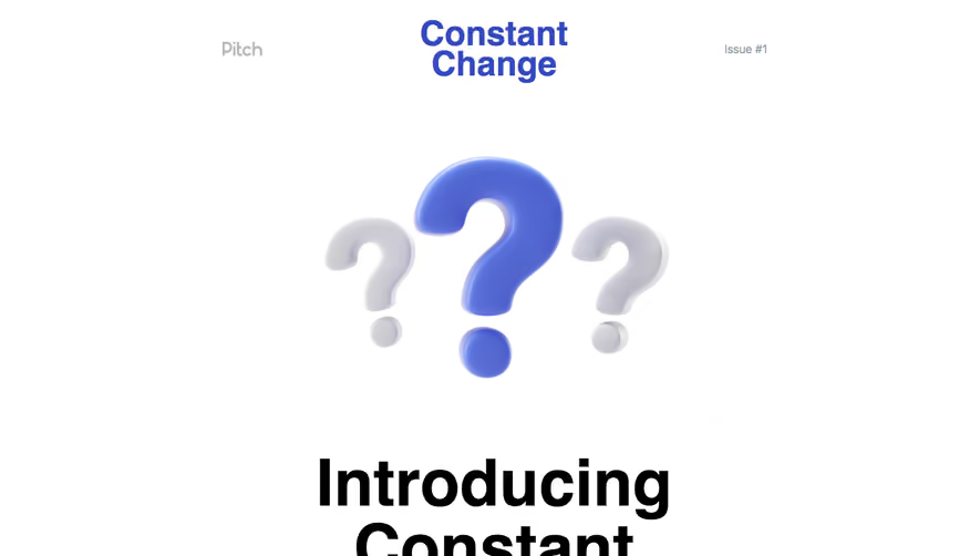


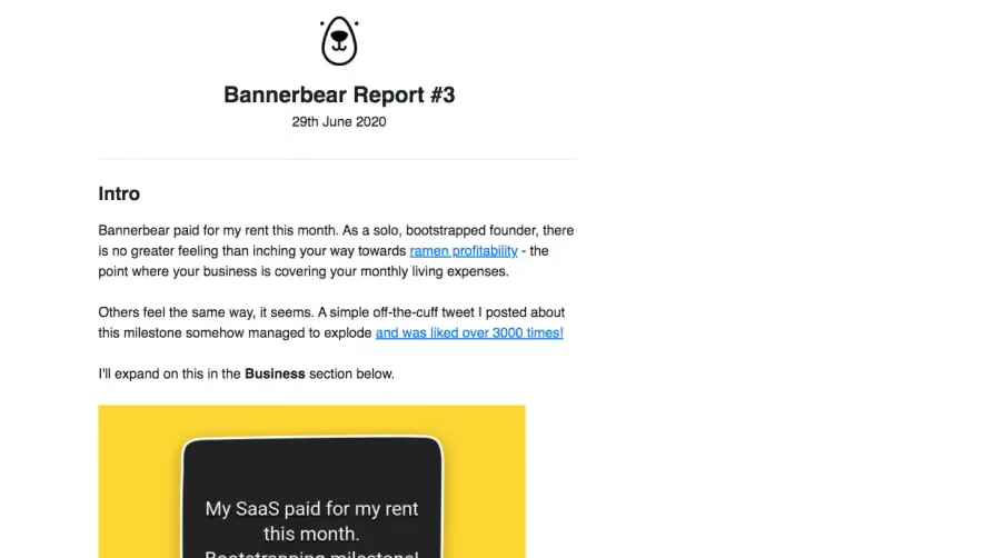

Upgrade to SaaSFrame Pro now to see similar examples.
Monthly
$18 /month
Billed $18 monthly
Browse all screens & flows
Filter and search screens & flows
Search text in screenshots
Access Figma files
Access mobile versions
Join now
Quarterly
$16 /month
Billed $48 quarterly
Browse all screens & flows
Filter and search screens & flows
Search text in screenshots
Access Figma files
Access mobile versions
Join now
Yearly
$15 /month
Billed $180 yearly
Browse all screens & flows
Filter and search screens & flows
Search text in screenshots
Access Figma files
Access mobile versions
Join now