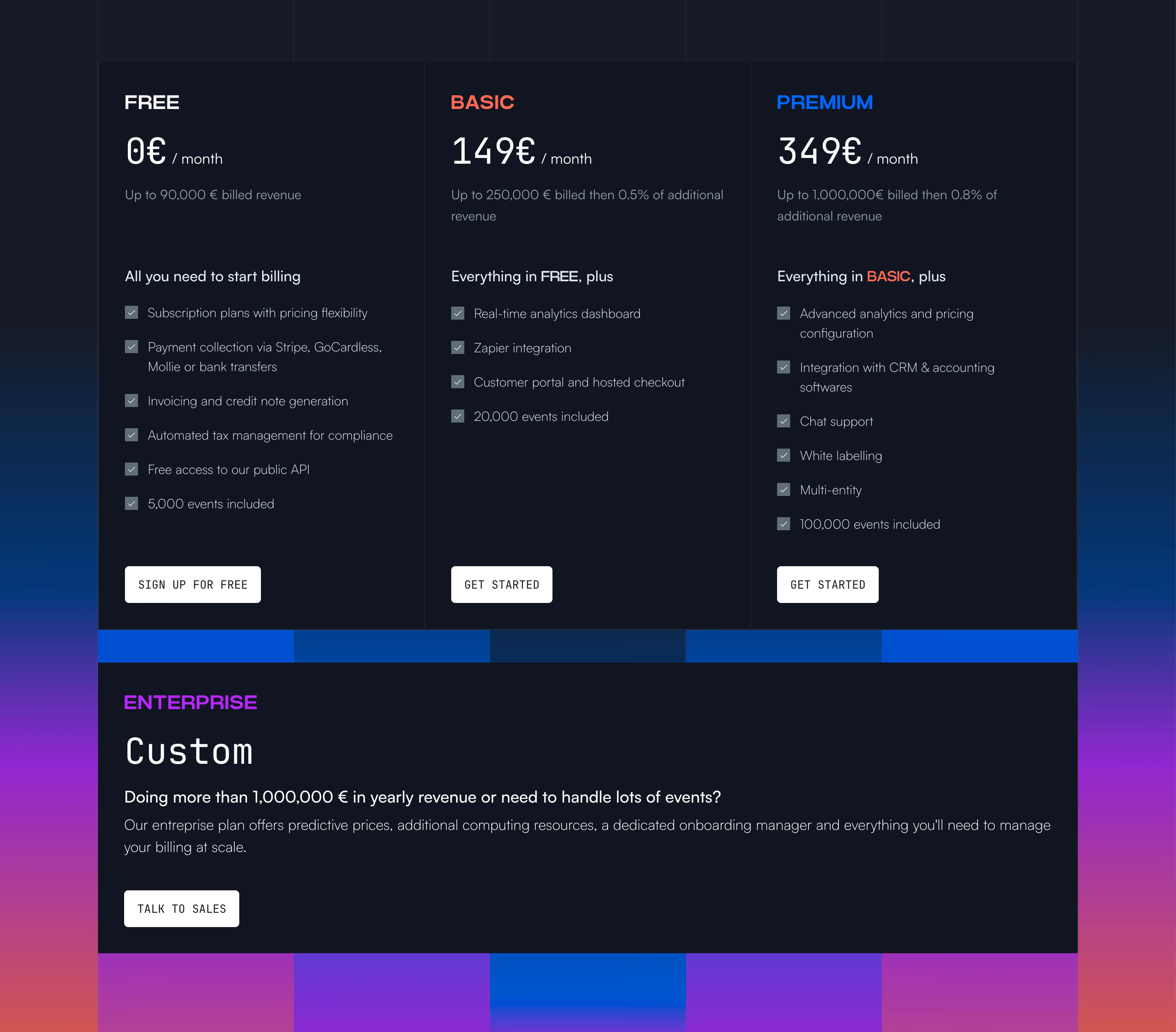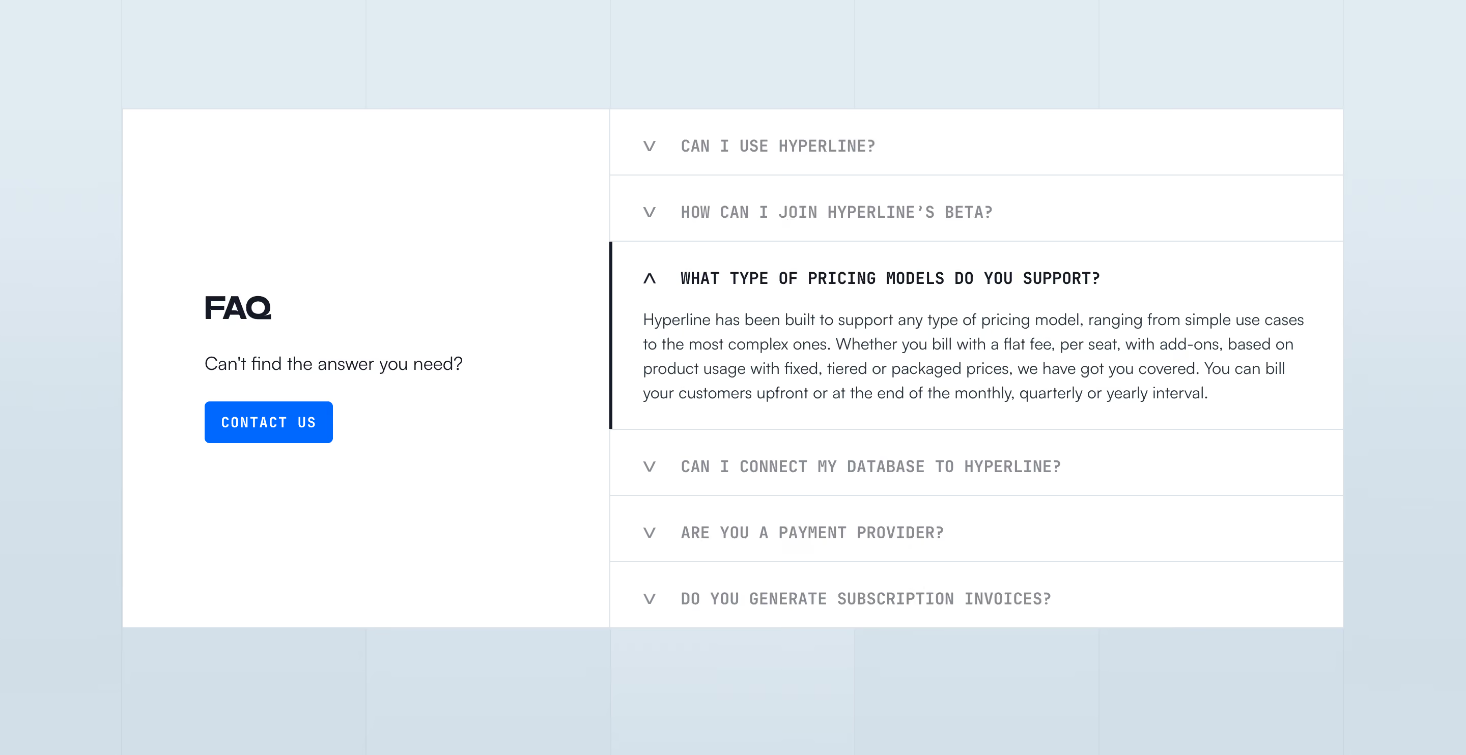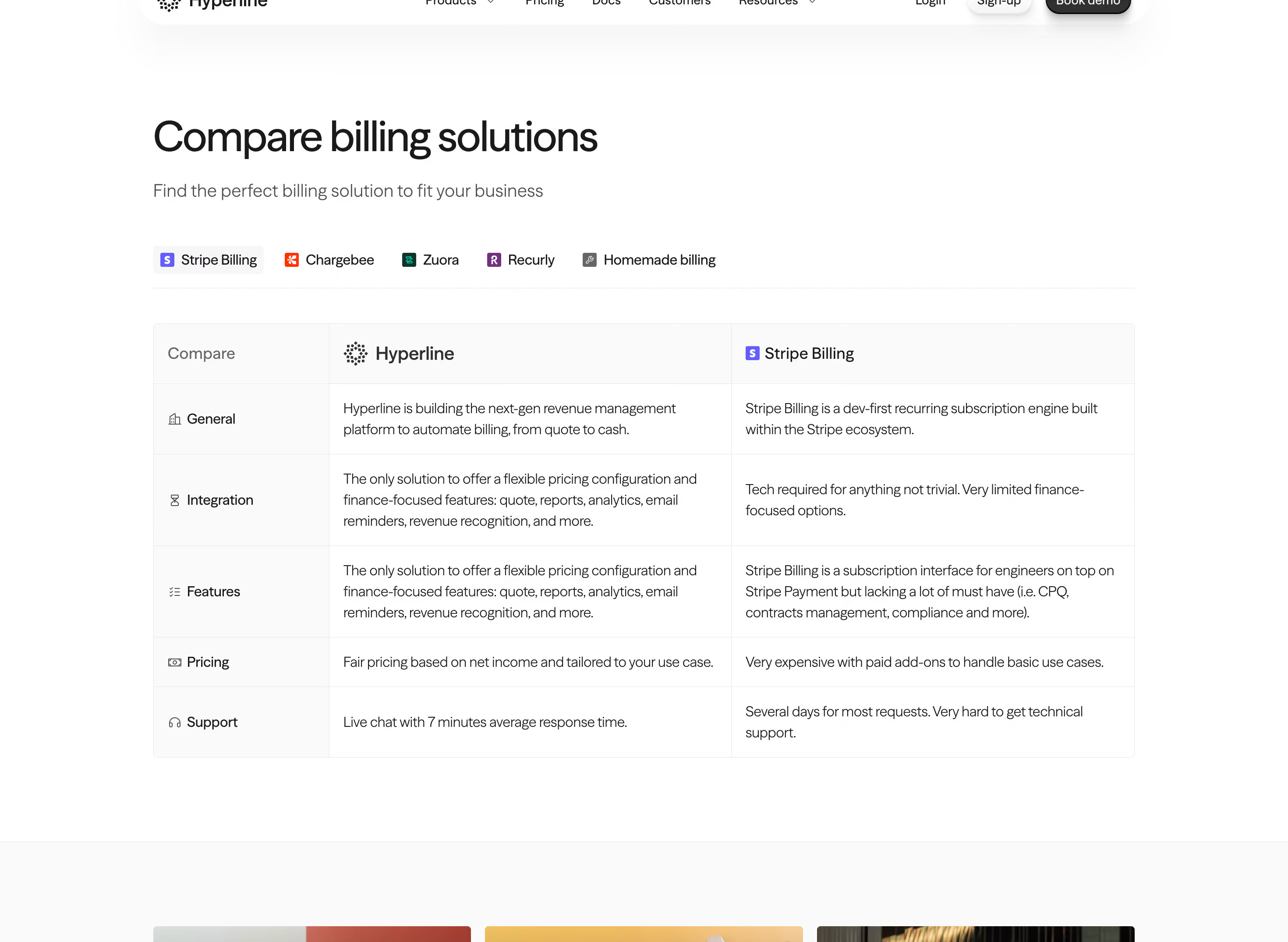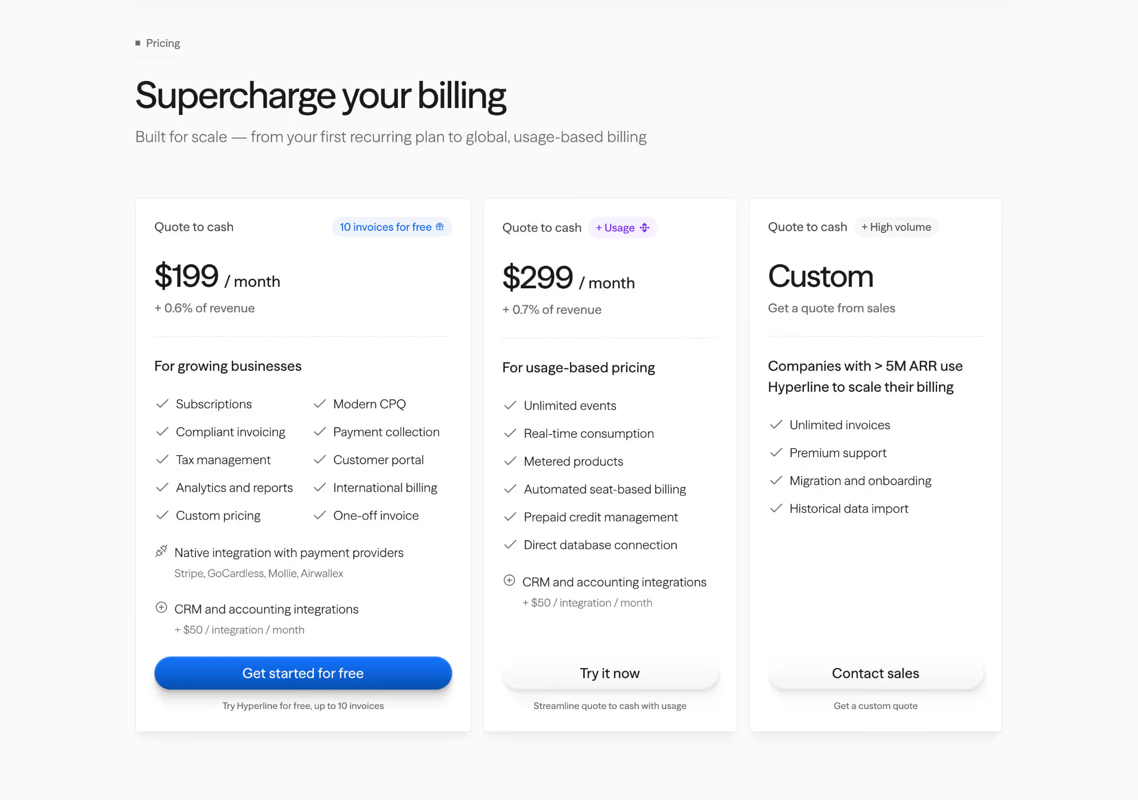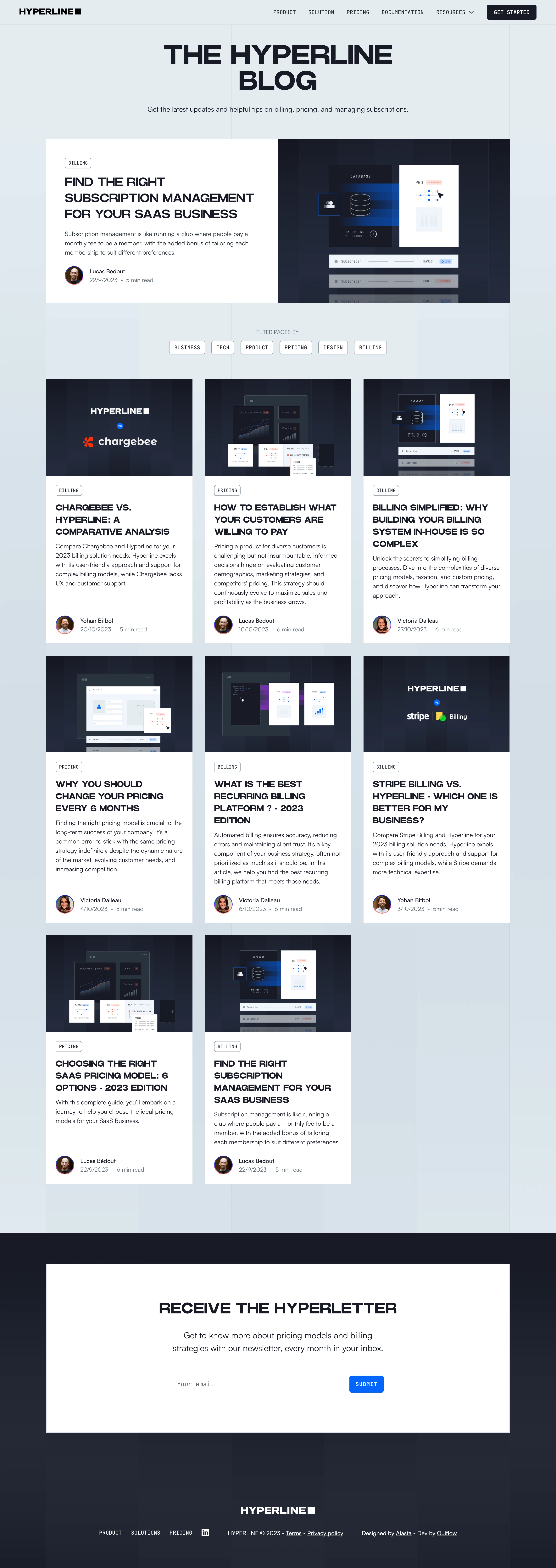

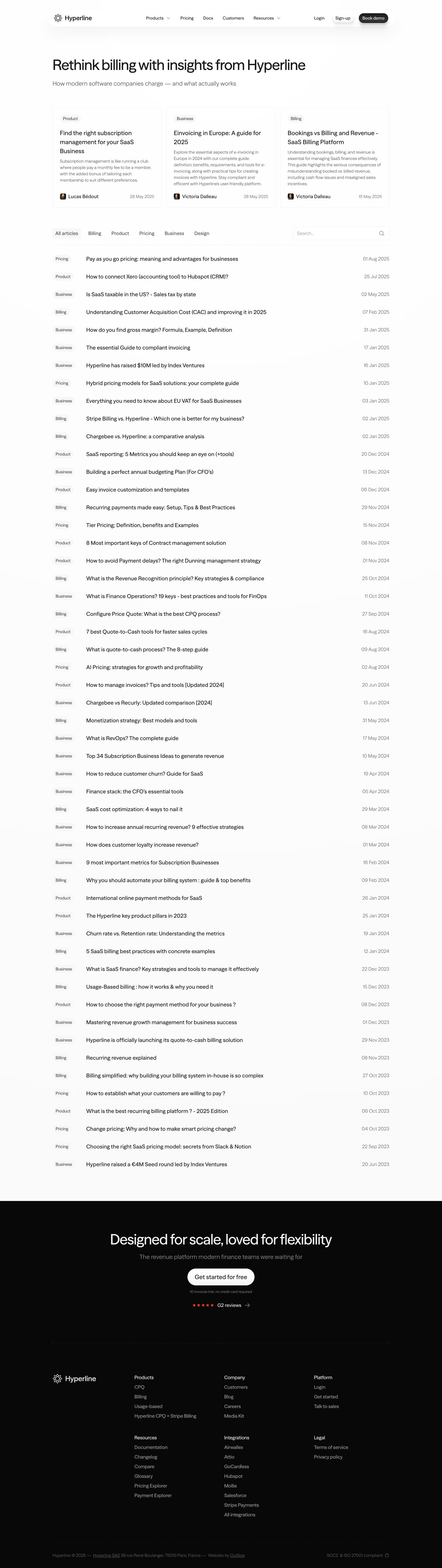


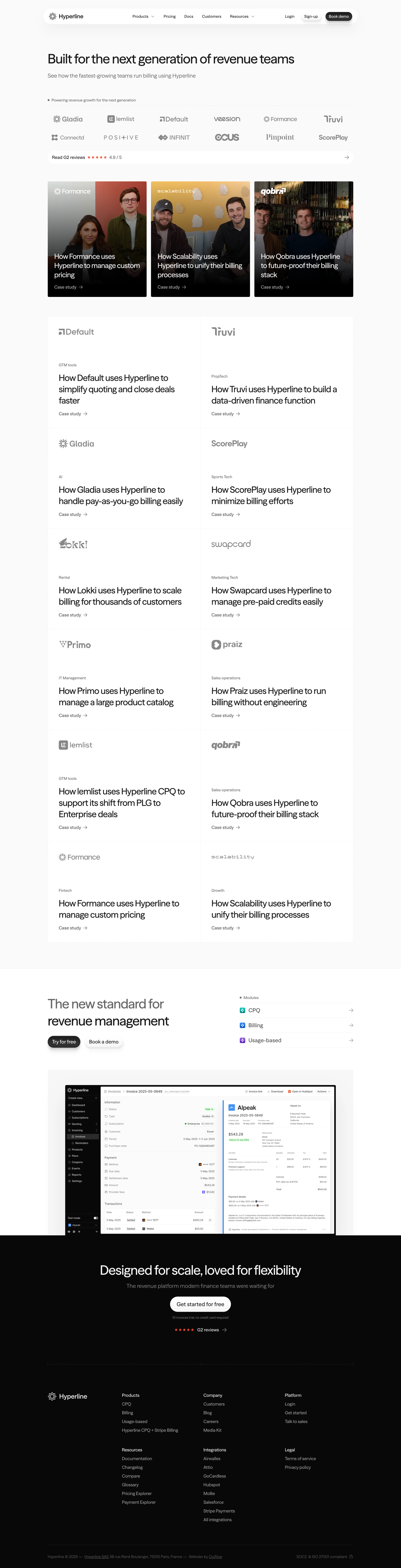




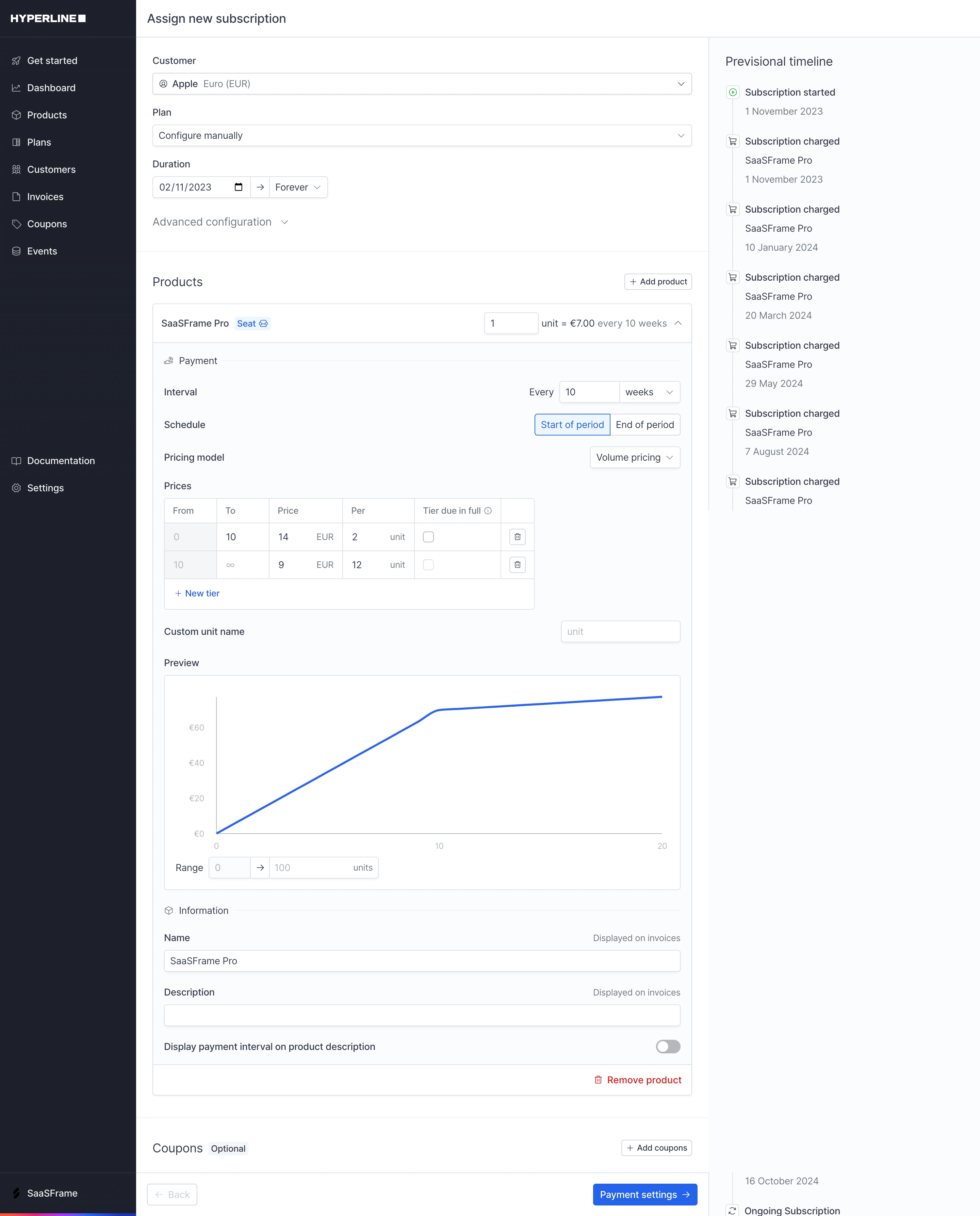


Figma file available
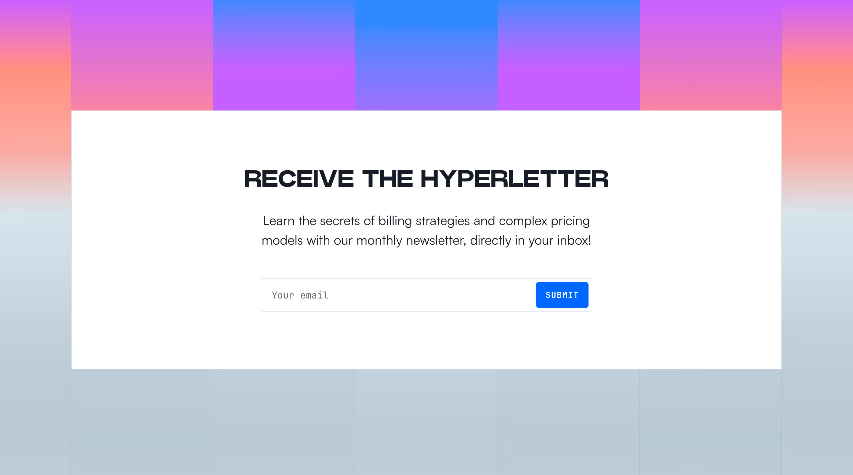


Hyperline's marketing site is built on Webflow (confirmed via website-files.com CDN and footer credit to Ouiflow, a Webflow development agency). Assets are served from cdn.prod.website-files.com. No custom front-end framework detected — standard Webflow class-based styling.
The site uses a clean, modern sans-serif type system consistent with premium B2B SaaS. Based on visual analysis and Webflow conventions:
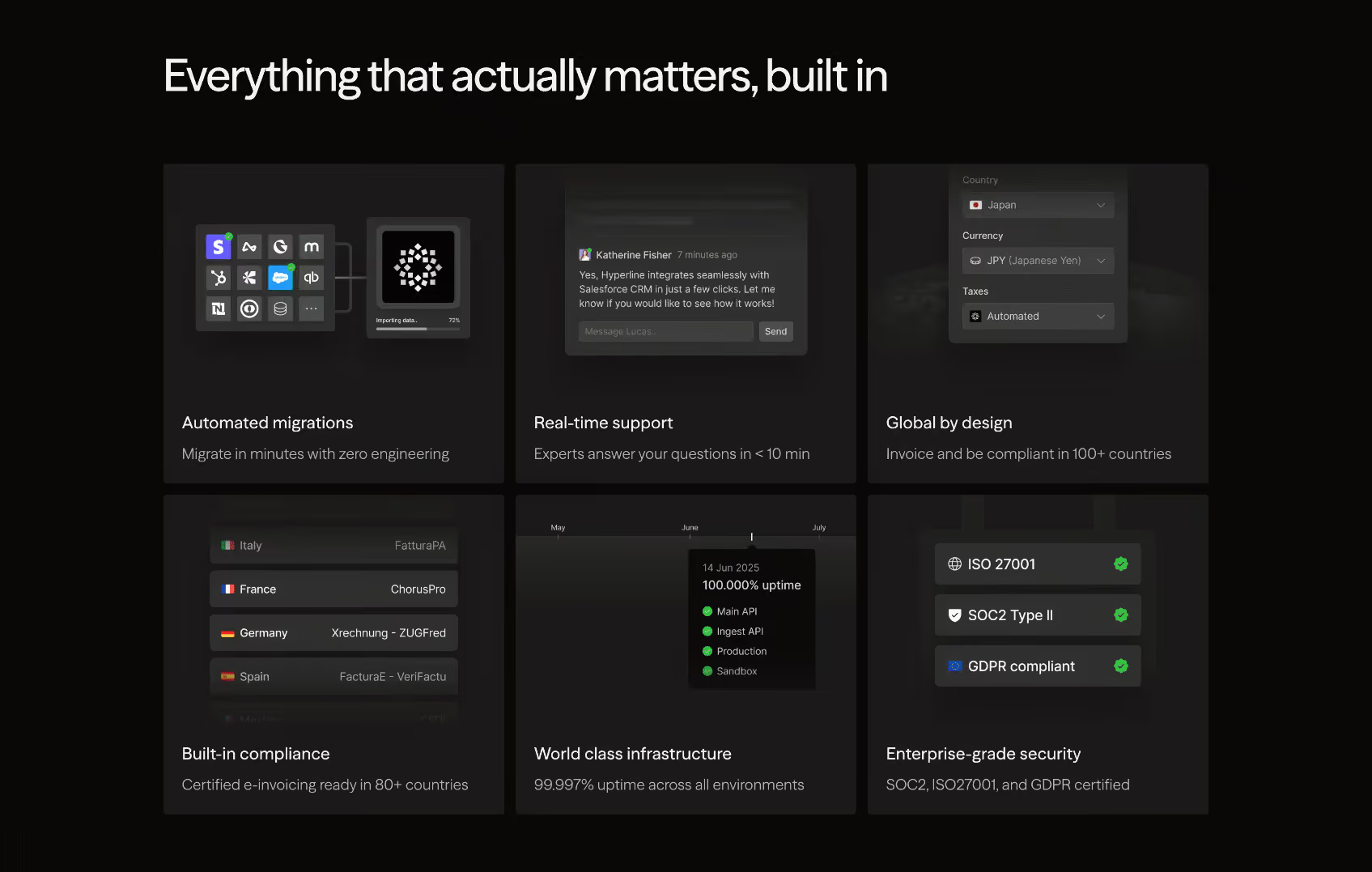
Hyperline uses a dark-first design language — the homepage hero and footer operate on a near-black background (#0A0A0B or similar), with product screenshots rendered on dark cards. The overall palette is high-contrast with a single vivid accent color (electric blue/violet) used for CTAs and interactive elements. Secondary sections use a very light off-white/gray background for contrast alternation.
#0B0B0F)#F7F7F8)#4F46E5 – #6366F1)#FFFFFF)#A1A1AA)#22C55E) used in metrics#27272A on dark, #E4E4E7 on light)Spacing follows an 8px base grid, consistent with Webflow's default spacing system:
/\* ============================================
   HYPERLINE DESIGN SYSTEM — CSS VARIABLES
   Derived from visual analysis of hyperline.co
   Built on Webflow — tokens are inferred
   ============================================ \*/

:root {
  /_ --- Brand Colors --- _/
  --color-brand-primary: #5B5BD6;       /_ Indigo accent — CTAs, links, highlights _/
  --color-brand-primary-hover: #4F46E5; /_ Darker on hover _/
  --color-brand-secondary: #818CF8;     /_ Lighter indigo — gradients, glows _/

  /_ --- Background --- _/
  --color-bg-base: #0B0B0F;             /_ Hero / footer dark background _/
  --color-bg-surface: #111116;          /_ Card / panel background (dark) _/
  --color-bg-elevated: #18181B;         /_ Elevated card / dropdown _/
  --color-bg-light: #F7F7F8;            /_ Light section background _/
  --color-bg-light-surface: #FFFFFF;    /_ White card on light bg _/
  --color-bg-light-muted: #F4F4F5;      /_ Muted light surface _/

  /_ --- Text --- _/
  --color-text-primary: #FFFFFF;        /_ Primary text on dark _/
  --color-text-secondary: #A1A1AA;      /_ Muted / supporting text _/
  --color-text-tertiary: #71717A;       /_ Placeholder / disabled _/
  --color-text-on-light: #09090B;       /_ Primary text on light bg _/
  --color-text-on-light-muted: #52525B; /_ Muted text on light bg _/

  /_ --- Border --- _/
  --color-border-dark: #27272A;         /_ Subtle border on dark sections _/
  --color-border-light: #E4E4E7;        /_ Border on light sections _/
  --color-border-brand: #5B5BD6;        /_ Brand-colored border (focus, highlight) _/

  /_ --- Status Colors --- _/
  --color-success: #22C55E;
  --color-success-bg: #052E16;
  --color-warning: #F59E0B;
  --color-error: #EF4444;

  /_ --- Typography --- _/
  --font-family-base: 'Inter', -apple-system, BlinkMacSystemFont, 'Segoe UI', sans-serif;
  --font-family-display: 'Inter', sans-serif;

  --font-size-xs: 0.75rem;    /_ 12px _/
  --font-size-sm: 0.875rem;   /_ 14px _/
  --font-size-base: 1rem;     /_ 16px _/
  --font-size-md: 1.125rem;   /_ 18px _/
  --font-size-lg: 1.25rem;    /_ 20px _/
  --font-size-xl: 1.5rem;     /_ 24px _/
  --font-size-2xl: 2rem;      /_ 32px _/
  --font-size-3xl: 2.5rem;    /_ 40px _/
  --font-size-4xl: 3rem;      /_ 48px _/
  --font-size-hero: 4rem;     /_ 64px — hero H1 _/

  --font-weight-regular: 400;
  --font-weight-medium: 500;
  --font-weight-semibold: 600;
  --font-weight-bold: 700;
  --font-weight-extrabold: 800;

  --line-height-tight: 1.1;
  --line-height-snug: 1.25;
  --line-height-normal: 1.5;
  --line-height-relaxed: 1.65;

  --letter-spacing-tight: -0.02em;
  --letter-spacing-normal: 0em;
  --letter-spacing-wide: 0.05em;

  /_ --- Spacing (8px grid) --- _/
  --space-1: 0.25rem;   /_ 4px _/
  --space-2: 0.5rem;    /_ 8px _/
  --space-3: 0.75rem;   /_ 12px _/
  --space-4: 1rem;      /_ 16px _/
  --space-6: 1.5rem;    /_ 24px _/
  --space-8: 2rem;      /_ 32px _/
  --space-10: 2.5rem;   /_ 40px _/
  --space-12: 3rem;     /_ 48px _/
  --space-16: 4rem;     /_ 64px _/
  --space-20: 5rem;     /_ 80px _/
  --space-24: 6rem;     /_ 96px _/
  --space-32: 8rem;     /_ 128px _/

  /_ --- Border Radius --- _/
  --radius-sm: 4px;
  --radius-md: 8px;
  --radius-lg: 12px;
  --radius-xl: 16px;
  --radius-2xl: 24px;
  --radius-full: 9999px;  /_ Pills, badges _/

  /_ --- Shadows --- _/
  --shadow-sm: 0 1px 2px 0 rgba(0, 0, 0, 0.4);
  --shadow-md: 0 4px 6px -1px rgba(0, 0, 0, 0.5), 0 2px 4px -1px rgba(0, 0, 0, 0.3);
  --shadow-lg: 0 10px 15px -3px rgba(0, 0, 0, 0.6), 0 4px 6px -2px rgba(0, 0, 0, 0.3);
  --shadow-xl: 0 20px 25px -5px rgba(0, 0, 0, 0.7);
  --shadow-brand: 0 0 0 3px rgba(91, 91, 214, 0.3);  /_ Focus ring _/
  --shadow-glow: 0 0 40px rgba(91, 91, 214, 0.2);    /_ Brand glow on dark _/

  /_ --- Layout --- _/
  --max-width-content: 1280px;
  --max-width-text: 720px;
  --grid-columns: 12;
  --grid-gutter: 1.5rem; /_ 24px _/
  --section-padding-y: 5rem; /_ 80px _/

  /_ --- Motion --- _/
  --transition-fast: 150ms ease;
  --transition-base: 250ms ease;
  --transition-slow: 400ms ease;
  --transition-spring: 300ms cubic-bezier(0.34, 1.56, 0.64, 1);
}

/_ --- Light mode overrides (applied on light sections) --- _/
[data-theme="light"],
.section-light {
  --color-bg-base: #F7F7F8;
  --color-bg-surface: #FFFFFF;
  --color-bg-elevated: #F4F4F5;
  --color-text-primary: #09090B;
  --color-text-secondary: #52525B;
  --color-text-tertiary: #A1A1AA;
  --color-border-dark: #E4E4E7;
  --shadow-sm: 0 1px 3px 0 rgba(0, 0, 0, 0.08);
  --shadow-md: 0 4px 6px -1px rgba(0, 0, 0, 0.07), 0 2px 4px -1px rgba(0, 0, 0, 0.05);
  --shadow-lg: 0 10px 15px -3px rgba(0, 0, 0, 0.08), 0 4px 6px -2px rgba(0, 0, 0, 0.04);
}| Token | Value | Usage |
|---|---|---|
color-brand-primary | #5B5BD6 | Primary CTA buttons, active links, key highlights |
color-brand-secondary | #818CF8 | Gradient endpoints, decorative accents, glow effects |
color-bg-base | #0B0B0F | Hero section, footer, primary dark background |
color-bg-surface | #111116 | Dark cards, feature panels |
color-bg-light | #F7F7F8 | Alternating light sections |
color-text-primary | #FFFFFF | Headings and body on dark backgrounds |
color-text-secondary | #A1A1AA | Subheadings, supporting copy, captions |
color-text-on-light | #09090B | Text on white/light backgrounds |
color-border-dark | #27272A | Card borders and dividers on dark bg |
color-border-light | #E4E4E7 | Dividers and card borders on light bg |
color-success | #22C55E | Positive metrics, uptime indicators, success states |
color-error | #EF4444 | Error states, alerts |
| Token | Value | Usage |
|---|---|---|
space-1 | 4px | Icon padding, tight inline gaps |
space-2 | 8px | Component internal padding, small gaps |
space-4 | 16px | Default element spacing, button padding |
space-6 | 24px | Card internal padding, grid gutter |
space-8 | 32px | Block-level spacing between components |
space-12 | 48px | Section sub-group spacing |
space-16 | 64px | Section top/bottom padding (compact) |
space-20 | 80px | Standard section vertical padding |
space-24 | 96px | Hero section generous spacing |
| Token | Value | Usage |
|---|---|---|
font-size-hero | 64px / 4rem | Homepage H1 hero headline |
font-size-4xl | 48px / 3rem | Section headings (H2) |
font-size-3xl | 40px / 2.5rem | Large sub-section titles |
font-size-2xl | 32px / 2rem | Card headings, pricing tier names |
font-size-xl | 24px / 1.5rem | H3 component headings |
font-size-lg | 20px / 1.25rem | Feature item titles |
font-size-md | 18px / 1.125rem | Lead paragraph / intro text |
font-size-base | 16px / 1rem | Body text, nav links, CTA labels |
font-size-sm | 14px / 0.875rem | Captions, badges, legal text |
font-weight-bold | 700 | Headings |
font-weight-semibold | 600 | CTA buttons, nav items, sub-headings |
font-weight-regular | 400 | Body copy, captions |
line-height-tight | 1.1 | Hero and large display headings |
line-height-normal | 1.5 | Body text |
letter-spacing-tight | -0.02em | Large headings for visual compression |
| Token | Value | Usage |
|---|---|---|
radius-sm | 4px | Small UI elements, inline code snippets |
radius-md | 8px | Buttons, input fields, small cards |
radius-lg | 12px | Feature cards, modal dialogs |
radius-xl | 16px | Pricing cards, large panels |
radius-2xl | 24px | Hero image frames, product screenshots |
radius-full | 9999px | Pill badges, logo strips, toggle switches |
| Token | Value | Usage |
|---|---|---|
shadow-sm | 0 1px 2px rgba(0,0,0,0.4) | Subtle lift on dark cards |
shadow-md | 0 4px 6px rgba(0,0,0,0.5) | Default card elevation |
shadow-lg | 0 10px 15px rgba(0,0,0,0.6) | Hover states, floating elements |
shadow-brand | 0 0 0 3px rgba(91,91,214,0.3) | Focus rings on interactive elements |
shadow-glow | 0 0 40px rgba(91,91,214,0.2) | Brand glow under CTAs and hero elements |
Framework: Hyperline's marketing site is built with Webflow, developed by the agency Ouiflow. Assets are served from cdn.prod.website-files.com. No custom JavaScript framework (React, Vue, etc.) detected on the marketing layer. The product app at app.hyperline.co is a separate SPA.
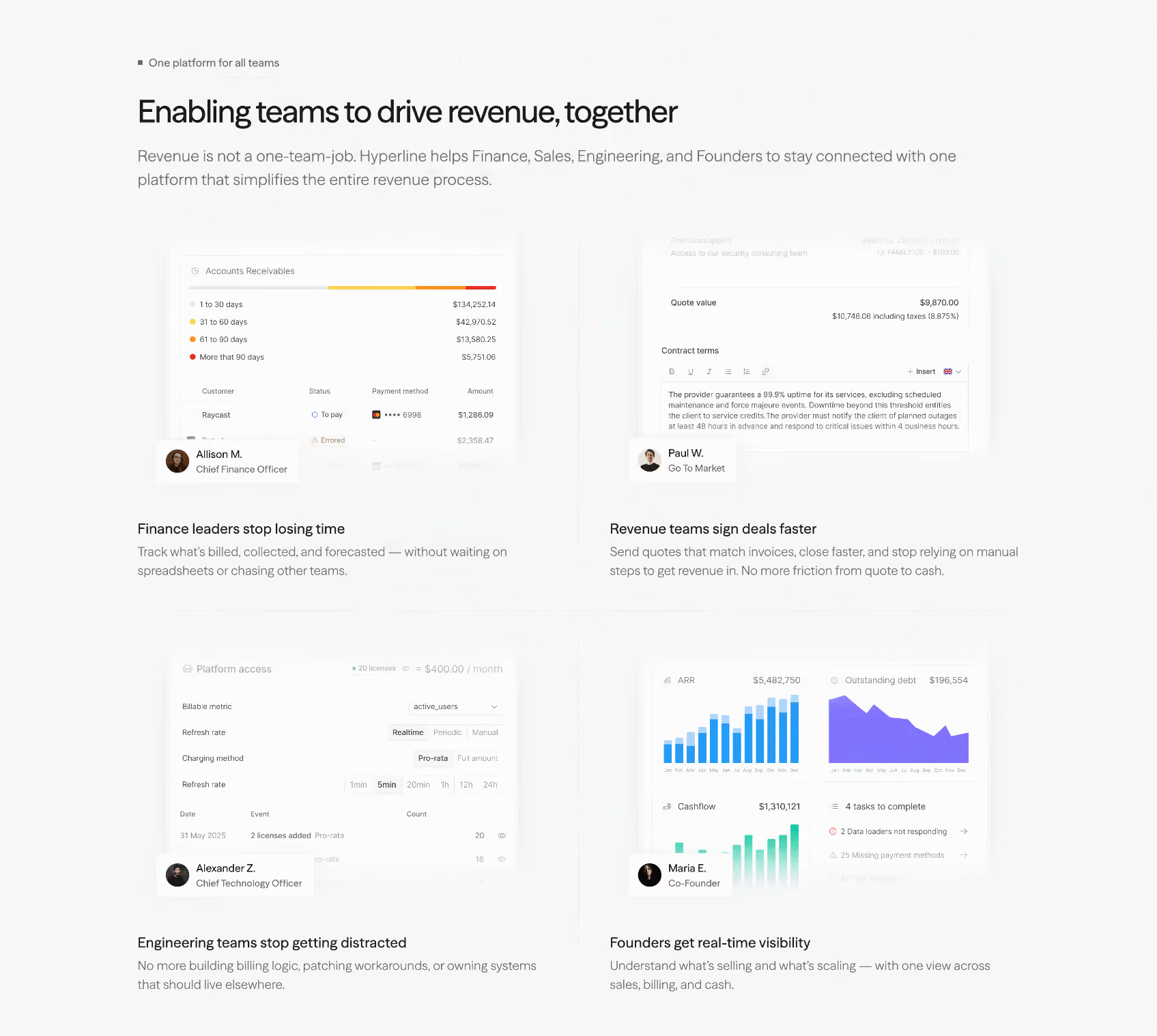
Theme Strategy: The site uses a hybrid dark/light approach — not a user-switchable dark mode, but intentional section-level contrast alternation. Dark sections (hero, testimonials, footer CTA) alternate with light sections (feature breakdowns, FAQ, pricing details). This creates visual rhythm and hierarchy without relying on a toggle.
Data Confidence:
Notable Patterns: