
Thank you! Your submission has been received!
Oops! Something went wrong while submitting the form.
Get SaaSFrame Pro
Monthly
$18
Quarterly
$48
Yearly
$180
Upgrade to access this feature
Browse all screens & flows
Filter and search screens & flows
Access Figma files
Access mobile versions
Bookmark screens & flows
Join now
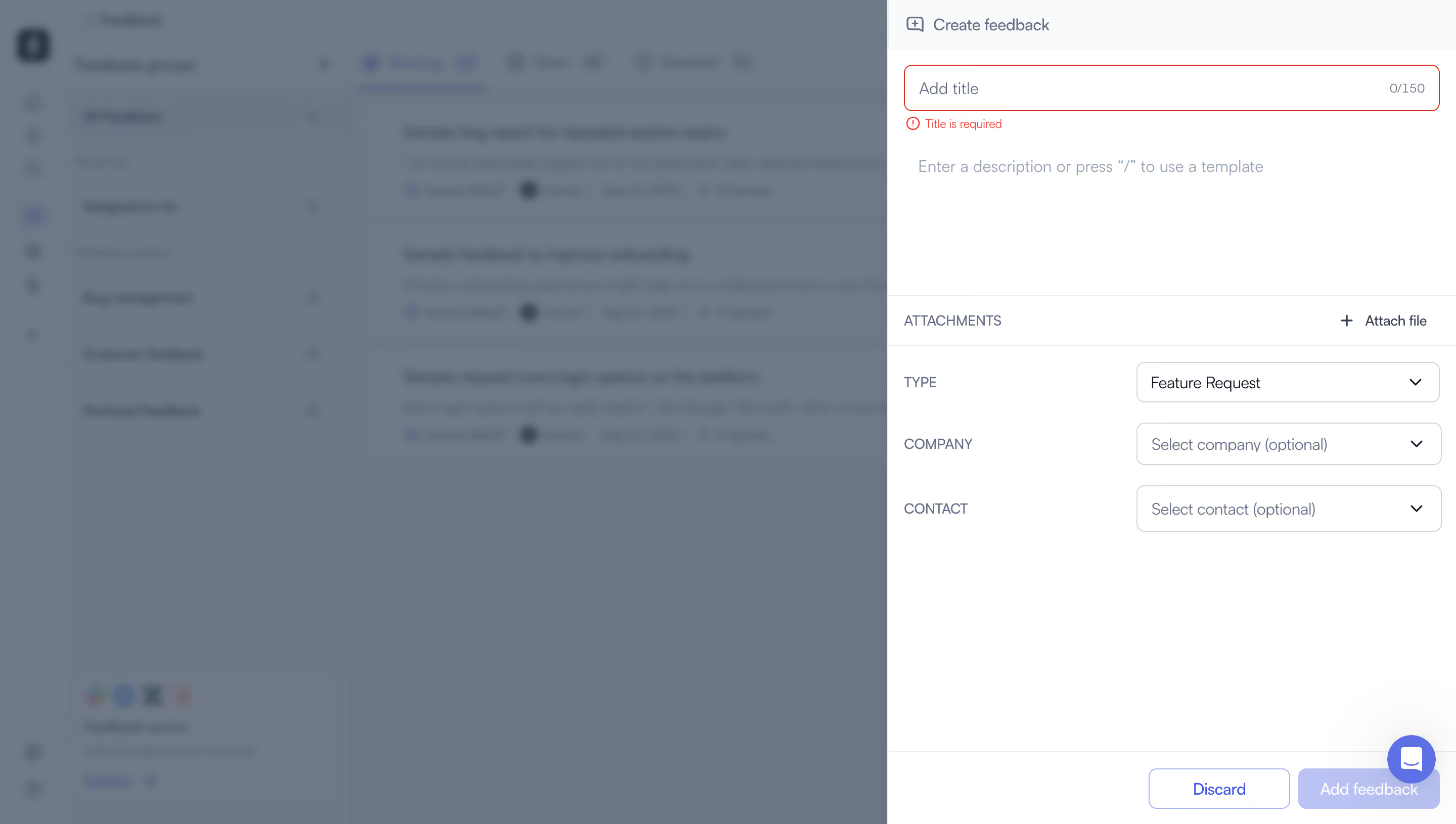
Zeda.io Create A Feedback

Zeda.io
AI-powered product discovery and strategy software
Designed by
No items found.

Bookmark
Bookmark

Design with AI
Thank you! Your submission has been received!
Oops! Something went wrong while submitting the form.
# Design from Reference: Zeda.io Create A Feedback
Create an original, high-fidelity visual design inspired by the reference. Prioritize composition, typography, colors, spacing, and component styling over technical implementation.
## Reference
- **Product:** Zeda.io
- **Category:** Add & Edit
- **Screenshot:** https://cdn.prod.website-files.com/5e9dc792e1210c5325f7ebbc/6acadc4e5c79bb17f221afc5_6acadba5d05a3f53c0a850d0_cms-ee589f49efa9d3902948c7d9.webp
Analyze the screenshot first. If inaccessible, request it rather than guessing.
## Content
{{content.instructions}}
{{content.data}}
Preserve essential messaging and factual accuracy. Adapt structure and copy length for visual balance; never invent product claims.
## Visual Design
### Overall aesthetic
- **Character:** A white feedback-creation drawer overlays a blurred, blue-gray dimmed product workspace.
- **Tone:** Thin cool-gray borders, muted labels and spacious empty areas create a lightweight form. A red title-validation state provides the strongest immediate emphasis.
### Page composition
- **Capture scale:** The source measures 2880 × 1630 image pixels. CSS estimates below assume a 2× capture; device-pixel ratio is unverified.
- **Drawer:** A full-height panel occupies the rightmost approximately 560 px CSS, about 39% of the screen.
- **Upper form:** A compact title bar precedes a full-width title input, validation message and large unfilled description area.
- **Metadata:** A ruled attachment row is followed by three two-column label/select rows for type, company and contact.
- **Footer:** A separated bottom action area right-aligns Discard and Add feedback. A floating chat launcher overlaps this corner region.
### Information hierarchy
- **Task identity:** The Create feedback label and small speech-plus icon identify the drawer.
- **Validation:** The empty title input has a red border and a small red required-field message directly beneath it.
- **Content entry:** The description placeholder mentions template access, while the large blank editor space signals room for longer feedback.
- **Metadata priority:** Type is populated; company and contact display optional selection placeholders.
- **Action state:** Add feedback uses a pale lavender fill, visually quieter than an active saturated primary action; functional disabled behavior is not verified.
### Typography
- **Family:** A neutral sans serif is visible; exact font identity is unverified.
- **Form text:** Header, input and placeholder text are approximately 14–16 px CSS with 20 px leading.
- **Metadata labels:** Uppercase labels are around 14 px in muted blue-gray, aligned to the left of the controls.
- **Validation and counters:** The required message and character count are smaller, approximately 12 px.
### Colors & surfaces
- **Measured surfaces:** ICC-aware sRGB sampling yields #FFFFFF for the drawer and #F9FAFB for subtle header/surface areas.
- **Measured backdrop:** The blurred workspace contains blue-grays #6A7687, #6E7988 and #6C7788.
- **Form palette:** Cool gray borders and muted slate text establish the neutral structure.
- **State accents:** Bright red marks the invalid title; blue-violet accents appear in action text, the pale primary button and chat launcher.
### Components
- **Title field:** A roughly 530 × 46 px CSS input has approximately 8 px corners, a red outline and a right-aligned 0/150 counter.
- **Description editor:** A large borderless white editing area displays one line of muted placeholder text beneath the title error.
- **Attachment row:** A full-width horizontal strip pairs an uppercase label with a plus icon and Attach file action.
- **Select controls:** Three approximately 300 × 40 px CSS outlined fields use small rounded corners and right-aligned chevrons.
- **Bottom actions:** Discard is a white outlined button with blue-violet text; Add feedback is filled pale lavender with white text. Both have rounded corners around 7 px.
- **Chat launcher:** A small circular blue-violet button with a white message icon sits above the footer's right side.
### Visual rhythm
- **Alignment:** Title input, description and attachment row share consistent drawer insets of approximately 16 px CSS.
- **Metadata cadence:** Select rows are separated by roughly 20 px, with labels and fields maintaining stable columns.
- **Whitespace:** A broad empty lower region separates metadata from the bottom action bar.
- **Layer contrast:** The crisp drawer edges and text stand apart from the heavily softened background.
### Responsive
- **Evidence boundary:** Only one desktop state is captured; responsive behaviors are recommendations.
- **Full-screen form:** Expand the drawer to viewport width on small screens and stack metadata labels above controls.
- **Keyboard and scroll:** Allow the form body to scroll while keeping validation visible near its field.
- **Action clearance:** Reposition the support launcher so it does not cover confirmation controls on narrow layouts.
### Adaptation guidance
- **Feedback workflow:** Reuse the title, rich description, attachments and optional relationship fields as a clear creation sequence.
- **Validation clarity:** Pair error color with explicit text and expose required-field status programmatically.
- **State completeness:** Define focused, valid, submitting and success states; the screenshot verifies an empty-title error state only.
- **Layer behavior:** Provide accessible drawer focus management and dismissal without relying on background blur alone.
- **Scale validation:** Confirm the assumed 2× capture scale before implementing dimensions.
Use this context to reproduce the reference's visual language: layout, typography, colors, spacing, borders, radii, and distinctive elements. The screenshot takes priority if descriptions conflict.
## Direction
{{preferences.fidelityInstructions}}
## Output
{{output.instructions}}
Deliver a polished, cohesive design with precise alignment, hierarchy, and spacing. Produce the requested visual artifact, not just a description. If unsupported, explain the limitation.


Category
Patterns
Tech Stack

Added on
August 10, 2023
Found in 1 flow
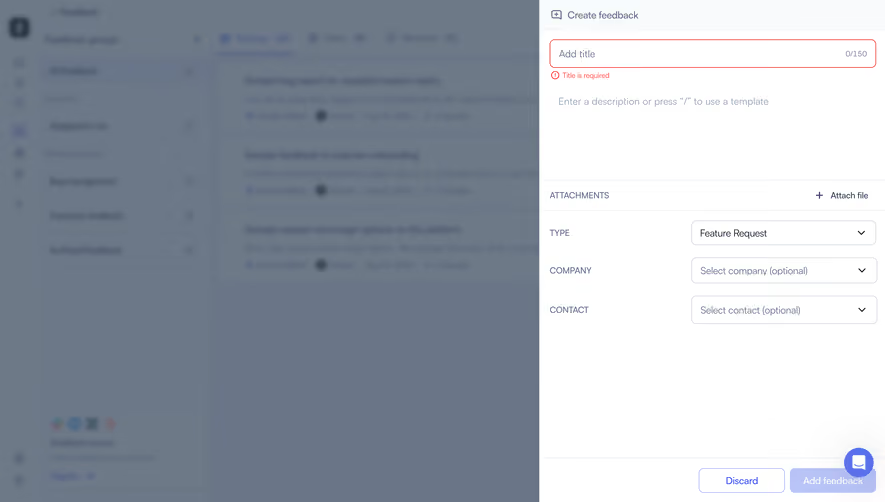
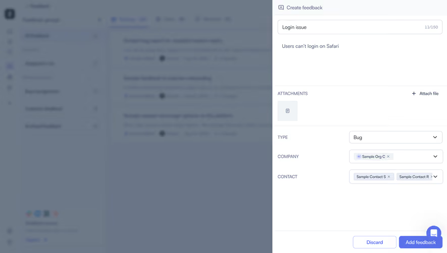
Similar screens




Upgrade to SaaSFrame Pro now to see similar examples.
Monthly
$18 /month
Billed $18 monthly
Browse all screens & flows
Filter and search screens & flows
Search text in screenshots
Access Figma files
Access mobile versions
Join now
Quarterly
$16 /month
Billed $48 quarterly
Browse all screens & flows
Filter and search screens & flows
Search text in screenshots
Access Figma files
Access mobile versions
Join now
Yearly
$15 /month
Billed $180 yearly
Browse all screens & flows
Filter and search screens & flows
Search text in screenshots
Access Figma files
Access mobile versions
Join now