Generate a new design based on this screen using your own content.
Thank you! Your submission has been received!
Oops! Something went wrong while submitting the form.
# Design from Reference: Wiza Pricing Page
Create an original, high-fidelity visual design inspired by the reference. Prioritize composition, typography, colors, spacing, and component styling over technical implementation.
## Reference
- **Product:** Wiza
- **Category:** Pricing Page
- **Screenshot:** https://cdn.prod.website-files.com/5e9dc792e1210c5325f7ebbc/6acad57786f1bee9c3650853_6acad4a6701e38c794889ceb_cms-9774872cad57c86731b84432.webp
Analyze the screenshot first. If inaccessible, request it rather than guessing.
## Content
{{content.instructions}}
{{content.data}}
Preserve essential messaging and factual accuracy. Adapt structure and copy length for visual balance; never invent product claims.
## Visual Design
Use this context to reproduce the reference's visual language: layout, typography, colors, spacing, borders, radii, and distinctive elements. The screenshot takes priority if descriptions conflict.
## Direction
{{preferences.fidelityInstructions}}
## Output
{{output.instructions}}
Deliver a polished, cohesive design with precise alignment, hierarchy, and spacing. Produce the requested visual artifact, not just a description. If unsupported, explain the limitation.
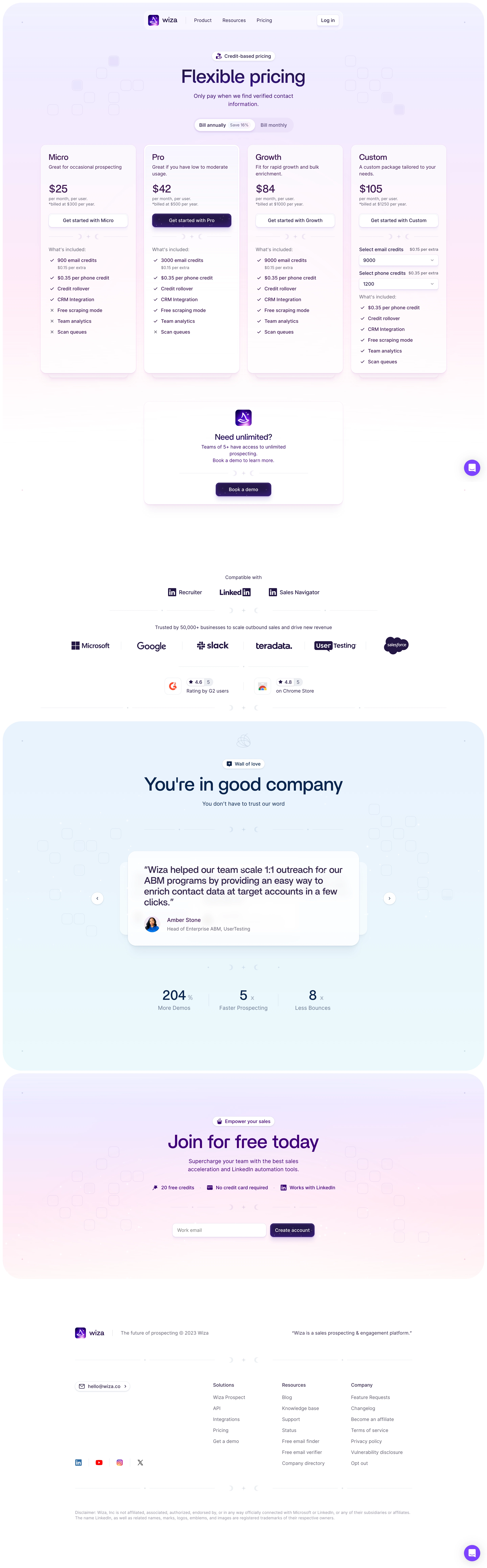
Wiza’s pricing page exemplifies modern SaaS minimalism—clean, airy, and ultra-professional. White space is generously used to promote focus, with subtle accent colors giving personality without distraction. The overall feel is trustworthy and confident, blending approachability with enterprise-level polish.
Layout and Structure
The page opens directly with its core pricing tables, eliminating distractions and making comparison effortless. Plans are arranged horizontally, highlighted with soft drop-shadowed panels for clarity. Above, clear messaging explains value and common use cases, while auxiliary sections such as FAQs and a prominent support prompt are conveniently tucked at the bottom. The logical structure helps users move from awareness to decision-making in a smooth flow.
Visual Elements
Iconography is sharp and consistent, with custom vector graphics used to illustrate key features beside each plan. Visuals are functional, never ornamental; micro-interactions (such as hover states) provide subtle feedback, creating an interactive, responsive experience. There’s a complete absence of distracting animations—everything serves usability first.
Color Palette and Typography
A restrained palette spotlights navy blue (#0E2146) for brand prominence and call-to-action buttons, paired with muted grays for backgrounds and borders. Headings use a bold, geometric sans-serif for instant scanning, while body text leans lighter—the hierarchy is crystal-clear at a glance.
User Experience Patterns and Unique Choices
Sticky navigation keeps trial and signup options top-of-mind as users scroll. The “Start Free” CTAs are distinct and repeated for convenience. A live chat bubble follows the user, offering help without intrusion. The no-nonsense tone, frictionless conversion funnel, and transparency on what’s included make the experience feel honest and user-focused. The result: a pricing page that’s as decisive as it is persuasive.