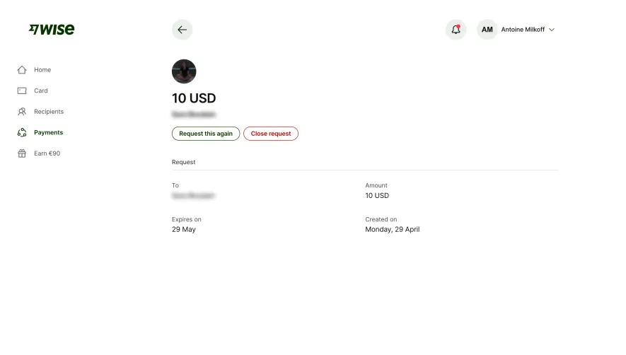
Generate a new design based on this screen using your own content.
Thank you! Your submission has been received!
Oops! Something went wrong while submitting the form.
# Design from Reference: Wise Request Money
Create an original, high-fidelity visual design inspired by the reference. Prioritize composition, typography, colors, spacing, and component styling over technical implementation.
## Reference
- **Product:** Wise
- **Category:** Add & Edit
- **Screenshot:** https://cdn.prod.website-files.com/5e9dc792e1210c5325f7ebbc/6aca27e5aca7079066e8e761_6aca26fee379045e1b721845_cms-a48afa3588cb2b9477dce8c5.webp
Analyze the screenshot first. If inaccessible, request it rather than guessing.
## Content
{{content.instructions}}
{{content.data}}
Preserve essential messaging and factual accuracy. Adapt structure and copy length for visual balance; never invent product claims.
## Visual Design
Use this context to reproduce the reference's visual language: layout, typography, colors, spacing, borders, radii, and distinctive elements. The screenshot takes priority if descriptions conflict.
## Direction
{{preferences.fidelityInstructions}}
## Output
{{output.instructions}}
Deliver a polished, cohesive design with precise alignment, hierarchy, and spacing. Produce the requested visual artifact, not just a description. If unsupported, explain the limitation.
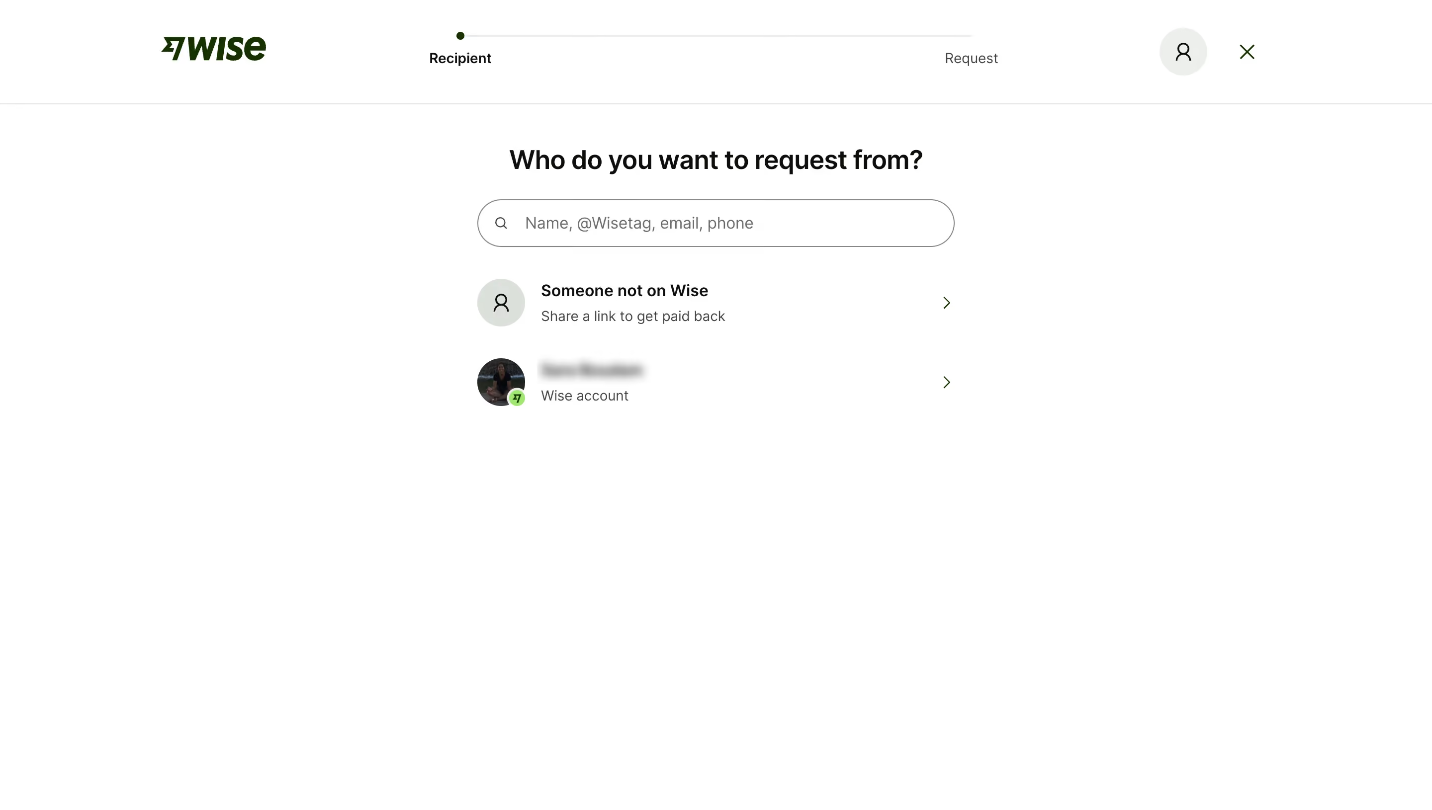
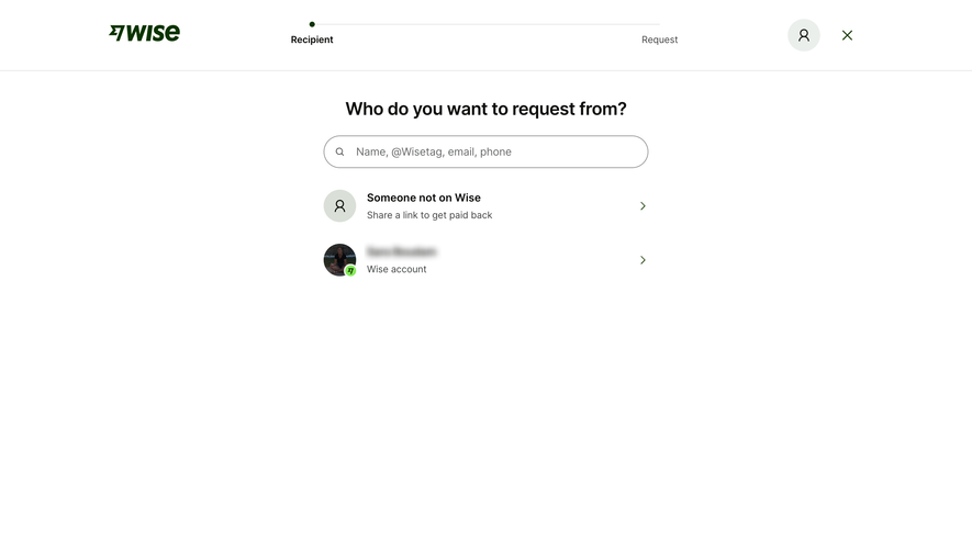
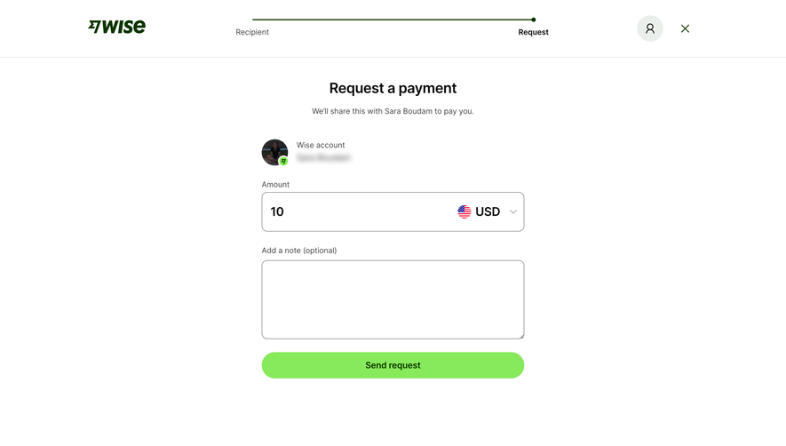
This is a great example of a multi-step form that doesn't overwhelm. The progress bar at the top is dead simple: two labeled stops, "Recipient" and "Request," connected by a thin line with a filled dot showing where you are. No unnecessary decoration.
Typography Does the Heavy Lifting
"Who do you want to request from?" is set large and centered in a bold serif-adjacent weight that feels confident without being loud. The search input below it is generous in size with ghost text listing multiple input types. Smart move. It tells users they have options without needing a separate explainer.
The Contact List is Minimal but Functional
Two rows. That's it. One for "Someone not on Wise" with a share link CTA, and one showing an existing Wise contact with their avatar and a verified badge. The chevrons on the right quietly signal tappability. The whole page breathes. Tons of whitespace, dark green brand color used sparingly only in the logo and badge. It feels fast and trustworthy, which is exactly what you want when money is involved.