Generate a new design based on this screen using your own content.
Thank you! Your submission has been received!
Oops! Something went wrong while submitting the form.
# Design from Reference: Unflow Blog Feed
Create an original, high-fidelity visual design inspired by the reference. Prioritize composition, typography, colors, spacing, and component styling over technical implementation.
## Reference
- **Product:** Unflow
- **Category:** Blog Feed
- **Screenshot:** https://cdn.prod.website-files.com/5e9dc792e1210c5325f7ebbc/62ee97d617fa63b62b9997d6_1659802908115-screenshot-device-a652d54dfa00fb819dc76486231717d6-1659802869472.webp
Analyze the screenshot first. If inaccessible, request it rather than guessing.
## Content
{{content.instructions}}
{{content.data}}
Preserve essential messaging and factual accuracy. Adapt structure and copy length for visual balance; never invent product claims.
## Visual Design
Use this context to reproduce the reference's visual language: layout, typography, colors, spacing, borders, radii, and distinctive elements. The screenshot takes priority if descriptions conflict.
## Direction
{{preferences.fidelityInstructions}}
## Output
{{output.instructions}}
Deliver a polished, cohesive design with precise alignment, hierarchy, and spacing. Produce the requested visual artifact, not just a description. If unsupported, explain the limitation.
Unflow’s blog page exemplifies modern minimalism with a polished, professional edge. White space reigns, giving content room to breathe and amplifying clarity. Subtle motion and understated gradients add energy without feeling flashy, crafting an inviting yet sleek environment ideal for creative SaaS brands.
Layout and Structure
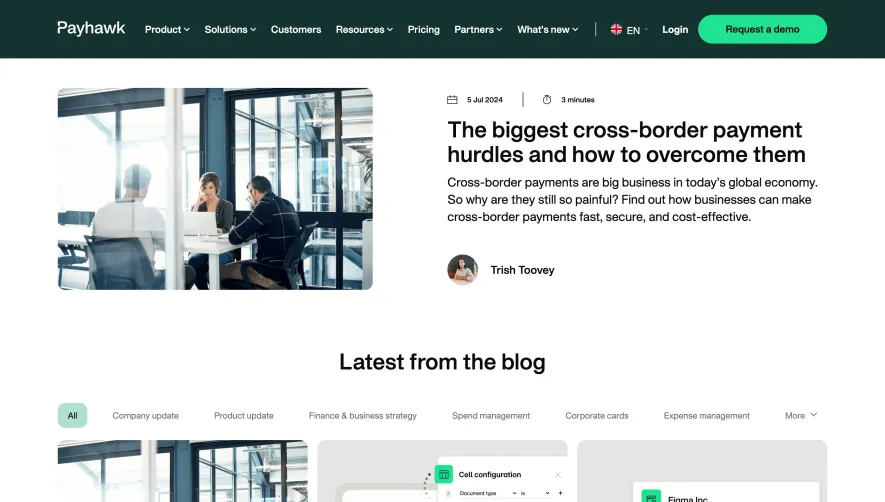
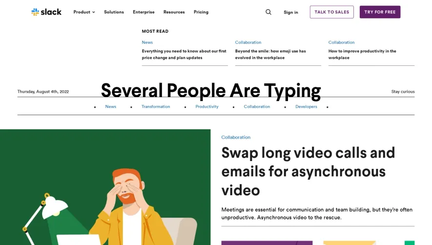
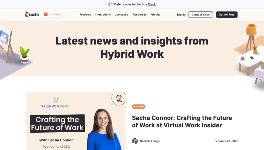
The page forgoes a traditional hero section, diving straight into blog content framed by a sticky and efficient top navigation. Each blog entry is presented as a card within a clean, responsive grid—creating visual balance and making it easy to scan. Category filters are smartly sticky, aiding discoverability while the footer delivers concise brand reinforcement and helpful links.
Visual Elements
Soft, rounded card corners and subtle drop shadows deliver a tactile feel. Blog images are thoughtfully curated, blending minimalist illustrations with crisp, real-world photography. Hover effects gently lift cards, guiding user attention and hinting at interactivity without overwhelming the senses.
Color Palette and Typography
A restrained, neutral palette—principally whites and soft grays—gets pops of blue and purple for accents and CTAs. Typography is ultra-legible with a contemporary sans-serif (likely Inter or a similar web font), establishing hierarchy using bold face for titles and lighter weights for metadata.
User Experience Patterns
Navigation is sticky and fuss-free, streamlining exploration. CTAs (“Read More”) are prominent but not aggressive. Category tags allow personalized browsing without clutter. The scroll experience is smooth, with each card animating in gently, making the page feel dynamic yet unobtrusive.
Unique or Notable Design Choices
Unflow’s subtle yet purposeful micro-interactions—from animated fades to floating tags—inject modernity and delight. The absence of visual noise ensures a focus on content, while thoughtful rhythm and spacing create a trustworthy, forward-thinking atmosphere ideal for SaaS inspiration.