```html
Overall Style and Aesthetic
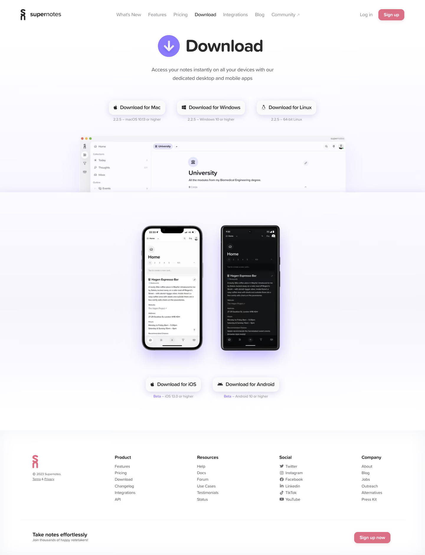
``` Supernotes sets a refined tone with its minimalist, modern aesthetic. Crisp edges, ample white space, and subtle gradients make the page feel airy yet sophisticated. The design balances professionalism with approachability, using understated UI elements that invite focus without distraction—a hallmark of top SaaS products. ```html Layout and Structure
``` The layout is clean and efficient, kicking off with a concise hero section that highlights cross-platform availability. Below, a clearly organized grid displays download options for various operating systems, each card styled uniformly for immediate recognition. Supplemental sections, like FAQs, are tucked beneath, ensuring the download action remains center-stage. ```html Visual Elements
``` Vibrant platform icons bring pops of color to an otherwise muted palette, guiding users by platform association. Subtle illustrations and micro-animations enhance the interactive download buttons, delivering feedback and delight. No stock photography or distracting videos: every visual is thoughtfully chosen to prioritize clarity and rapid comprehension. ```html Color Palette and Typography
``` A restrained palette of cool off-whites, soft grays, and accent blues dominates, signifying trust and reliability. Typography leans on elegant sans-serifs, employing clear hierarchy with generous headings and legible body text, improving scannability and reinforcing the product’s credible image. ```html User Experience Patterns
``` Navigation is frictionless—persistent header links, clear platform delineation, and high-contrast CTAs all smooth the path to download. Smart use of spacing and scroll flow keep the page light and uncluttered, while direct “Download” buttons minimize decision fatigue. ```html Unique or Notable Design Choices
``` Supernotes shines in its unified card-based grid, ensuring parity across platform options. The hero’s instant context (cross-device imagery and callouts) meets user intent without forcing a scroll. Overall, the tone is calm, confident, and accessible—a masterclass in how frictionless design can drive decisive user action.