Design with AI
Generate a new design based on this screen using your own content.
# Design from Reference: Squeaky Website set up
Create an original, high-fidelity visual design inspired by the reference. Prioritize composition, typography, colors, spacing, and component styling over technical implementation.
## Reference
- **Product:** Squeaky
- **Category:** User Onboarding
- **Screenshot:** https://cdn.prod.website-files.com/5e9dc792e1210c5325f7ebbc/6acbbebf39e7f22db402885a_6acbbdffd01e364847669cbd_cms-24405327fd7fbca850d254eb.webp
Analyze the screenshot first. If inaccessible, request it rather than guessing.
## Content
{{content.instructions}}
{{content.data}}
Preserve essential messaging and factual accuracy. Adapt structure and copy length for visual balance; never invent product claims.
## Visual Design
### Overall aesthetic
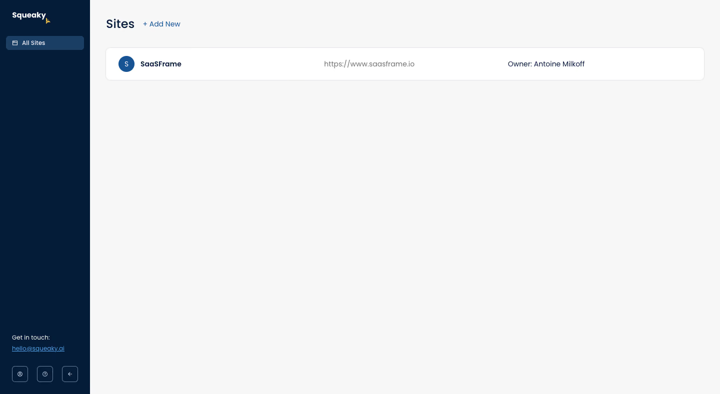
- **Character:** Extremely sparse site-management dashboard with a dark navy navigation rail, pale-gray workspace and one white site row.
- **Emphasis:** A single title, small add link and existing site entry carry nearly all functional content; no decorative illustration or setup form is visible.
- **Scale:** The capture is 1440 × 789 image px. Measurements refer to image pixels; actual CSS scale is unverified.
### Page composition
- **Sidebar:** A roughly 180 px-wide navy rail contains the white brand mark, one selected All Sites destination, bottom contact text and three small utility controls.
- **Header:** Sites appears near x212/y38, with a blue Add New link immediately to its right.
- **Site row:** A wide white rounded container starts around x211/y95 and spans nearly the remaining viewport width. It contains a circular initial avatar/name left, site URL centrally and owner attribution right.
- **Canvas:** The rest of the workspace remains blank, indicating a list overview rather than a multi-step setup screen.
### Information hierarchy
- **Title:** Sites is the strongest text in the workspace; Add New is a smaller inline action.
- **Row:** A bold site name leads, while the URL is muted and owner attribution uses smaller dark text.
- **Navigation:** All Sites is the only visible selected destination, clearly separated through a lighter navy strip.
- **State:** One site is listed. No progress, warning, editing controls or completion message is visible.
### Typography
- **Family:** Rounded neutral sans-serif; exact identity is unverified.
- **Title:** Approximately 25–27 image px, medium-to-bold weight.
- **Row roles:** Site name is about 14–15 px bold; URL and owner text are approximately 14–15 px at regular weight.
- **Sidebar:** Navigation and contact text are roughly 12–13 px, with compact leading.
- **Add link:** Approximately 14–15 px, blue and regular-to-medium weight, visually lighter than a filled button.
### Colors & surfaces
- **Measured canvas:** ICC-aware sRGB sampling yields #F7F7F7 for the large workspace and #FFFFFF for the site row.
- **Measured navy:** #051C38 is the sidebar's dominant dark tone; #1B3E65 appears in the selected destination.
- **Measured accents:** #185494 and #519BE5 occur in blue interface details.
- **Measured border:** #E5E6E9 defines the subtle row outline.
- **Depth:** The screen is flat; the row uses a thin border and approximately 8–10 px corners rather than a pronounced shadow.
### Components
- **Selected item:** A compact rounded navy-blue row includes a small site/list icon and All Sites label.
- **Site identity:** A roughly 32 px blue circular avatar precedes the bold site label.
- **Site container:** Approximately 1200 × 66 image px with generous horizontal padding; three text groups share one vertical center.
- **Bottom utilities:** Three small outlined square buttons sit in a horizontal row below the contact link. Their exact icon functions are not all established by the screenshot.
### Visual rhythm
- **Insets:** Around 30 px padding separates the workspace from the rail and viewport edge.
- **Vertical spacing:** The title sits roughly 35–40 px above the site container.
- **Whitespace:** Most of the viewport is intentionally unused, emphasizing the single-item list.
- **Sidebar anchoring:** Contact and utility controls sit near the bottom, distant from the single main destination.
### Responsive
- **Evidence limit:** Only desktop is shown; these are recommendations.
- **Shell:** Collapse the narrow rail into a menu at small widths.
- **Row:** Stack URL and owner below the site identity instead of forcing three columns.
- **Actions:** Keep Add New visible and give small utility controls adequate touch targets.
### Adaptation guidance
- **Reusable pattern:** Use a simple title/add action and clean site summary rows for a low-density management overview.
- **Content hierarchy:** Keep site identity primary and technical URL/ownership secondary.
- **Accessibility:** Label icon-only utilities, provide visible focus and ensure blue links retain adequate contrast.
- **State coverage:** Add empty, loading and error states separately; this capture shows one existing site only.
Use this context to reproduce the reference's visual language: layout, typography, colors, spacing, borders, radii, and distinctive elements. The screenshot takes priority if descriptions conflict.
## Direction
{{preferences.fidelityInstructions}}
## Output
{{output.instructions}}
Deliver a polished, cohesive design with precise alignment, hierarchy, and spacing. Produce the requested visual artifact, not just a description. If unsupported, explain the limitation.