Design with AI
Generate a new design based on this screen using your own content.
# Design from Reference: Sidebird User Onboarding
Create an original, high-fidelity visual design inspired by the reference. Prioritize composition, typography, colors, spacing, and component styling over technical implementation.
## Reference
- **Product:** Sidebird
- **Category:** User Onboarding
- **Screenshot:** https://cdn.prod.website-files.com/5e9dc792e1210c5325f7ebbc/6acbbb69151c40fa407461f6_6acbba6c83450040441b249a_cms-e22149577804fb298236a5f5.webp
Analyze the screenshot first. If inaccessible, request it rather than guessing.
## Content
{{content.instructions}}
{{content.data}}
Preserve essential messaging and factual accuracy. Adapt structure and copy length for visual balance; never invent product claims.
## Visual Design
### Overall aesthetic
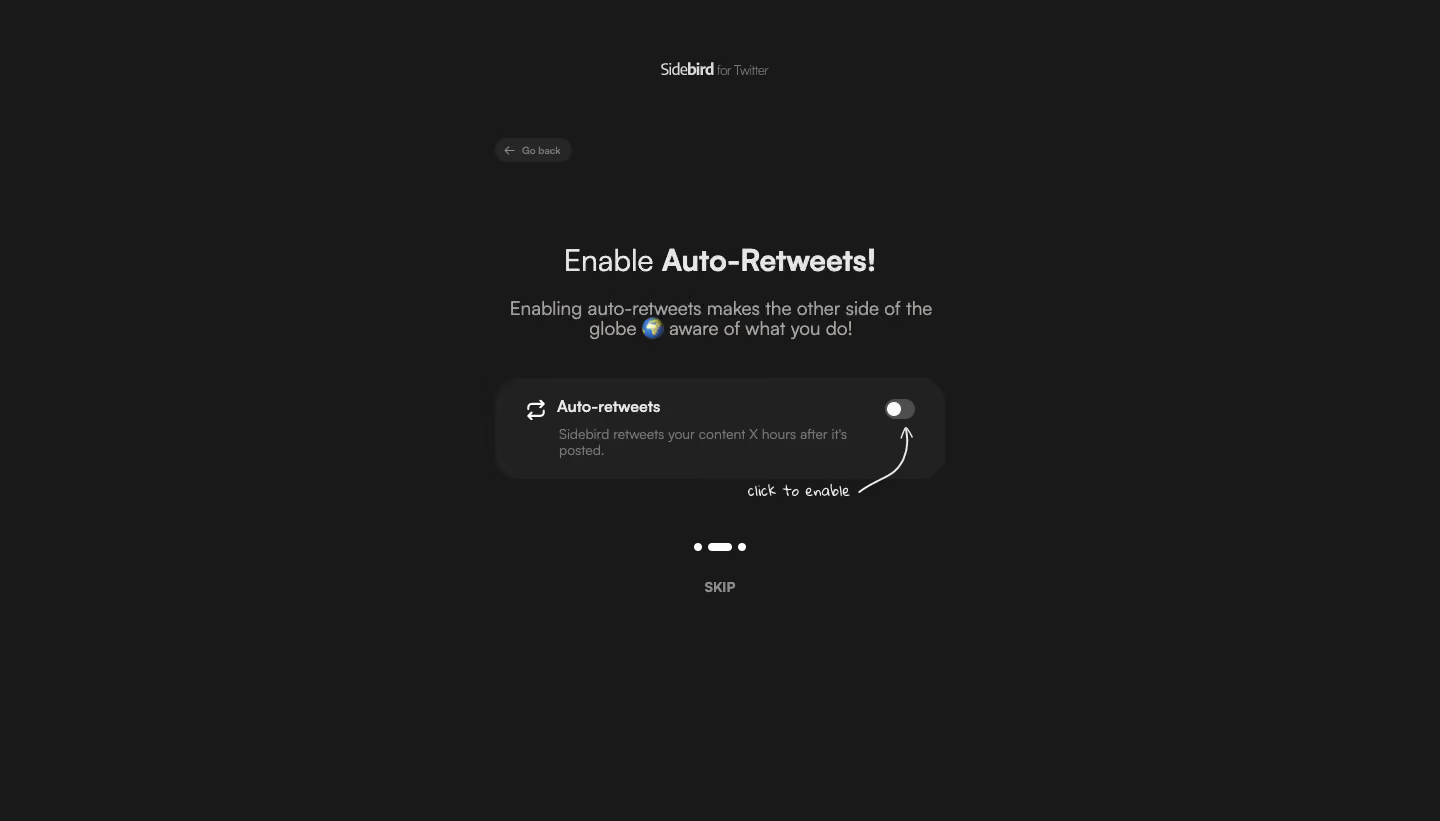
- **Character:** Minimal dark preference-onboarding slide with a single switch and handwritten guidance.
### Page composition
- **Canvas:** 1440 × 821 screenshot px.
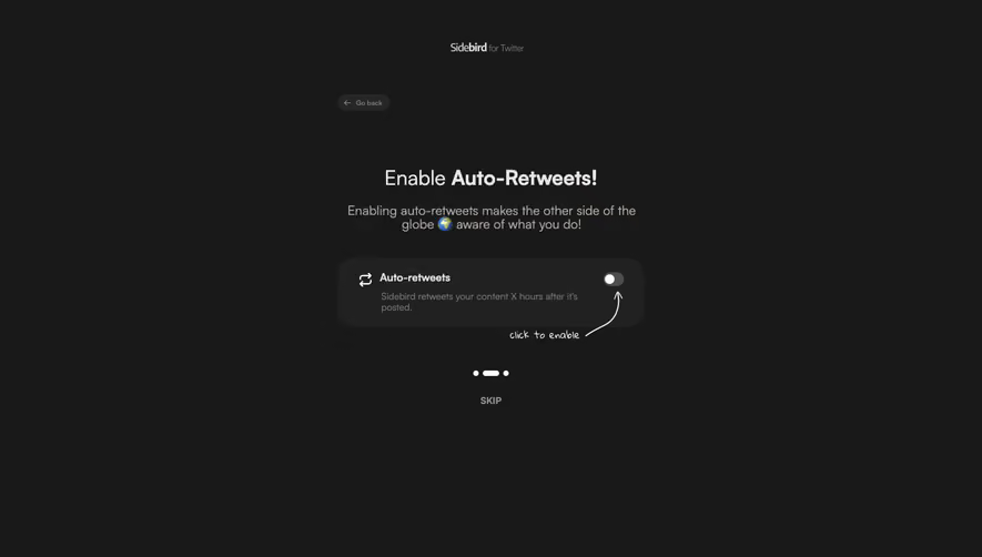
- **Structure:** Small centered brand at top, subtle back pill, heading/short description, rounded auto-retweet setting tile, curved arrow annotation, progress dots and Skip.
### Information hierarchy
- **Priority:** Auto-Retweets is bold within the heading; switch and handwritten click-to-enable cue direct attention to the optional preference.
### Typography
- **Family:** Rounded sans serif with handwritten annotation; exact fonts unverified.
- **Scale:** Estimated screenshot heading 30 px, supporting text 18 px, tile label 16 px and helper 14 px.
### Colors & surfaces
- **Sampled palette:** Canvas #191919, tile #212121/#262626, light text #E7E5E4, muted text #A7A29E and switch gray #4D4D4D.
### Components
- **Setting:** Wide dark rounded card, retweet icon, label/helper left and small off-state toggle right.
- **Progress:** Three white marks with elongated center mark; uppercase muted Skip beneath.
- **Geometry:** Estimated screenshot tile 450 × 100 px with 28 px corners; broad empty margins.
### Visual rhythm
- **Spacing:** Approximately 35–50 screenshot px between description, tile and progress; centered narrow composition.
### Responsive
- **Observed:** Desktop only.
- **Adaptation:** Fit tile to viewport with wrapping helper, preserve switch hit target and expose optional Skip clearly.
### Adaptation guidance
- **Preserve:** Single optional choice, dark restraint and instructional arrow.
- **Replace:** Use the actual feature and truthful toggle behavior; do not infer automation timing from reference text.
Use this context to reproduce the reference's visual language: layout, typography, colors, spacing, borders, radii, and distinctive elements. The screenshot takes priority if descriptions conflict.
## Direction
{{preferences.fidelityInstructions}}
## Output
{{output.instructions}}
Deliver a polished, cohesive design with precise alignment, hierarchy, and spacing. Produce the requested visual artifact, not just a description. If unsupported, explain the limitation.