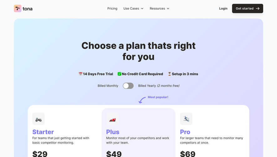
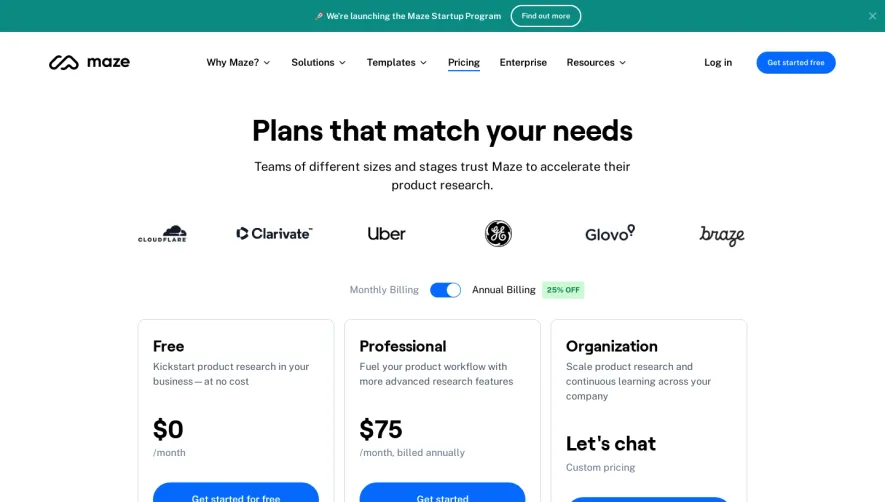
Generate a new design based on this screen using your own content.
Thank you! Your submission has been received!
Oops! Something went wrong while submitting the form.
# Design from Reference: Searchable Pricing Page
Create an original, high-fidelity visual design inspired by the reference. Prioritize composition, typography, colors, spacing, and component styling over technical implementation.
## Reference
- **Product:** Searchable
- **Category:** Pricing Page
- **Screenshot:** https://cdn.prod.website-files.com/5e9dc792e1210c5325f7ebbc/6acad39ac2028efdec71ae73_6acad1185af75170c4bbfbe4_cms-1a41dafc16061be1f6c830ff.webp
Analyze the screenshot first. If inaccessible, request it rather than guessing.
## Content
{{content.instructions}}
{{content.data}}
Preserve essential messaging and factual accuracy. Adapt structure and copy length for visual balance; never invent product claims.
## Visual Design
Use this context to reproduce the reference's visual language: layout, typography, colors, spacing, borders, radii, and distinctive elements. The screenshot takes priority if descriptions conflict.
## Direction
{{preferences.fidelityInstructions}}
## Output
{{output.instructions}}
Deliver a polished, cohesive design with precise alignment, hierarchy, and spacing. Produce the requested visual artifact, not just a description. If unsupported, explain the limitation.
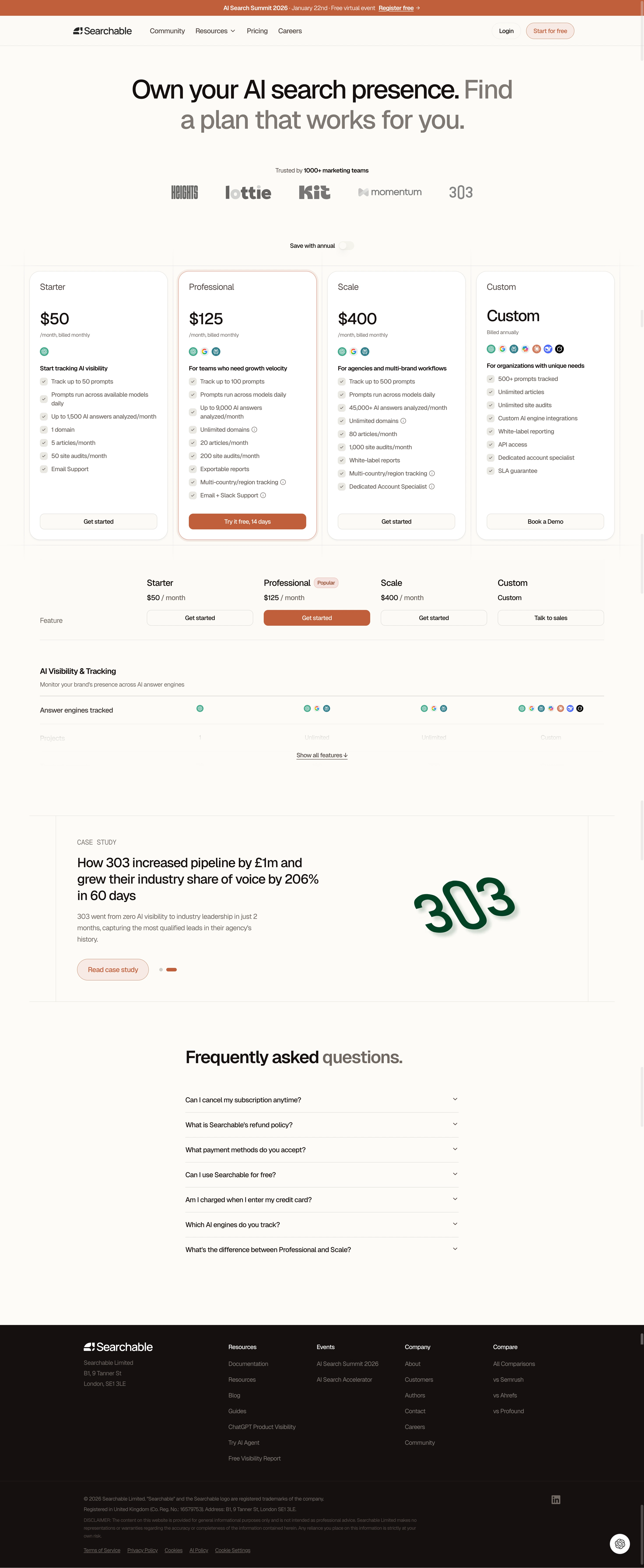
The first thing that grabs you is how restrained this is. Searchable's pricing page leans into a warm terracotta accent against a clean white canvas, and it works. The hero type is big, confident serif text that feels editorial without trying too hard. "Own your AI search presence" hits immediately.
Pricing cards that don't overwhelm
Four tiers laid out horizontally with just enough visual hierarchy. The Professional card gets a subtle highlight and a burnt orange CTA that pulls your eye exactly where they want it. The "Try it free, 14 days" button stands apart from the other flat "Get started" links. Smart move. Below the cards, there's a comparison table that starts collapsed with a "Show all features" toggle. Keeps things scannable.
The case study placement is clever
Dropping a real case study between pricing and FAQs is an underrated pattern. The 303 logo rendered huge in dark green creates a nice visual break. It adds credibility right when someone might hesitate. The FAQ accordion at the bottom is straightforward. No surprises, just answers.