Design with AI
Generate a new design based on this screen using your own content.
# Design from Reference: Remote Employee Product Onboarding
Create an original, high-fidelity visual design inspired by the reference. Prioritize composition, typography, colors, spacing, and component styling over technical implementation.
## Reference
- **Product:** Remote
- **Category:** User Onboarding
- **Screenshot:** https://cdn.prod.website-files.com/5e9dc792e1210c5325f7ebbc/6acad79afbf1299940aab5bf_6acad645fef6904ce0091598_cms-c5d209b0cbef818845cf0f9b.webp
Analyze the screenshot first. If inaccessible, request it rather than guessing.
## Content
{{content.instructions}}
{{content.data}}
Preserve essential messaging and factual accuracy. Adapt structure and copy length for visual balance; never invent product claims.
## Visual Design
### Overall aesthetic
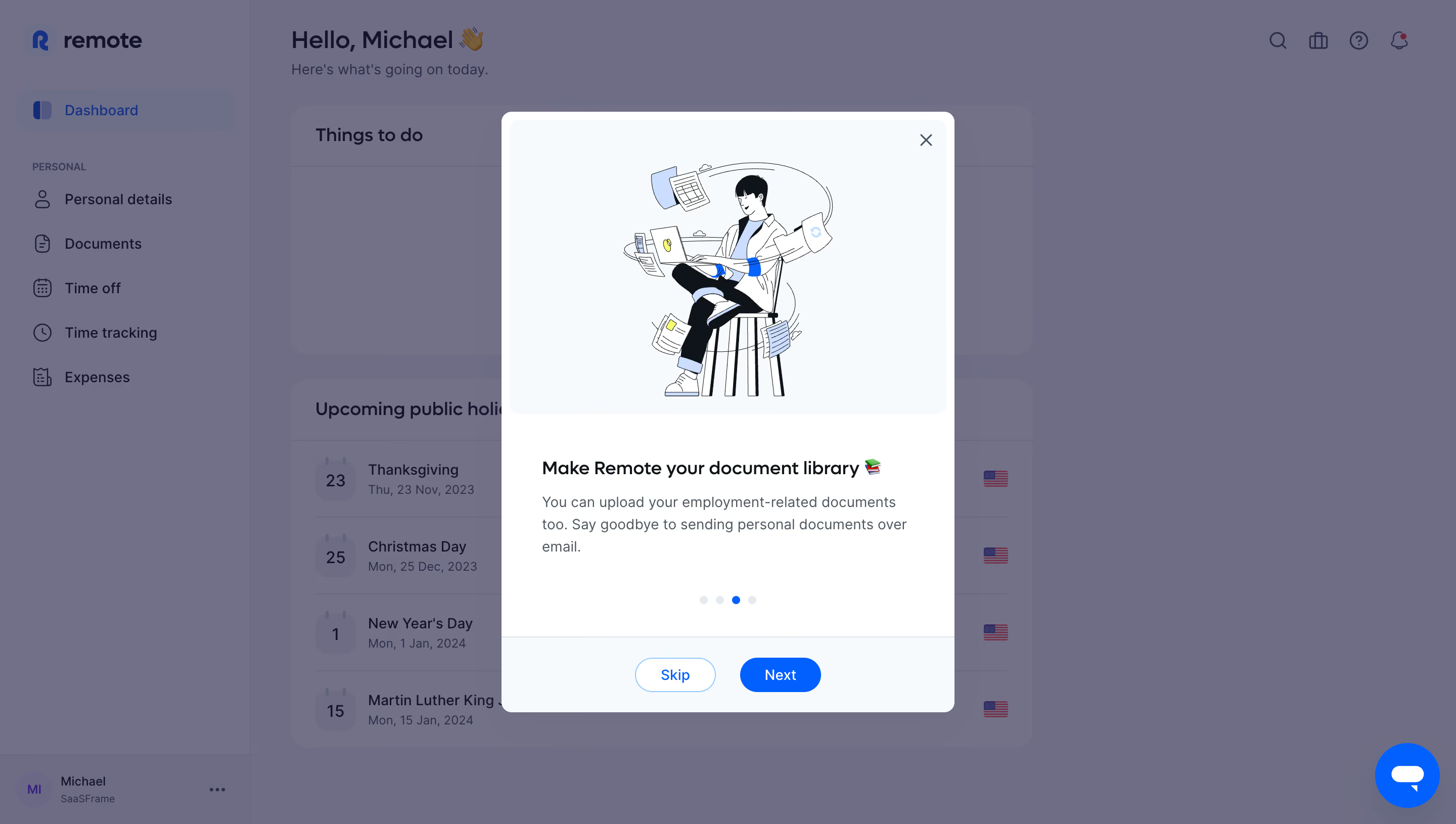
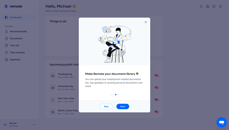
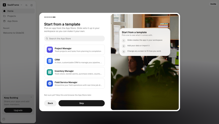
- **Style:** Illustrated employee-onboarding carousel over a dimmed HR dashboard.
- **Character:** White dialog, pale-blue artwork area, restrained navy text, and blue progression controls.
### Page composition
- **Canvas:** 2880 × 1630 image px; CSS estimates assume an unverified 2× capture.
- **Dialog:** Approximately 450 × 594 CSS px, centered.
- **Layout:** Large illustration panel above title/body, four pagination dots, then a separated action footer.
- **Background:** Sidebar, dashboard greeting, tasks, and holiday list remain visible through a violet-gray overlay.
### Information hierarchy
- **Primary:** Illustration and short document-library title.
- **Secondary:** Brief explanatory paragraph.
- **Progress:** Third of four dots is active.
- **Actions:** Outlined Skip followed by filled Next; close X in the artwork corner.
### Typography
- **Family:** Neutral sans serif; exact family unverified.
- **Title:** Approximately 18 CSS px, semibold.
- **Body:** Approximately 14px with 22px line-height.
- **Buttons:** Approximately 14px.
- **Precision:** Typography and CSS scale are estimates.
### Colors & surfaces
- **Dialog:** #FFFFFF.
- **Artwork/footer pale surface:** #F6FAFC.
- **Dimmed background:** #6E6D87 and #71708A; these include overlay.
- **Actions:** Bright blue; exact flat token unverified.
- **Text:** Dark navy with muted blue-gray body copy.
- **Precision:** Sampled colors were profile-converted where applicable.
### Components
- **Dialog radius:** Approximately 10 CSS px under assumed 2×.
- **Artwork:** Seated person with laptop and orbiting documents; thin dark strokes and blue accents.
- **Buttons:** Small pills roughly 80 × 34 CSS px.
- **Pagination:** Four small circles with blue active dot.
- **Footer:** Fine top separator and centered action pair.
### Visual rhythm
- **Spacing:** Generous illustration area, 32–40px body insets, and clear footer separation.
- **Alignment:** Left-aligned text contrasts with centered art, dots, and actions.
- **Backdrop:** Dimming suppresses dashboard detail.
### Responsive
- **Observed:** Desktop only.
- **Recommendation:** Fit dialog within viewport margins, reduce artwork height, and allow vertical scrolling.
- **Actions:** Keep close and progression reachable.
### Adaptation guidance
- **Preserve:** One benefit per carousel step, image/text grouping, visible progress, and optional skip.
- **Content:** Use supplied onboarding benefits and artwork.
- **Behavior:** Carousel transitions and document upload are not demonstrated.
Use this context to reproduce the reference's visual language: layout, typography, colors, spacing, borders, radii, and distinctive elements. The screenshot takes priority if descriptions conflict.
## Direction
{{preferences.fidelityInstructions}}
## Output
{{output.instructions}}
Deliver a polished, cohesive design with precise alignment, hierarchy, and spacing. Produce the requested visual artifact, not just a description. If unsupported, explain the limitation.