Generate a new design based on this screen using your own content.
Thank you! Your submission has been received!
Oops! Something went wrong while submitting the form.
# Design from Reference: Producter Blog Post
Create an original, high-fidelity visual design inspired by the reference. Prioritize composition, typography, colors, spacing, and component styling over technical implementation.
## Reference
- **Product:** Producter
- **Category:** Blog Post
- **Screenshot:** https://cdn.prod.website-files.com/5e9dc792e1210c5325f7ebbc/62f272e2523cfaa2eb76ae1c_1660054878193-6e192197-ccae-4e30-ac5e-1031202b74b8-name%3DProducterBlogTemplate.webp
Analyze the screenshot first. If inaccessible, request it rather than guessing.
## Content
{{content.instructions}}
{{content.data}}
Preserve essential messaging and factual accuracy. Adapt structure and copy length for visual balance; never invent product claims.
## Visual Design
Use this context to reproduce the reference's visual language: layout, typography, colors, spacing, borders, radii, and distinctive elements. The screenshot takes priority if descriptions conflict.
## Direction
{{preferences.fidelityInstructions}}
## Output
{{output.instructions}}
Deliver a polished, cohesive design with precise alignment, hierarchy, and spacing. Produce the requested visual artifact, not just a description. If unsupported, explain the limitation.
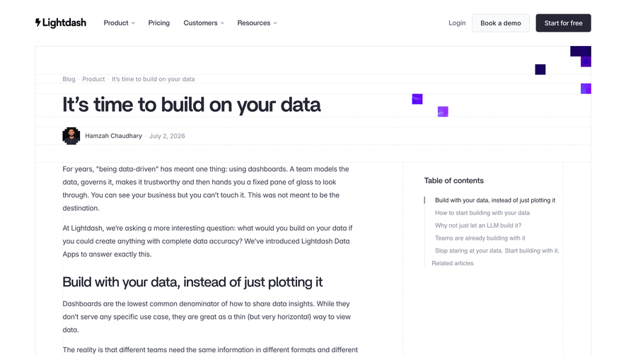
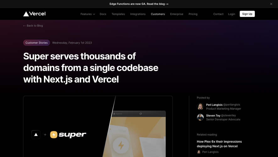
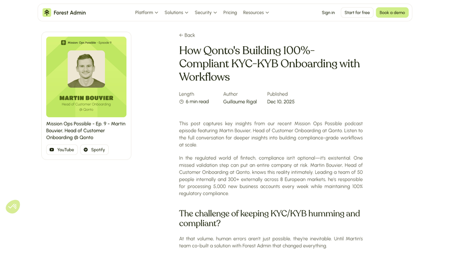
Producter’s Public Beta launch page exudes a clean, modern vibe with unmistakable SaaS sophistication. The minimalist aesthetic champions clarity and function, while strategic pops of color inject energy without overwhelming the senses. The visual approach feels trustworthy and professional yet approachable—friendly enough for startups, polished enough for enterprises.
Layout and Structure
The page follows a logical, well-spaced structure: a concise hero section quickly communicates the purpose with the product’s branding and a clear CTA. The content unfolds in digestible blocks—feature highlights, animated visuals, and a friendly founder’s message—eschewing clutter in favor of focused storytelling. A sticky sidebar on desktop aids navigation, and a persistent call-to-action ensures users are never far from their next step, supporting seamless conversions.
Visual Elements
Sharp custom illustrations and delightful yet subtle UI animations create a lively, interactive feel. Product screenshots are tastefully integrated, offering real-world glimpses without breaking the site’s aesthetic unity. The use of animated icons and playful accent graphics softens the otherwise crisp lines, enhancing engagement and guiding the eye strategically down the page.
Color Palette and Typography
A soft white backdrop is enlivened by cool blues and vibrant purples, evoking creativity and innovation. Typography is modern and accessible—headlines are bold and inviting, while paragraph text remains legible and spacious. The clear type hierarchy ensures messaging is absorbed intuitively, empowering effortless scanning.
User Experience Patterns & Unique Choices
Intuitive navigation, sticky CTAs, and a scrolling sidebar exemplify thoughtful UX patterns that nudge visitors toward engagement without distraction. The inclusion of a concise founder’s note and a welcoming sign-up form personalizes the journey, signaling a product built by people who care. Subtle microinteractions and contrasting CTAs ensure that every action feels guided, making the visitor’s path from intrigue to action seamless and inviting.