Design with AI
Generate a new design based on this screen using your own content.
# Design from Reference: Plausible Analytics Add A Goal
Create an original, high-fidelity visual design inspired by the reference. Prioritize composition, typography, colors, spacing, and component styling over technical implementation.
## Reference
- **Product:** Plausible Analytics
- **Category:** Add & Edit
- **Screenshot:** https://cdn.prod.website-files.com/5e9dc792e1210c5325f7ebbc/6acadb71494a081980ea07fe_6acada8ea4d980f859f09761_cms-e5e465b6338293d21582429c.webp
Analyze the screenshot first. If inaccessible, request it rather than guessing.
## Content
{{content.instructions}}
{{content.data}}
Preserve essential messaging and factual accuracy. Adapt structure and copy length for visual balance; never invent product claims.
## Visual Design
### Overall aesthetic
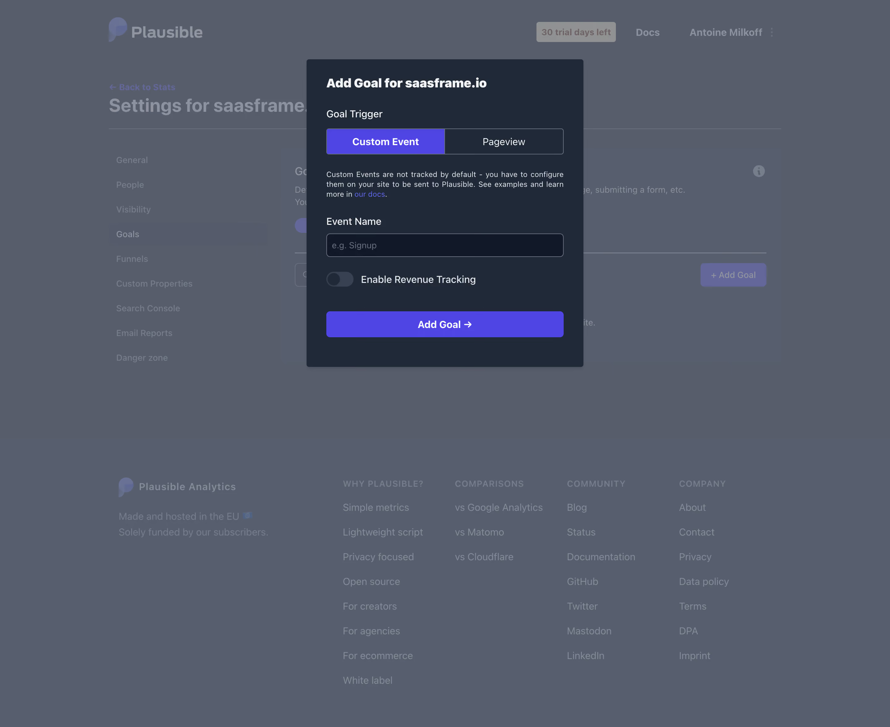
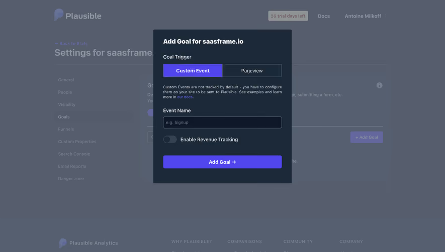
- **Style:** Dark goal-creation modal over a dimmed analytics settings page.
- **Character:** Navy surface, white labels, violet selected/action states, and compact form.
### Page composition
- **Canvas:** 2880 × 2354 image px; CSS estimates assume an unverified 2× capture.
- **Modal:** Approximately 450 × 500 CSS px near upper center.
- **Sequence:** Title, trigger tabs, helper paragraph, event-name input, revenue toggle, and full-width Add Goal.
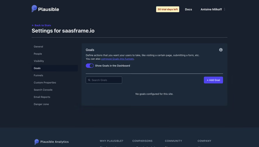
- **Background:** Settings navigation and footer remain visible through overlay.
### Information hierarchy
- **Primary:** Add Goal title and trigger selection.
- **Selected:** Custom Event filled violet; Pageview outlined.
- **Form:** Event Name and optional revenue tracking.
- **Action:** Wide violet Add Goal with arrow.
### Typography
- **Family:** Neutral sans serif; exact identity unverified.
- **Title:** Approximately 20 CSS px, bold.
- **Labels:** Approximately 16px.
- **Helpers:** Approximately 12px with 17px line-height.
- **Action:** Approximately 16px, semibold.
- **Precision:** Metrics and assumed 2× are estimates.
### Colors & surfaces
- **Modal:** #1C2938.
- **Input:** #0F1828.
- **Violet:** #5145ED.
- **Dimmed backdrop:** #555F6F and #565D6C.
- **Text:** White and light gray.
- **Precision:** Backdrop colors include overlay.
### Components
- **Tabs:** Two equal segments with shared outline.
- **Input:** Dark outlined full-width field.
- **Toggle:** Small gray off-state track.
- **Modal radius:** Small, approximately 4px CSS.
- **Button:** Full-width violet rectangle with modest radius.
- **Shadow:** Soft lower elevation.
### Visual rhythm
- **Spacing:** Consistent 32px modal inset; clear gaps between trigger help and input.
- **Alignment:** Fields/tabs/action share width.
- **Focus:** Overlay suppresses underlying page.
### Responsive
- **Observed:** Desktop only.
- **Recommendation:** Fluid modal width, wrapped helpers, and reachable actions.
- **Controls:** Preserve tab labels and toggle association.
### Adaptation guidance
- **Preserve:** Trigger-first configuration and clear optional revenue tracking.
- **Privacy:** Replace site identity and event names.
- **Behavior:** Tabs, tracking, validation, and save are unverified.
Use this context to reproduce the reference's visual language: layout, typography, colors, spacing, borders, radii, and distinctive elements. The screenshot takes priority if descriptions conflict.
## Direction
{{preferences.fidelityInstructions}}
## Output
{{output.instructions}}
Deliver a polished, cohesive design with precise alignment, hierarchy, and spacing. Produce the requested visual artifact, not just a description. If unsupported, explain the limitation.