


1. Header: The page starts with a header that includes the Placid logo, a navigation menu, and a button to log in. 2. Hero section: The hero section has a banner that showcases the different features of Placid, such as automating image generation and optimizing image SEO. 3. Pricing plans: The pricing plans are laid out in a three-column grid. Each plan is color-coded and features its name, price, and features. The first two plans have a "get started" button, while the third plan has a "contact us" button. 4. Standard plan: This plan includes 10,000 image generations per month, access to all Placid integrations, support for PNG, JPG, SVG, and GIF formats, and a monthly subscription fee of $49. 5. Pro plan: This plan includes 50,000 image generations per month, all the features of the Standard plan, 20% discount on additional generations, and a monthly subscription fee of $199. 6. Premium plan: This plan is customizable and requires contacting their sales team for personalized pricing. The Premium plan includes all the features of the Pro Plan, with the addition of a dedicated account manager, custom integrations and features, and other customizable options. 7. Feature comparison: A feature comparison chart highlights the main differences between each plan, feature by feature. 8. FAQ section: The page includes a FAQ section with commonly asked questions and their answers. The questions are tabbed, and each answer is revealed upon clicking on the question. 9. Testimonials: The page ends with a section that showcases testimonials from Placid's customers, including their name, company, and an excerpt from their review. Overall, the page has a clean and organized layout, with attention-grabbing headings, a detailed breakdown of features and pricing, and an easy-to-use navigation menu.

Thank you! Your submission has been received!
Oops! Something went wrong while submitting the form.
Get SaaSFrame Pro
Monthly
$18
Quarterly
$48
Yearly
$180
Upgrade to access this feature
Browse all screens & flows
Filter and search screens & flows
Access Figma files
Access mobile versions
Bookmark screens & flows
Join now
Placid Pricing Page

Placid
Automate your Social Share Images
Designed by
No items found.

Bookmark
Bookmark
Design with AI
Thank you! Your submission has been received!
Oops! Something went wrong while submitting the form.
# Design from Reference: Placid Pricing Page
Create an original, high-fidelity visual design inspired by the reference. Prioritize composition, typography, colors, spacing, and component styling over technical implementation.
## Reference
- **Product:** Placid
- **Category:** Pricing Page
- **Screenshot:** https://cdn.prod.website-files.com/5e9dc792e1210c5325f7ebbc/62eca43e8ef108d1f00f97b6_1659674891699-62ec9c9fd64065f7cc99baea_screenshot-device-473520bbbde0611be760432997cac099-1659617475105.webp
Analyze the screenshot first. If inaccessible, request it rather than guessing.
## Content
{{content.instructions}}
{{content.data}}
Preserve essential messaging and factual accuracy. Adapt structure and copy length for visual balance; never invent product claims.
## Visual Design
### Overall aesthetic
- **Character:** A bright pricing page uses white space, heavy rounded headings and purple gradients, with soft shadows replacing strong borders.
- **Tone:** Friendly plan selectors and colorful customer-output examples make a technical creative-automation offer feel approachable.
### Page composition
- **Capture:** The source measures 1440 × 4218 image pixels. Observed dimensions below approximate CSS only under an unverified 1× capture assumption.
- **Header:** A centered wide navigation row places the Placid mark at the left, product links in the middle and login/gradient signup actions at the right.
- **Pricing area:** A centered heading/subtitle and monthly/yearly switch precede a two-column selector. Four horizontal plan cards stack on the left; a narrower feature-summary panel sits on the right.
- **Supporting content:** A contact prompt and two short policy notes lead into eight FAQ rows.
- **Customer proof:** A centered heading precedes a collage of five example creatives, a bold testimonial, attribution, read-more link and three pagination dots.
- **Footer:** A thin rule separates a five-column footer with brand/about content and four groups of links.
### Information hierarchy
- **Plan selection:** Plan names and large price labels dominate each row; credit allowances appear smaller beneath the names.
- **Selected tier:** The second plan is filled deep purple, with a white check and a small Popular badge.
- **Feature summary:** Bold credit/preview totals lead the right panel, followed by checkmarked features and a gradient trial action.
- **FAQ:** Heavy question labels sit in separate shadowed white rows; no answer text is visible.
- **Proof:** Example outputs occupy the widest visual strip below pricing, with a centered bold quote beneath.
### Typography
- **Family:** Headings use a heavy rounded sans-serif style, while body text uses a lighter sans serif. Exact font identities are unverified.
- **Major headings:** Approximately 38–40 px, heavy, with compact leading. The subtitle is around 23–24 px and light gray.
- **Plan roles:** Names are approximately 22 px and heavy; prices around 32 px. Credit and billing qualifiers are around 14 px.
- **FAQ and quote:** Questions and testimonial text are approximately 21–24 px, bold, with comfortable wrapping.
- **Utility text:** Feature lists and footer links are approximately 14–16 px; primary actions use compact uppercase bold labels.
### Colors & surfaces
- **Measured foundation:** ICC-aware sRGB sampling yields white #FFFFFF and pale blue-lavender #F6F8FE.
- **Measured selected plan:** Deep purple #54138D fills the active tier.
- **Gradient accents:** Blue-violet transitions toward magenta on signup/trial controls and the circular brand mark.
- **Neutral hierarchy:** Dark charcoal headings contrast with light-gray descriptive text. Inactive plan prices use bright purple against pale inset blocks.
- **Depth:** Broad low-opacity gray shadows lift plan selectors and FAQ rows from the white canvas.
### Components
- **Billing switch:** A small lavender toggle sits between Monthly and Yearly labels, with a compact savings note beside the latter.
- **Plan rows:** Four roughly 620 × 125 px observed cards use rounded corners around 12 px, generous padding, radio/check markers at the left and inset price blocks at the right.
- **Summary panel:** A pale tinted rectangle has a ruled top allowance region, vertical feature list and full-width gradient pill action near the bottom.
- **Feature markers:** Small purple circular checks precede available features; the final unavailable item is visibly faded with a cross marker.
- **FAQ rows:** Eight white rounded shadowed boxes have bold labels and small triangular indicators at the far right.
- **Creation collage:** Mixed landscape and portrait examples have rounded corners and align into a compact irregular mosaic.
- **Footer:** A circular brand mark, descriptive paragraph, small legal lines and two purple social circles sit beside long link columns.
### Visual rhythm
- **Pricing cadence:** Equal-height plan rows and regular gaps make the four choices easy to scan.
- **Section spacing:** Large white intervals separate pricing, FAQ, customer proof and footer.
- **Centering:** Hero copy, FAQ heading, customer heading and quote are centered, while plan content and footer links are left aligned.
- **Contrast rhythm:** The selected purple row provides a single strong block among white cards; the customer collage introduces visual variety after repeated text rows.
### Responsive
- **Evidence boundary:** Only the desktop page is captured; responsive behaviors are recommendations.
- **Pricing stack:** Place the feature summary below the plan choices on narrow screens, retaining selected-plan visibility.
- **FAQ wrapping:** Allow long questions to wrap without colliding with the indicator.
- **Proof and footer:** Reflow the creation collage and stack footer groups while preserving readable example imagery and link targets.
- **Controls:** Keep billing and plan selection operable by touch and keyboard.
### Adaptation guidance
- **Interactive pricing pattern:** Reuse stacked selectable plans with a single adjacent detail panel when features depend on the selected tier.
- **State clarity:** Provide explicit selected, focus and loading states; only the currently selected second plan is shown.
- **Content separation:** Populate prices, allowances and policy notes from maintained data rather than treating the screenshot as current commercial information.
- **Accessible selection:** Implement real radio-group semantics and expose feature availability with text/icon meaning beyond color.
- **Scale calibration:** Validate observed image dimensions against the target CSS viewport before implementing spacing and radii.
Use this context to reproduce the reference's visual language: layout, typography, colors, spacing, borders, radii, and distinctive elements. The screenshot takes priority if descriptions conflict.
## Direction
{{preferences.fidelityInstructions}}
## Output
{{output.instructions}}
Deliver a polished, cohesive design with precise alignment, hierarchy, and spacing. Produce the requested visual artifact, not just a description. If unsupported, explain the limitation.
Category
Patterns
No items found.
Tech Stack
No items found.
Added on
January 28, 2021
Similar screens





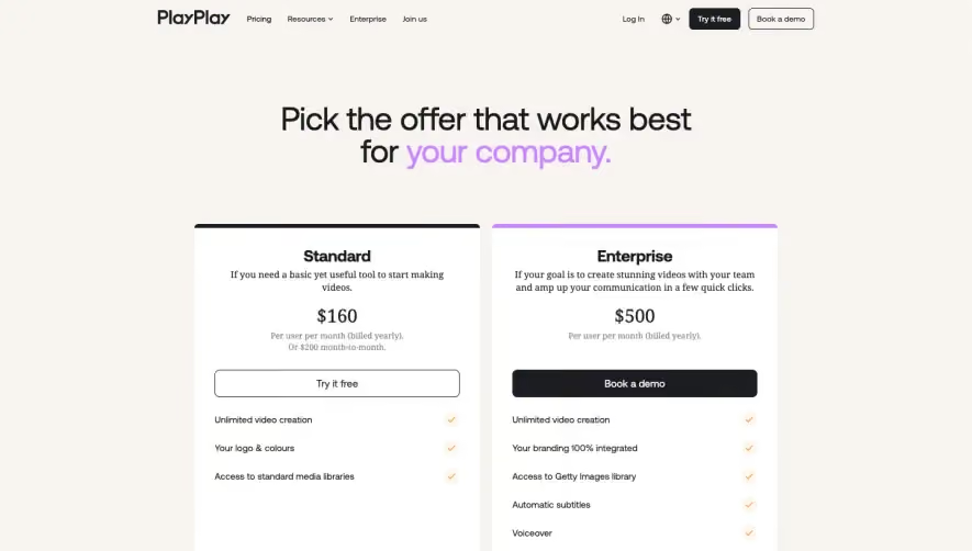

Upgrade to SaaSFrame Pro now to see similar examples.
Monthly
$18 /month
Billed $18 monthly
Browse all screens & flows
Filter and search screens & flows
Search text in screenshots
Access Figma files
Access mobile versions
Join now
Quarterly
$16 /month
Billed $48 quarterly
Browse all screens & flows
Filter and search screens & flows
Search text in screenshots
Access Figma files
Access mobile versions
Join now
Yearly
$15 /month
Billed $180 yearly
Browse all screens & flows
Filter and search screens & flows
Search text in screenshots
Access Figma files
Access mobile versions
Join now