Prompt 1,044 words Copy
# Design from Reference: PlayPlay Pricing Page

Create an original, high-fidelity visual design inspired by the reference. Prioritize composition, typography, colors, spacing, and component styling over technical implementation.

## Reference

- **Product:** PlayPlay
- **Category:** Pricing Page
- **Screenshot:** attached to this message (also available at https://media.saasframe.io/o/0e0b92a6dba41b7c62d1.webp)
- **Source:** https://playplay.com/pricing/

Analyze the attached screenshot first. If no image is attached, open the screenshot link; if neither is accessible, ask for it rather than guessing.

## Visual Design Context

### Overall aesthetic

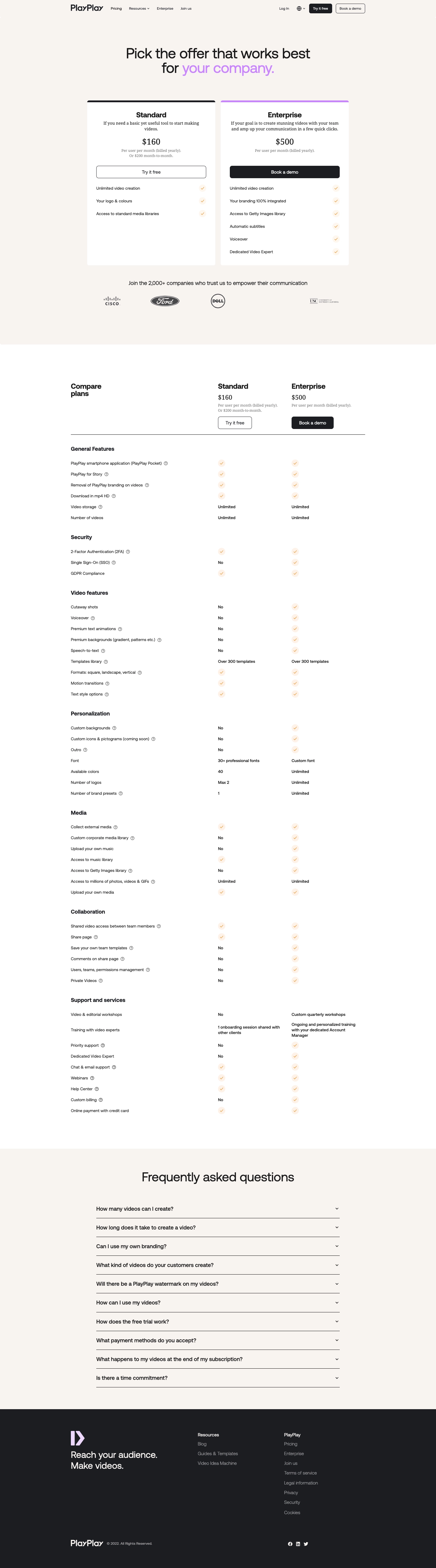
- **Character:** A restrained pricing page uses warm off-white sections, white plan cards, black typography, lavender emphasis and peach check badges.
- **Evidence:** The image is 1440 × 5183 pixels. All four readable portions were inspected; CSS dimensions assume an unverified 1× capture density.

### Page composition

- **Header/hero:** A compact navigation row precedes a centered two-line offer heading, with the final phrase in lavender.
- **Plan cards:** Two equal white columns present Standard and Enterprise, followed by four customer logos.
- **Comparison:** A long three-column table aligns feature names with the two plans, grouped into General Features, Security, Video features, Personalization, Media, Collaboration and Support/services.
- **Closing:** A warm-background FAQ contains ten collapsed rows before a dark footer with brand statement, two link groups and social/legal details.

### Information hierarchy

- **Offer:** The large headline leads into plan names, descriptions, prices and actions.
- **Plan emphasis:** Standard has a black top rule and outlined trial action; Enterprise uses a lavender top rule and filled black demo action.
- **Comparison:** Bold group headings separate dense feature rows; availability uses peach checks, No labels and explicit limits.
- **Support:** FAQ questions provide the last decision-support layer before footer links.

### Typography

- **Hero:** Approximately 46–48 pixels regular sans-serif with tight tracking and around 1.0 line-height.
- **Plan names:** About 24 pixels bold; prices and card descriptions visibly use serif forms, around 28 and 16 pixels respectively.
- **Table:** Feature labels/values are roughly 13–14 pixels, with bold section headings around 18 pixels.
- **FAQ/footer:** FAQ title is around 42 pixels; question labels about 18 pixels semibold. Exact font identities are unverified, including the mixed serif card copy.

### Colors & surfaces

- **Measured base:** ICC-to-sRGB sampling identifies #FFFFFF as cards/table, #F8F4F0 as warm section background and #1C1D21 as dark footer/action surfaces.
- **Measured support:** #F8F3F2 is a nearby warm variation and #1A1A1A a dark foreground tone.
- **Accents:** Lavender highlights the hero phrase, Enterprise rule and footer emblem; pale peach circles contain orange checks.
- **Depth:** Flat cards with small radii dominate; the comparison relies on alignment rather than extensive cell borders.

### Components

- **Plan cards:** Approximately 420 pixels wide with about 30-pixel padding, small radii and thin colored top strips.
- **Actions:** Full-card-width trial/demo controls are around 40 pixels tall; smaller equivalents repeat above the comparison.
- **Feature matrix:** A broad label column and two narrower plan columns maintain aligned rows, with small circled help icons beside selected labels.
- **Checks:** Small pale circular badges indicate inclusion; text values communicate unlimited/custom/limited allowances.
- **FAQ rows:** Roughly 800 pixels wide, with thin black lower rules, left-aligned question and right chevron.
- **Footer:** A lavender symbol and large two-line statement sit left of resource/company links; social icons and copyright occupy the lower band.

### Visual rhythm

- **Centered widths:** Header and comparison use a roughly 970-pixel centered container; plan cards and FAQ are narrower.
- **Table cadence:** Compact approximately 36-pixel row spacing contrasts with larger gaps between feature groups.
- **Section breaks:** Warm hero/FAQ surfaces separate pricing and support from the long white matrix.
- **Whitespace:** Plan cards have significant lower whitespace where feature lists differ in length.

### Responsive

- **Observed scope:** Only a desktop pricing comparison with collapsed FAQs is shown.
- **Recommended layout:** Stack plan cards and provide an accessible horizontally scrollable or plan-selectable comparison on narrow screens.
- **Recommended text:** Preserve row labels with their values, allow long feature descriptions to wrap and keep help targets usable.
- **Recommended footer:** Stack link groups and reduce headline size without losing the lavender phrase emphasis.

### Adaptation guidance

- **Pricing pattern:** Present two clear offers first, then detailed capability differences and common purchase questions.
- **Content clarity:** Use explicit text alongside check marks; maintain consistent alignment for limits and custom services.
- **Evidence fidelity:** Preserve the observed serif/sans mixture when documenting the screenshot, but verify intended brand typography before rebuilding.
- **Implementation:** Confirm fonts/density and live prices, define FAQ expansion/help states and retain visible focus for trial/demo controls.

## Content

**Instructions:**

Generate realistic example content that fits the selected design reference.

Create appropriate headlines, descriptions, labels, buttons, and supporting copy based on the type of interface being designed.

If a product or business description is provided, use it to guide the content.

Otherwise, invent a plausible fictional SaaS product appropriate for the reference.

Keep the content concise, coherent, and visually balanced.

Do not present fictional statistics, customer names, or testimonials as verified facts.

## Design Direction

**Instructions:**

Use the reference screenshot as the main source of visual inspiration rather than a strict layout template.

Preserve its most distinctive design characteristics, such as typography, visual rhythm, color relationships, component treatments, and overall aesthetic.

Feel free to modify section arrangements, proportions, spacing, and individual components to better suit my content.

Introduce original design decisions where they improve usability, composition, or brand consistency.

The result should clearly reflect the reference's visual language without looking like a direct reproduction.

Follow the visual identity of the reference design.

Use its typography, color palette, component styling, and overall aesthetic as the primary design direction.

Do not introduce an unrelated visual identity.

## Output

**Instructions:**

Generate a high-fidelity visual mockup of the requested interface.

Present the design as a polished, realistic website or product UI screenshot.

Prioritize visual composition, typography, spacing, colors, alignment, and component details.

Use the available image-generation or visual-design capabilities.

Do not replace the mockup with source code, a written design specification, or a textual description.

If direct visual generation is unavailable, clearly explain the limitation.

## Constraints

- Use the actual screenshot as the primary visual reference.
- Preserve essential messaging and factual accuracy.
- Prioritize visual quality and consistency.
- Do not invent unsupported product claims.
- Adapt structure and copy length for visual balance.
Reference image Attach it to your message: assistants can’t open image links. Open in ChatGPT ↗ Open in Claude ↗
Build it in Lovable ↗ v0 ↗ Figma Make ↗
Opening a tool copies the screenshot so you can paste it with your prompt.
 SaaSFrame