Design with AI
Generate a new design based on this screen using your own content.
# Design from Reference: Pangram Unlock Gmail integration
Create an original, high-fidelity visual design inspired by the reference. Prioritize composition, typography, colors, spacing, and component styling over technical implementation.
## Reference
- **Product:** Pangram
- **Category:** Upgrading
- **Screenshot:** https://cdn.prod.website-files.com/5e9dc792e1210c5325f7ebbc/6aca261ba3a034e38b3ee69e_6aca22f36b8182f1bf7492a0_cms-0b8dc08194dbb46ca9faae2c.webp
Analyze the screenshot first. If inaccessible, request it rather than guessing.
## Content
{{content.instructions}}
{{content.data}}
Preserve essential messaging and factual accuracy. Adapt structure and copy length for visual balance; never invent product claims.
## Visual Design
### Overall aesthetic
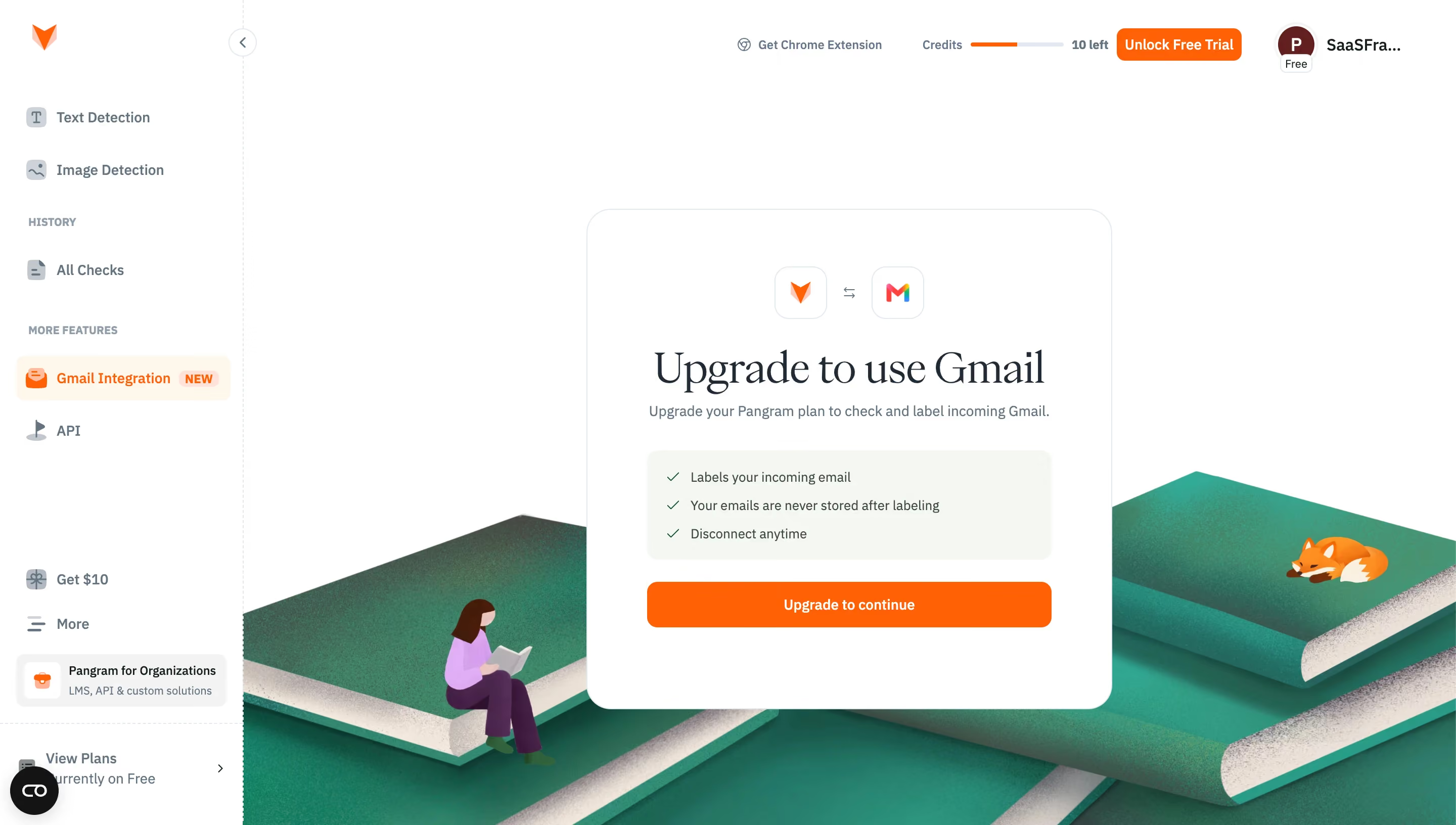
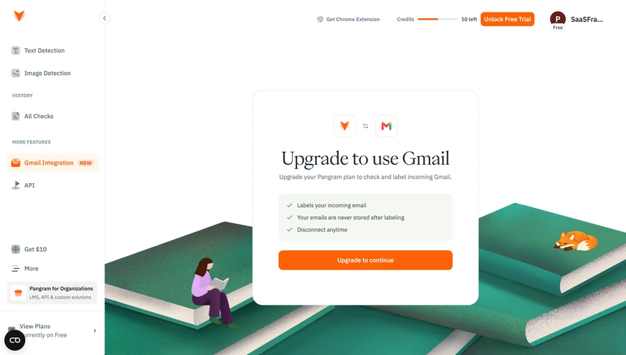
- **Style:** Bright integration-upgrade screen with a centered white card, orange conversion action, and illustrated green books.
- **Character:** Compact dashboard navigation contrasts with an editorial serif upgrade headline.
### Page composition
- **Canvas:** 2880 × 1632 image px; CSS estimates assume an unverified 2× capture.
- **Sidebar:** Approximately 240 CSS px wide.
- **Main card:** Approximately 520 × 495 CSS px, centered within remaining content.
- **Card sequence:** Product/Gmail logo pair, title, subtitle, pale benefit list, and orange CTA.
- **Artwork:** Oversized textured green books and small character/fox illustrations occupy the lower background.
### Information hierarchy
- **Primary:** Upgrade to use Gmail headline.
- **Benefits:** Three short checkmarked assurances.
- **Action:** Full-width Upgrade to continue.
- **Context:** Gmail Integration selected in sidebar; credits and free-trial action remain in header.
### Typography
- **Family:** Serif display title paired with compact sans serif UI; exact families unverified.
- **Title:** Approximately 44 CSS px, regular serif under assumed 2×.
- **Subtitle/body:** Approximately 14px with 22px line-height.
- **CTA:** Approximately 14px, semibold.
- **Navigation:** Approximately 12–14px.
- **Precision:** Sizes and scale are estimates.
### Colors & surfaces
- **Canvas/card:** #FFFFFF.
- **Benefit panel:** #F5F7F3.
- **Action orange:** #FF6105.
- **Selected navigation:** #FFF7ED.
- **Secondary surface:** #F3F3F3.
- **Muted text:** #637481.
- **Borders:** #E2E8F0.
- **Primary text:** #212B36.
- **Precision:** Screenshot samples converted to sRGB where applicable.
### Components
- **Card:** Thin cool outline, approximately 24px CSS radius.
- **Logos:** Two small white outlined squares with connection arrows.
- **Benefit box:** Pale rounded rectangle with green checks.
- **CTA:** Approximately 46 CSS px high, modest rounded corners.
- **Sidebar:** Orange active state, badges, small line icons, and lower promotions.
- **Artwork:** Textured illustration rather than flat UI surface.
### Visual rhythm
- **Whitespace:** Large upper margin and generous card padding.
- **Alignment:** Centered title/logos; benefits left-aligned within shared inset.
- **Layering:** Card overlays books without dimming the dashboard.
### Responsive
- **Observed:** Desktop only.
- **Recommendation:** Scale card fluidly, wrap serif title, and crop decorative books.
- **Navigation:** Collapse sidebar while preserving upgrade context.
### Adaptation guidance
- **Preserve:** Integration identity, concise benefits, editorial title, and strong orange action.
- **Content:** Use current integration requirements and supplied assurances.
- **Behavior:** Upgrade and connection flow are not demonstrated.
Use this context to reproduce the reference's visual language: layout, typography, colors, spacing, borders, radii, and distinctive elements. The screenshot takes priority if descriptions conflict.
## Direction
{{preferences.fidelityInstructions}}
## Output
{{output.instructions}}
Deliver a polished, cohesive design with precise alignment, hierarchy, and spacing. Produce the requested visual artifact, not just a description. If unsupported, explain the limitation.