Generate a new design based on this screen using your own content.
Thank you! Your submission has been received!
Oops! Something went wrong while submitting the form.
# Design from Reference: Nord VPN Blog Feed
Create an original, high-fidelity visual design inspired by the reference. Prioritize composition, typography, colors, spacing, and component styling over technical implementation.
## Reference
- **Product:** Nord VPN
- **Category:** Blog Feed
- **Screenshot:** https://cdn.prod.website-files.com/5e9dc792e1210c5325f7ebbc/6acb6af1bf2e69a0c03b6cc8_6acb6a2346a91b1bd897d924_cms-b3798ce50535cf0d39d36c92.webp
Analyze the screenshot first. If inaccessible, request it rather than guessing.
## Content
{{content.instructions}}
{{content.data}}
Preserve essential messaging and factual accuracy. Adapt structure and copy length for visual balance; never invent product claims.
## Visual Design
Use this context to reproduce the reference's visual language: layout, typography, colors, spacing, borders, radii, and distinctive elements. The screenshot takes priority if descriptions conflict.
## Direction
{{preferences.fidelityInstructions}}
## Output
{{output.instructions}}
Deliver a polished, cohesive design with precise alignment, hierarchy, and spacing. Produce the requested visual artifact, not just a description. If unsupported, explain the limitation.
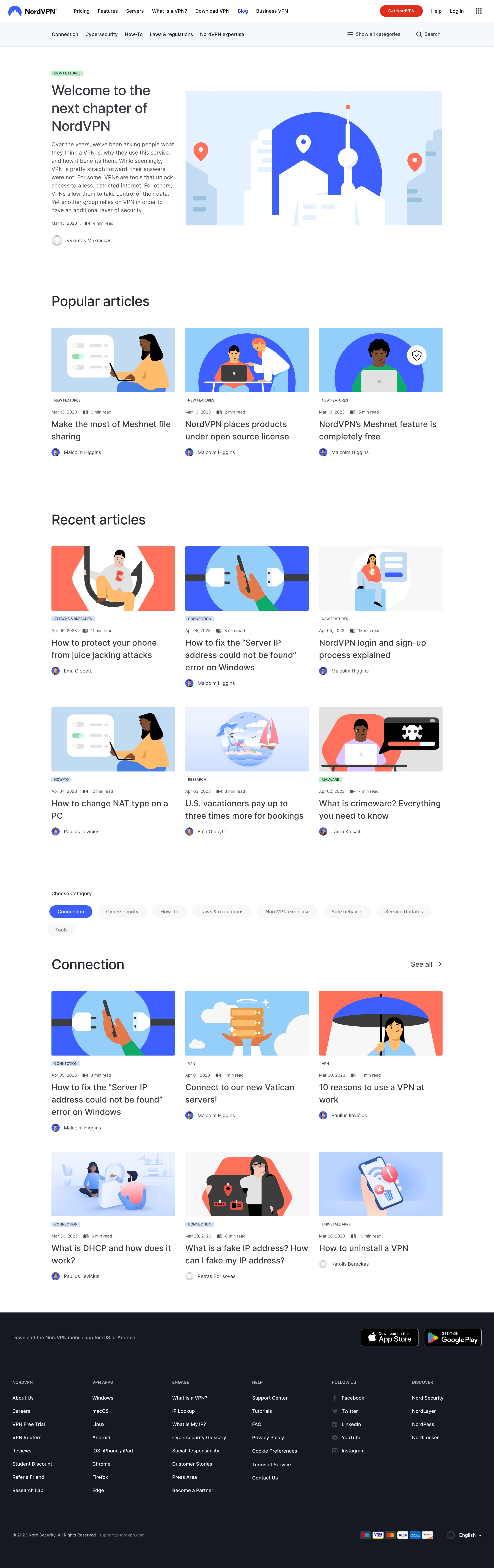
NordVPN’s blog exemplifies modern minimalism, blending professionalism with an approachable feel. The design is crisp and uncluttered, relying on generous whitespace and clean lines to foster a sense of trust and clarity—vital qualities for a cybersecurity SaaS product.
Layout and Structure
The layout guides users seamlessly from a welcoming hero section with bold, legible headlines right into curated blog content. Posts are arranged in a visually scannable grid, prioritized by category for immediate relevance. Prominent CTAs and sticky navigation maintain user orientation without distraction, and a well-organized footer anchors the experience with company resources and trust signals.
Visual Elements
The page leverages high-quality, editorial-style imagery and bespoke illustrations to maintain visual interest. Custom icons punctuate content sections, enhancing comprehension without overwhelming. Subtle hover effects bring the interface to life, delivering interactivity while keeping the look refined and trustworthy.
Color Palette and Typography
A cool, blue-centric palette reinforces NordVPN’s brand identity, invoking a sense of security and calm. Accents in teal and gentle grays create visual hierarchy, highlighting CTAs and featured posts. The typography is clean and sans-serif—utilizing varying font weights for distinct headings, subheadings, and readable body text—ensuring logical, user-friendly reading paths.
User Experience Patterns and Standout Details
Smart navigation, category filters, and search tools enable swift content discovery, while visible, actionable buttons encourage newsletter sign-ups and exploration. Notably, the integration of security-focused branding with blog content fosters an immediate sense of authority. The site’s overall tone feels competent yet accessible, striking a balance between innovation and user reassurance—ideal for SaaS inspiration.