Design with AI
Generate a new design based on this screen using your own content.
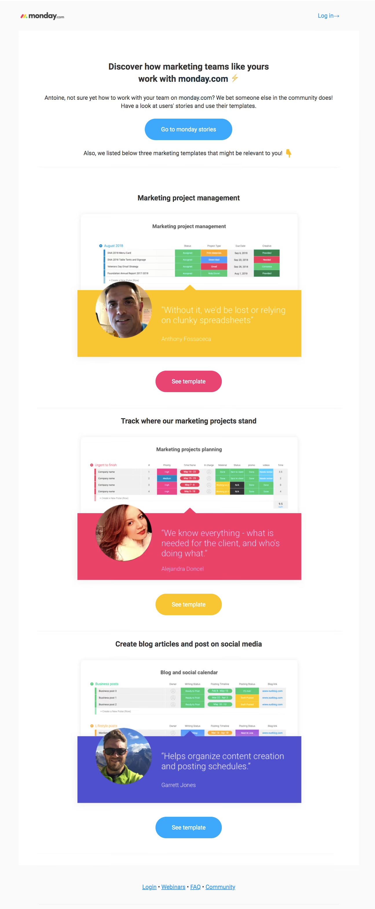
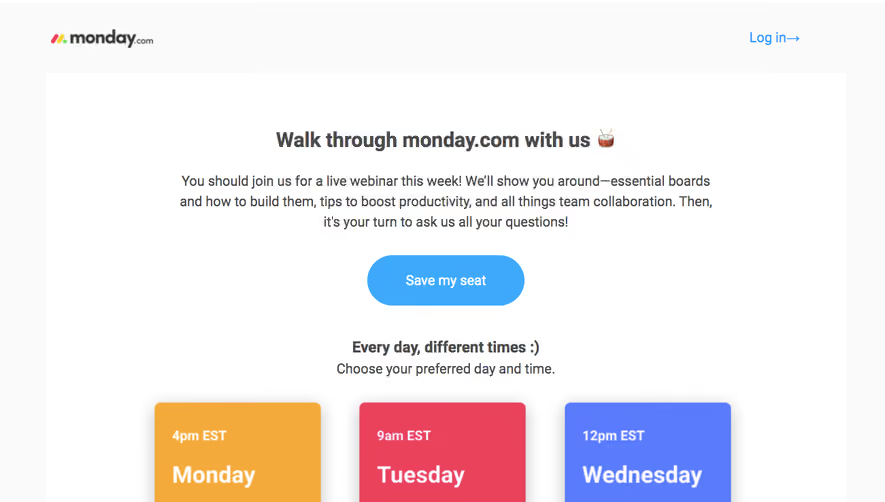
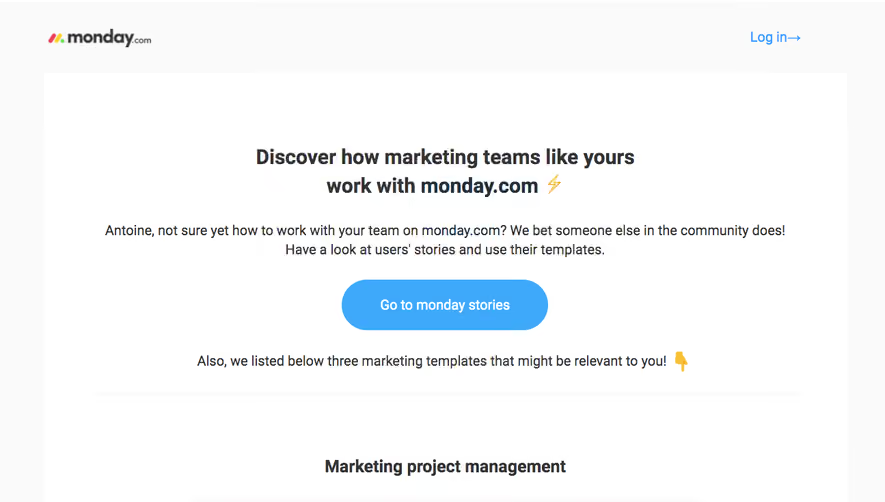
# Design from Reference: Monday Onboarding Emails
Create an original, high-fidelity visual design inspired by the reference. Prioritize composition, typography, colors, spacing, and component styling over technical implementation.
## Reference
- **Product:** Monday
- **Category:** Onboarding Email
- **Screenshot:** https://cdn.prod.website-files.com/5e9dc792e1210c5325f7ebbc/6acc0d3bea6cae5cb6f1c295_6acc084bca3783a9b9142144_cms-d42ebbf9dafd6227ba046065-v3.webp
Analyze the screenshot first. If inaccessible, request it rather than guessing.
## Content
{{content.instructions}}
{{content.data}}
Preserve essential messaging and factual accuracy. Adapt structure and copy length for visual balance; never invent product claims.
## Visual Design
### Overall aesthetic
- **Character:** Bright onboarding email combining practical template recommendations with colorful customer-proof panels.
### Page composition
- **Canvas:** 1295 × 3134 screenshot pixels; rendered CSS scale is unverified.
- **Structure:** Brand/login header; centered introduction and stories action; three repeated template sections; simple footer links.
### Information hierarchy
- **Priority:** Marketing-oriented headline and community explanation introduce a blue stories CTA.
- **Template anatomy:** Centered section title, product-board screenshot, overlapping circular customer portrait/colored quote panel and See template pill.
### Typography
- **Family:** Neutral sans-serif with bold centered headings; exact font is unverified.
- **Scale:** Estimated rendered hero heading 28–30px, section titles 24px, body 19–20px and large quotation text 28–30px.
### Colors & surfaces
- **Sampled palette:** White #FFFFFF; pale outer background #FAFAFA; yellow #F8C533; violet #4E50CE; pink #E94368; pale rules #F0F0F0.
- **Accents:** Blue primary stories action; template buttons alternate pink, yellow and blue.
### Components
- **Proof panels:** White rounded screenshot cards with soft shadows, overlaid rectangular quote banners and a small upward pointer.
- **Actions:** Broad pill buttons, approximately 64–72 screenshot pixels high.
- **Footer:** Centered underlined links separated by dots.
### Visual rhythm
- **Spacing:** Large 64–96 screenshot-pixel gaps separate repeated recommendations; faint rules create chapter breaks.
### Responsive
- **Guidance:** Mobile is not shown. Keep one-column order, scale screenshot/quote composites and protect customer-quote readability.
### Adaptation guidance
- **Transfer:** Preserve recommendation-plus-proof repetition. Use target templates, original screenshots and verified customer evidence.
Use this context to reproduce the reference's visual language: layout, typography, colors, spacing, borders, radii, and distinctive elements. The screenshot takes priority if descriptions conflict.
## Direction
{{preferences.fidelityInstructions}}
## Output
{{output.instructions}}
Deliver a polished, cohesive design with precise alignment, hierarchy, and spacing. Produce the requested visual artifact, not just a description. If unsupported, explain the limitation.