Generate a new design based on this screen using your own content.
Thank you! Your submission has been received!
Oops! Something went wrong while submitting the form.
# Design from Reference: Meiro Pricing Page
Create an original, high-fidelity visual design inspired by the reference. Prioritize composition, typography, colors, spacing, and component styling over technical implementation.
## Reference
- **Product:** Meiro
- **Category:** Pricing Page
- **Screenshot:** https://cdn.prod.website-files.com/5e9dc792e1210c5325f7ebbc/6acadbdfd05a3f53c0a8618f_6acadb216eb1019ee886e747_cms-9369cf709cade5b438aa4b75.webp
Analyze the screenshot first. If inaccessible, request it rather than guessing.
## Content
{{content.instructions}}
{{content.data}}
Preserve essential messaging and factual accuracy. Adapt structure and copy length for visual balance; never invent product claims.
## Visual Design
Use this context to reproduce the reference's visual language: layout, typography, colors, spacing, borders, radii, and distinctive elements. The screenshot takes priority if descriptions conflict.
## Direction
{{preferences.fidelityInstructions}}
## Output
{{output.instructions}}
Deliver a polished, cohesive design with precise alignment, hierarchy, and spacing. Produce the requested visual artifact, not just a description. If unsupported, explain the limitation.
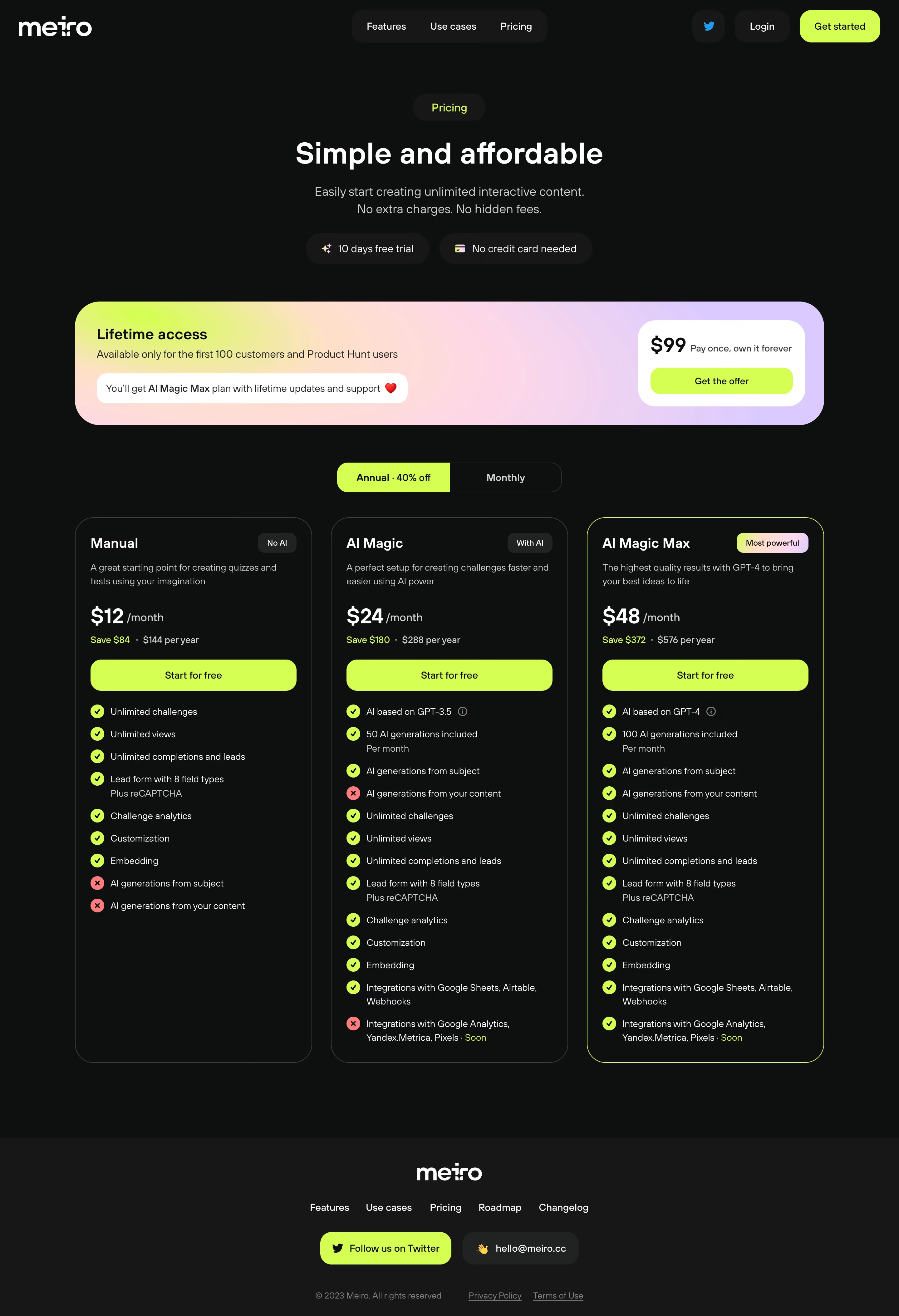
Meiro’s pricing page radiates sleek minimalism infused with a lively, tech-forward vibe. The interface balances generous white space with bursts of energetic gradients, creating an inviting and fresh environment. Playful micro-interactions and gently animated elements give a sense of approachability without compromising professionalism.
Layout and Structure
The structure is focused and intuitive: immediately after a crisp header, visitors are welcomed by a prominent pricing section, displaying plans in clear, distinct cards. Brief supporting information, such as a features overview and FAQ, is positioned logically below. The footer is streamlined, offering quick access to essentials without visual clutter.
Visual Elements
Custom, soft-edged illustrations and subtly shifting gradients inject personality and clarity. Friendly icons punctuate lists and plan features, while animated accents draw just enough attention to key choices and CTAs. There’s an absence of stock photography, allowing the illustrated ecosystem to shine.
Color Palette and Typography
The palette is led by a vibrant cyan and soft purple gradient, contrasting against a white and soft gray background to guide the eye. Typography mixes a geometric sans-serif for headlines with a crisp, highly-readable font for body copy, facilitating clear hierarchy and effortless scanning.
User Experience Patterns
Sticky header navigation stays accessible as users scroll, while CTAs—like “Start your free trial”—are bold and repeated at strategic points for maximal conversion. Switchers allow toggling between billing options, and forms are compact, frictionless, and reassuring.
Unique or Notable Design Choices
Standout elements include animated plan highlights when hovering, playful toggle switches for monthly/annual pricing, and conversational microcopy. The tone combines trustworthiness and innovation—underscored by expert polish—positioning Meiro as both cutting-edge and dependable.