Design with AI
Generate a new design based on this screen using your own content.
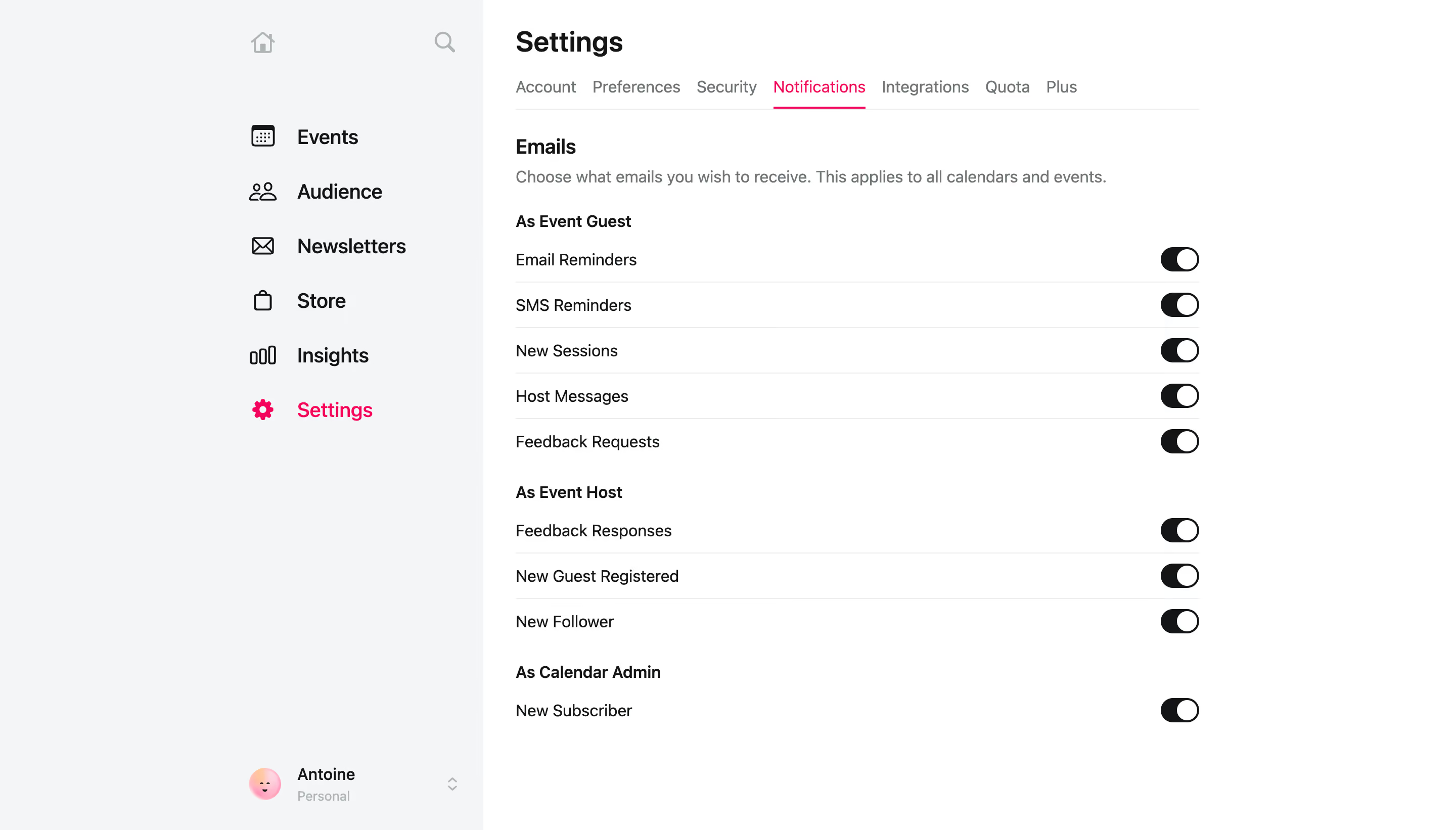
# Design from Reference: Luma Notifications Settings
Create an original, high-fidelity visual design inspired by the reference. Prioritize composition, typography, colors, spacing, and component styling over technical implementation.
## Reference
- **Product:** Luma
- **Category:** Settings
- **Screenshot:** https://cdn.prod.website-files.com/5e9dc792e1210c5325f7ebbc/6acb723110423f7ec1f65105_6acb707bfb17204a8e24b6ce_cms-f196a12a395b52f329f9954a.webp
Analyze the screenshot first. If inaccessible, request it rather than guessing.
## Content
{{content.instructions}}
{{content.data}}
Preserve essential messaging and factual accuracy. Adapt structure and copy length for visual balance; never invent product claims.
## Visual Design
### Overall aesthetic
- **Character:** Minimal notification-preferences page with a pale gray navigation field, black switches and vivid pink active states.
### Page composition
- **Capture:** 2880 × 1642 screenshot pixels; estimated 2× CSS scale.
- **Structure:** Wide left navigation and a compact main settings column. Horizontal tabs precede email preferences grouped by guest, host and calendar-admin roles.
### Information hierarchy
- **Priority:** Settings title and active Notifications tab establish location; role headings divide a repeated label/switch list.
### Typography
- **Family:** Sans serif; exact family unverified.
- **Estimated CSS sizes:** Page heading 28px, section title 20px, navigation 20px and preference labels/helper copy 16px.
### Colors & surfaces
- **Measured palette:** White #FFFFFF, sidebar #F4F5F7, ink #141517, rules #EDEDED and muted text #707578.
- **Accents:** Bright pink selected Settings link and Notifications underline; enabled toggles use near-black tracks and white knobs.
### Components
- **Elements:** Icon/text navigation, horizontal settings tabs, explanatory sentence, role subheadings, right-aligned switches and bottom profile switcher.
- **Estimated geometry:** Preference column approximately 676px wide, 44px rows, 38×24px pill switches and fine separators.
### Visual rhythm
- **Spacing:** Tight list rows are separated by larger role-group gaps. Extensive white space right of the column keeps the form calm.
### Responsive
- **Suggested adaptation:** Collapse sidebar, allow tabs to scroll horizontally and keep switches aligned beside wrapping labels. Mobile behavior is not shown.
### Adaptation guidance
- **Transfer:** Retain role-based grouping and consistent switch placement. Reflect actual preference state with clear labels.
Use this context to reproduce the reference's visual language: layout, typography, colors, spacing, borders, radii, and distinctive elements. The screenshot takes priority if descriptions conflict.
## Direction
{{preferences.fidelityInstructions}}
## Output
{{output.instructions}}
Deliver a polished, cohesive design with precise alignment, hierarchy, and spacing. Produce the requested visual artifact, not just a description. If unsupported, explain the limitation.