
Thank you! Your submission has been received!
Oops! Something went wrong while submitting the form.
Get SaaSFrame Pro
Monthly
$18
Quarterly
$48
Yearly
$180
Upgrade to access this feature
Browse all screens & flows
Filter and search screens & flows
Access Figma files
Access mobile versions
Bookmark screens & flows
Join now
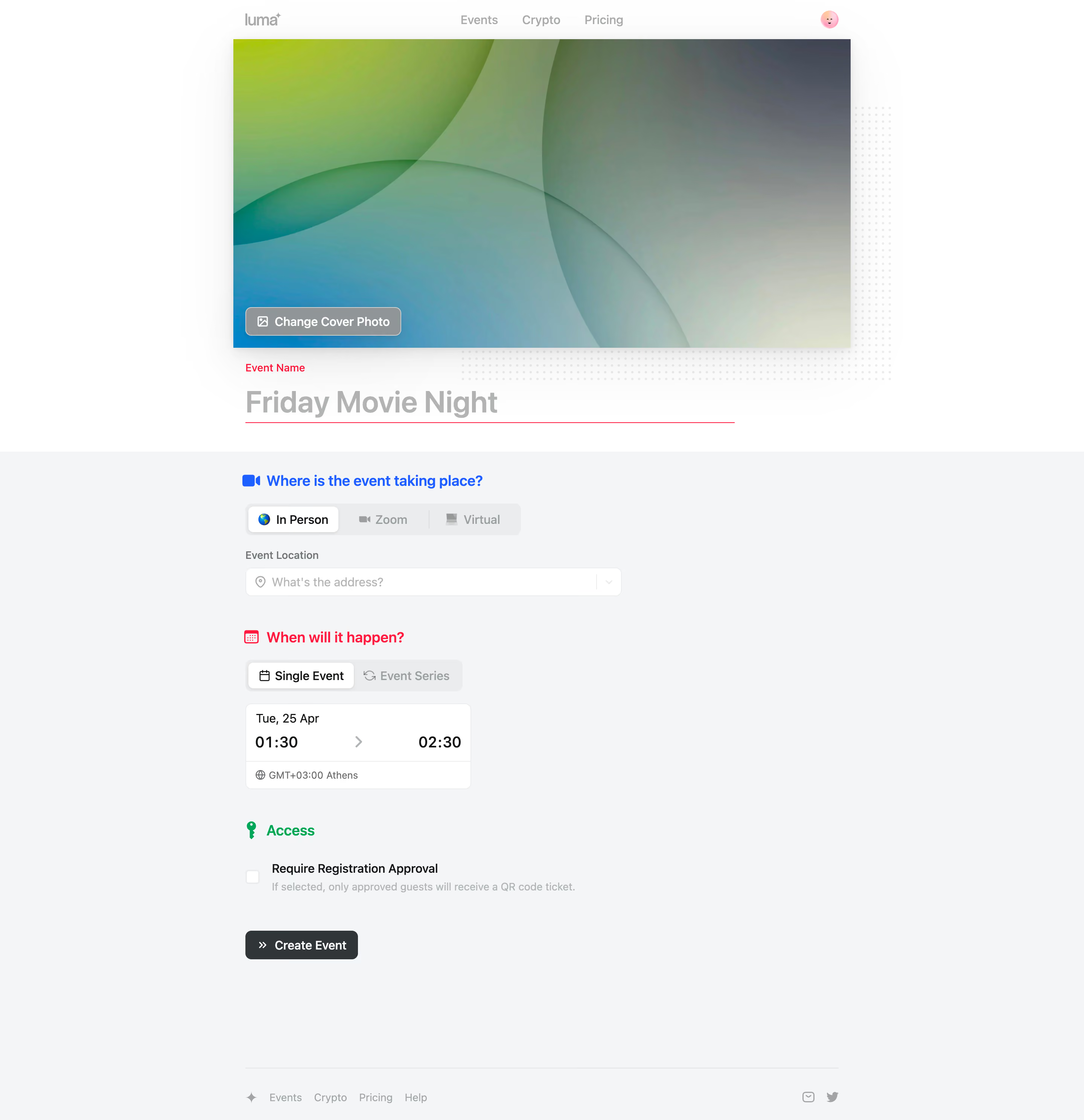
Luma Create An Event

Luma
Host Delightful Events
Designed by
No items found.

Bookmark
Bookmark

Design with AI
Thank you! Your submission has been received!
Oops! Something went wrong while submitting the form.
# Design from Reference: Luma Create An Event
Create an original, high-fidelity visual design inspired by the reference. Prioritize composition, typography, colors, spacing, and component styling over technical implementation.
## Reference
- **Product:** Luma
- **Category:** Add & Edit
- **Screenshot:** https://cdn.prod.website-files.com/5e9dc792e1210c5325f7ebbc/6acb723610423f7ec1f6519a_6acb70b059427db08a8b86d6_cms-7faa6f93730f6c5abc3f037a.webp
Analyze the screenshot first. If inaccessible, request it rather than guessing.
## Content
{{content.instructions}}
{{content.data}}
Preserve essential messaging and factual accuracy. Adapt structure and copy length for visual balance; never invent product claims.
## Visual Design
### Overall aesthetic
- **Character:** A light event-creation screen with a large abstract cover, spacious single-column setup controls and color-coded section headings.
- **Evidence scale:** Original 2880 × 2976 pixels, inspected to the footer. Estimated CSS sizes assume an unverified 2× capture scale.
### Page composition
- **Header:** A narrow centered navigation row places Luma branding at left, three links near the middle and a small circular avatar at right.
- **Cover region:** Approximately 820 × 410 px abstract green/blue-gray image spans the main column, with a Change Cover Photo button over its lower-left edge.
- **Title region:** A red Event Name label precedes a large gray title field and long red underline.
- **Form body:** A full-width pale-gray band holds an approximately 790 px centered column, with location, date/time and access sections in sequence.
- **Bottom:** A dark Create Event button appears below access settings; a divider and small link/icon footer close the page.
### Information hierarchy
- **Visual identity:** The cover dominates the upper portion, followed by the oversized event-name field.
- **Section landmarks:** Blue location, red timing and green access headings each use a matching icon.
- **Selected choices:** In Person and Single Event appear as raised white choices within gray segmented controls; alternative options are muted.
- **Final action:** A small dark Create Event button is the strongest filled form action. No creation result is visible.
### Typography
- **Event name:** Unverified sans-serif, approximately 40 px bold with 48 px line height.
- **Section headings:** Around 20 px semibold, 28 px line height.
- **Control text:** Approximately 16 px regular/medium; date/time values include larger bold time numerals around 20 px.
- **Labels and helpers:** Approximately 14 px regular, with muted helper text and a darker checkbox label. Tracking is largely neutral.
### Colors & surfaces
- **Base:** White #FFFFFF upper page and pale cool #F4F5F7 form body.
- **Controls:** White fields with pale #EBECEE outlines and light-gray segmented tracks.
- **Text:** Dark charcoal actions and values contrast with soft gray placeholder and navigation text.
- **Section accents:** Saturated blue, pink-red and green distinguish location, timing and access; the abstract cover adds lime, teal and blue-gray gradients.
- **Decoration:** A pale dotted grid offsets the cover at its right and lower edges.
### Components
- **Cover control:** Translucent gray rounded button with a fine white border, image icon and white medium text; roughly 206 × 38 px.
- **Name field:** Large unboxed text input with a thin red baseline spanning roughly 650 px.
- **Location tabs:** Rounded gray segmented bar with three icon-led choices, separated by subtle rules; active white segment has a small shadow.
- **Address field:** Approximately 500 × 38 px, pin icon at left and chevron region at right.
- **Time card:** Approximately 300 × 112 px white rounded container, with date above start/end times and a divided timezone footer.
- **Access option:** Empty square checkbox beside a bold registration-approval label, with muted explanatory text below.
- **Create action:** Approximately 150 × 38 px dark rounded button with a leading double-chevron.
### Visual rhythm
- **Section spacing:** Approximately 40–48 px separates the location, timing and access groups.
- **Alignment:** Cover overlay, event-name field and form controls follow a common left axis within the centered content region.
- **Density:** Compact controls occupy only part of the available form width, leaving ample breathing room to the right.
- **Footer:** A substantial empty interval after the create action distinguishes the setup flow from secondary links.
### Responsive
- **Observed limit:** Desktop only; smaller-screen form and cover behavior are unverified.
- **Recommendation:** Make the cover and name field fluid, retain natural image cropping and reduce title size for narrow viewports.
- **Control handling:** Wrap segmented choices where necessary and keep date, time and timezone together in a readable card.
### Adaptation guidance
- **Retain:** Begin with event identity, then organize setup into visibly distinct location, timing and access groups.
- **Implement:** Use color plus labels/icons for section recognition, consistent rounded controls and one final action.
- **Verify:** Confirm font, capture scale, validation and event-creation behavior separately. The screenshot's red field styling does not establish its validation cause.
Use this context to reproduce the reference's visual language: layout, typography, colors, spacing, borders, radii, and distinctive elements. The screenshot takes priority if descriptions conflict.
## Direction
{{preferences.fidelityInstructions}}
## Output
{{output.instructions}}
Deliver a polished, cohesive design with precise alignment, hierarchy, and spacing. Produce the requested visual artifact, not just a description. If unsupported, explain the limitation.


Category
Patterns
No items found.
Tech Stack



Added on
April 25, 2023
Similar screens



Upgrade to SaaSFrame Pro now to see similar examples.
Monthly
$18 /month
Billed $18 monthly
Browse all screens & flows
Filter and search screens & flows
Search text in screenshots
Access Figma files
Access mobile versions
Join now
Quarterly
$16 /month
Billed $48 quarterly
Browse all screens & flows
Filter and search screens & flows
Search text in screenshots
Access Figma files
Access mobile versions
Join now
Yearly
$15 /month
Billed $180 yearly
Browse all screens & flows
Filter and search screens & flows
Search text in screenshots
Access Figma files
Access mobile versions
Join now