Design with AI
Generate a new design based on this screen using your own content.
# Design from Reference: Livestorm Share Event
Create an original, high-fidelity visual design inspired by the reference. Prioritize composition, typography, colors, spacing, and component styling over technical implementation.
## Reference
- **Product:** Livestorm
- **Category:** Share
- **Screenshot:** https://cdn.prod.website-files.com/5e9dc792e1210c5325f7ebbc/6acb61bac08cd859ff851bc7_6acadc7ecdf07ad614998acd_cms-b2aceb12561662cd63825707.webp
Analyze the screenshot first. If inaccessible, request it rather than guessing.
## Content
{{content.instructions}}
{{content.data}}
Preserve essential messaging and factual accuracy. Adapt structure and copy length for visual balance; never invent product claims.
## Visual Design
### Overall aesthetic
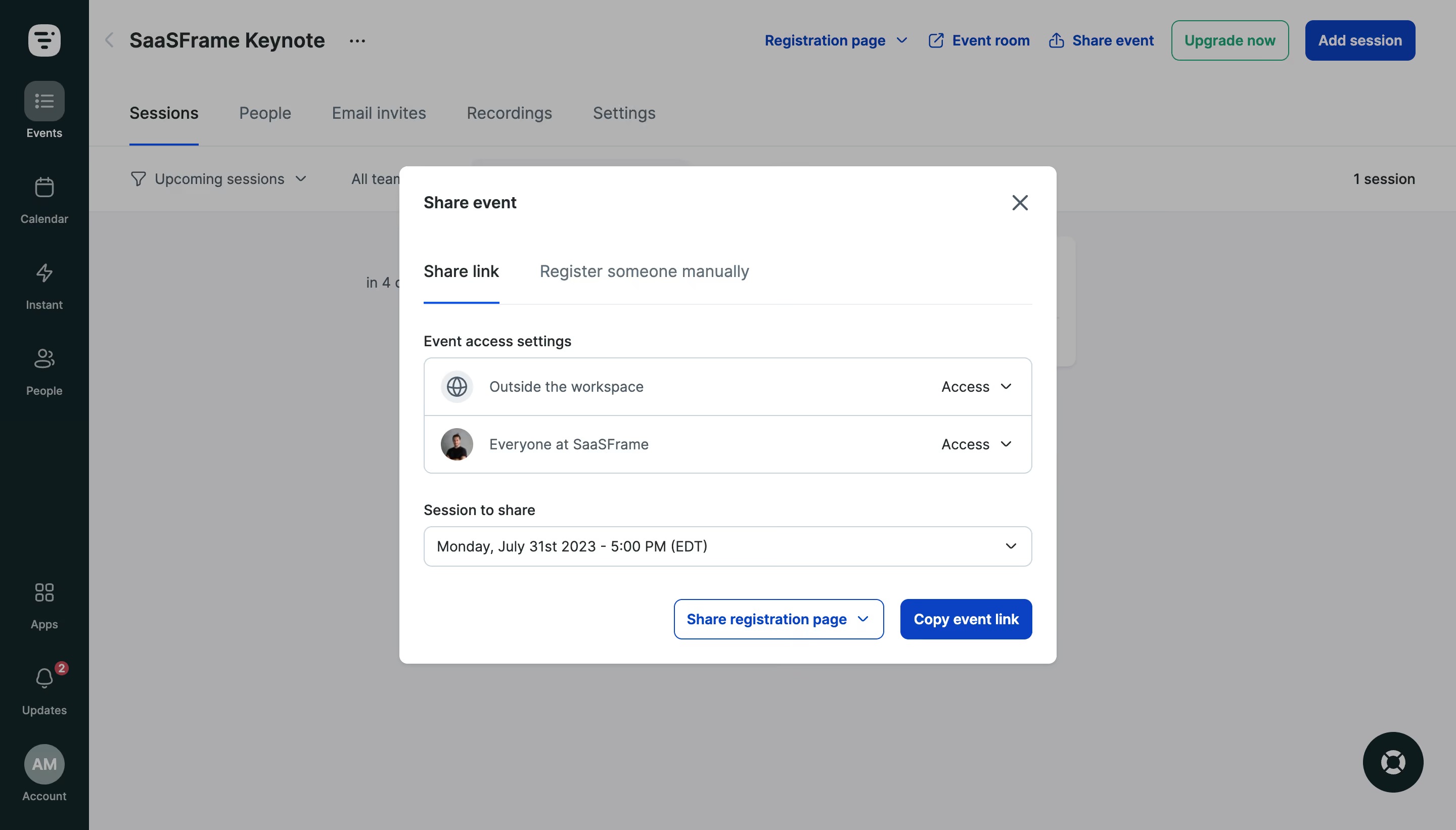
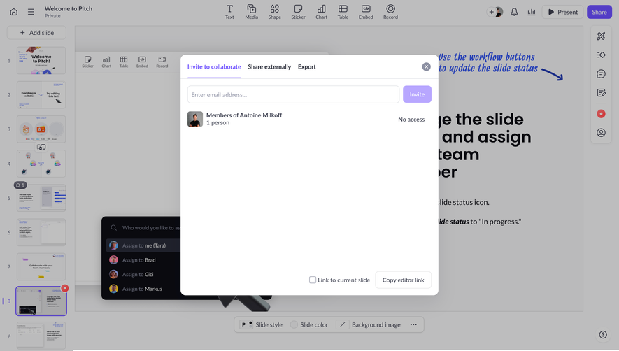
- **Character:** A clean event-sharing modal overlays a dimmed event dashboard, using white surfaces, cool-gray outlines and strong blue actions.
- **Capture scale:** The screenshot measures 2880 × 1642 pixels. Approximate CSS dimensions assume a 1440 × 821 viewport at 2× density; this is unverified.
- **Tone:** A compact permissions-and-link workflow keeps sharing controls grouped in one dialog.
### Page composition
- **Underlying app:** A dark teal icon rail and event-management workspace remain visible behind a gray veil.
- **Modal:** A centered roughly 650 × 492px CSS white rectangle contains the sharing workflow.
- **Header:** Share event sits left with a close X at upper right.
- **Tabs:** Share link is selected beside Register someone manually.
- **Permissions:** A two-row access group shows external and workspace audiences, each with a right-side access dropdown.
- **Session and actions:** A session selector sits above an outlined sharing-mode dropdown and filled Copy event link action.
### Information hierarchy
- **Task context:** The dialog title and selected tab establish link sharing.
- **Access control:** Audience labels and Access dropdowns precede the session choice.
- **Session specificity:** A full-width dropdown identifies which event session will be shared.
- **Action priority:** Copy event link is the strongest filled blue action; sharing mode is outlined.
- **Background context:** The Sessions tab and event header remain visible but subdued.
### Typography
- **Family:** A neutral interface sans-serif is visible; exact identity is unverified.
- **Modal title:** Approximately 16px CSS semibold.
- **Tabs:** Approximately 16px medium, with a darker selected label.
- **Section labels:** Approximately 14px medium.
- **Rows and selector:** Approximately 14px regular.
- **Actions:** Approximately 14px semibold, white on blue or blue on white.
- **Background:** Larger event title and navigation text remain legible beneath the overlay.
### Colors & surfaces
- **Modal:** Sampled #FFFFFF supplies the dialog.
- **Overlay:** Sampled #ACACAE and #B2B2B2 dominate the dimmed workspace appearance.
- **Underlying rail:** Sampled #081C1D and #091A1D supply dark teal navigation.
- **Primary blue:** Sampled #0043CB supplies strong sharing/action accents; #002F8D appears in dimmed blue background controls.
- **Borders:** Sampled #C5D3DB contributes to pale cool-gray outlines.
- **Text:** Dark blue-gray labels contrast with muted audience descriptions.
### Components
- **Dialog shell:** White surface with around 8px radii and a soft shadow.
- **Tabs:** A fine horizontal rule spans the row, with a short blue underline under Share link.
- **Access group:** Two approximately 56px-high rows share a thin rounded outer border and central divider.
- **Audience icons:** A globe in a pale circle represents external access; a small circular avatar represents the workspace audience.
- **Session selector:** A full-width outlined control around 40px high has a trailing chevron.
- **Action row:** Two right-aligned buttons around 40px high use small radii; the outlined mode control includes a dropdown arrow.
- **Close:** A simple dark X sits inside the dialog's upper-right padding.
### Visual rhythm
- **Padding:** Approximately 24px surrounds the dialog content.
- **Group spacing:** Around 28–32px separates tabs, permissions, session selector and actions.
- **Row alignment:** Audience icons, labels and access controls form stable columns.
- **Action balance:** The two bottom controls align on one baseline and sit close to the right edge.
- **Backdrop:** Uniform dimming separates the modal from a dense underlying event interface.
### Responsive
- **Evidence limit:** Only the desktop Share link tab is observed; permissions, copying and mobile behavior are unverified.
- **Dialog recommendation:** Use viewport margins and internal scrolling on short screens.
- **Permissions recommendation:** Allow audience labels and dropdowns to wrap without ambiguity.
- **Actions recommendation:** Stack sharing mode and copy action on narrow screens.
- **Focus recommendation:** Keep keyboard focus in the dialog and restore it to the triggering control on close.
### Adaptation guidance
- **Workflow order:** Preserve access settings, session selection and link action in that sequence.
- **Permission clarity:** Explain each audience and expose dropdown values semantically.
- **Feedback:** Provide accessible confirmation after copying and clear errors for unavailable sessions.
- **Accessibility:** Label the dialog, tabs, selectors and close control; expose selected-tab state.
- **Scope:** The screenshot establishes visible sharing controls only; no event link was copied or distributed.
Use this context to reproduce the reference's visual language: layout, typography, colors, spacing, borders, radii, and distinctive elements. The screenshot takes priority if descriptions conflict.
## Direction
{{preferences.fidelityInstructions}}
## Output
{{output.instructions}}
Deliver a polished, cohesive design with precise alignment, hierarchy, and spacing. Produce the requested visual artifact, not just a description. If unsupported, explain the limitation.